Form Manager
Introduction
Form Manager is the application most important part. You can see here all the forms you have been created in Easy Forms, plus all the actions that can be performed with each. For example, you can access to the users submissions, create reports, view statistics and more.
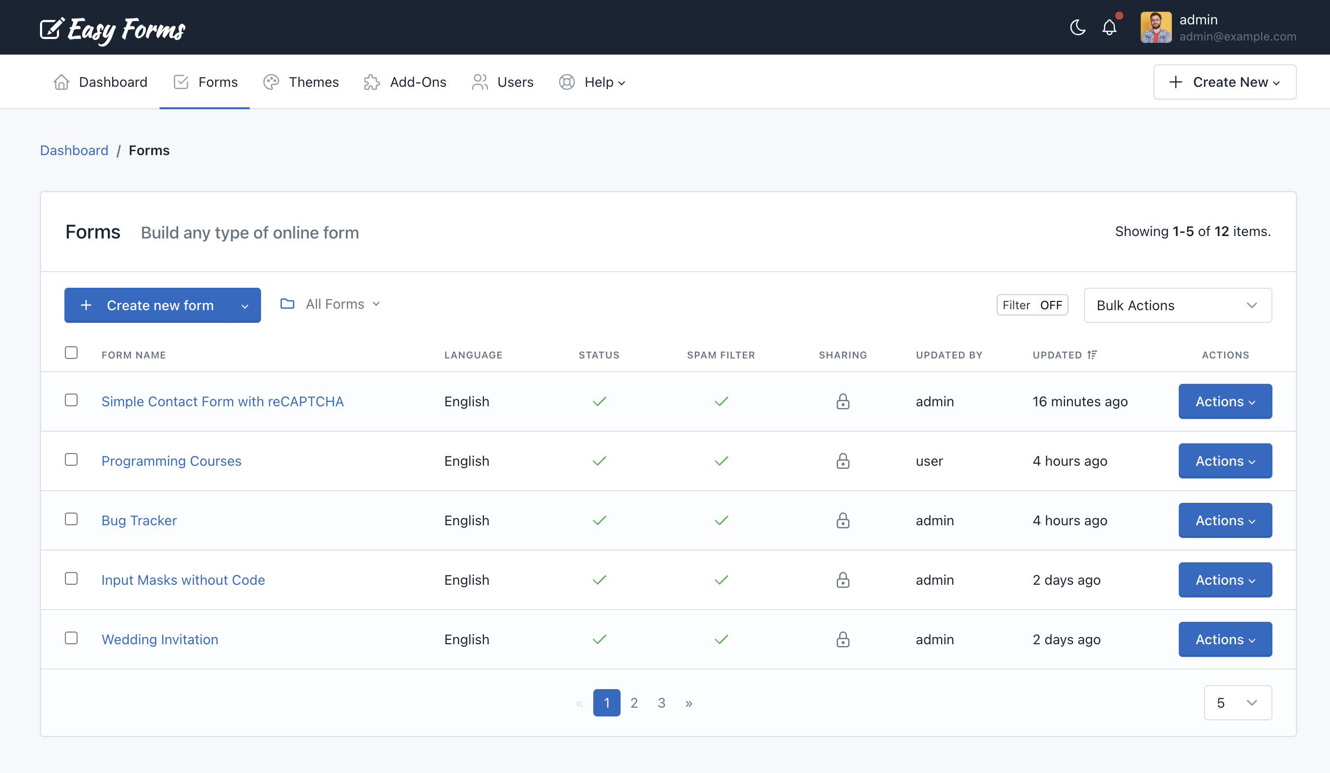
Note: To access the Form Manager click the “Forms” menu in the navigation bar.
Create a form
Before you create your first form, please read the Form Builder documentation.
If you are on the Dashboard or in the Form Manager, follow these steps:
- Click “Create Form”
- Drag and drop all the fields that your form needs.
- Drag and drop one button or more, according to your needs.
- Click “Save Form”. A modal window will appear with 3 options:
- Continue editing the form.
- Go to Advanced Form Settings
- Go to Form Manager
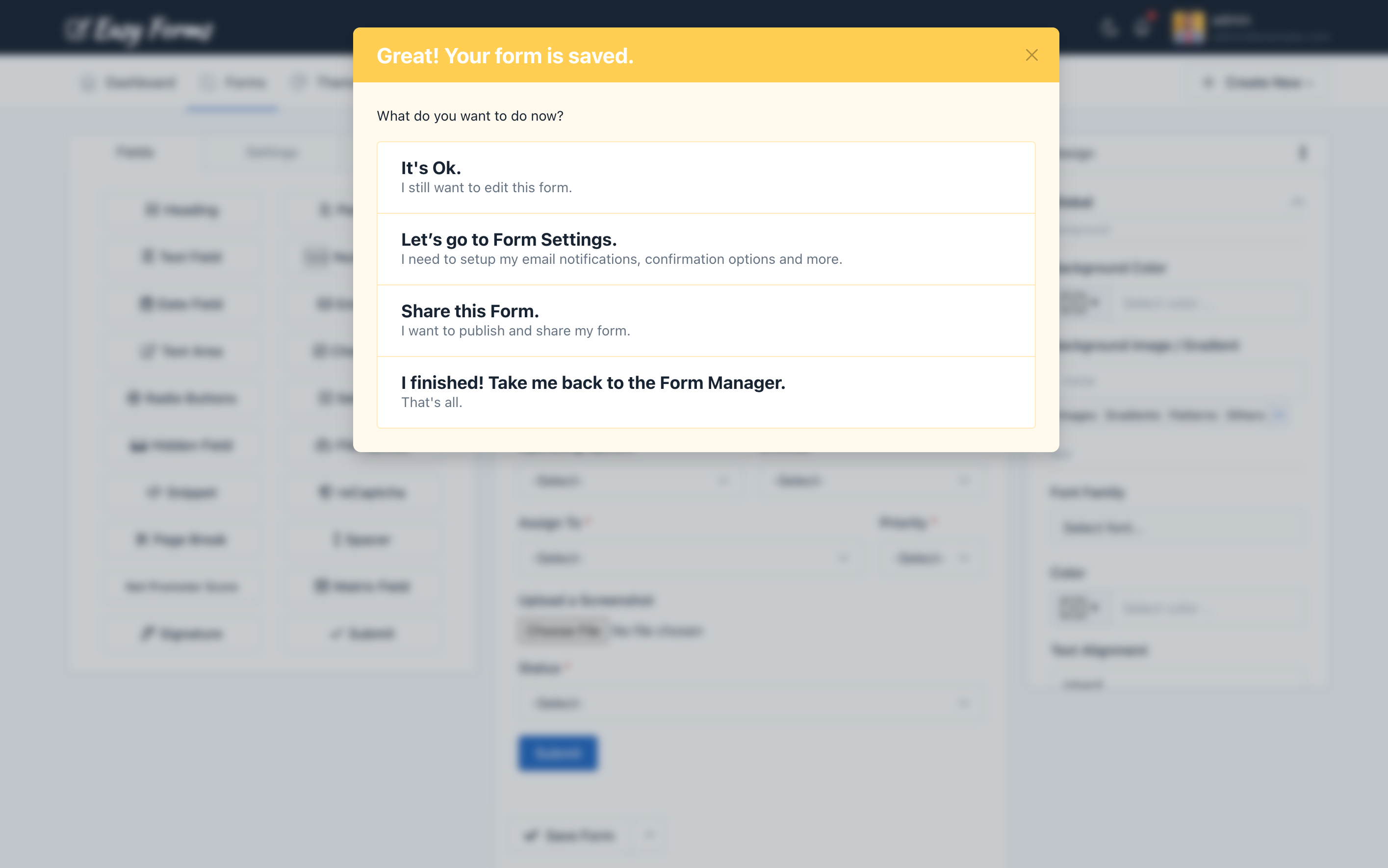
Note: If you close the modal window without choosing one of these three options, when you “Save” again, you create another form and not edit the already created. This option can be useful if you want to create several similar forms quickly.
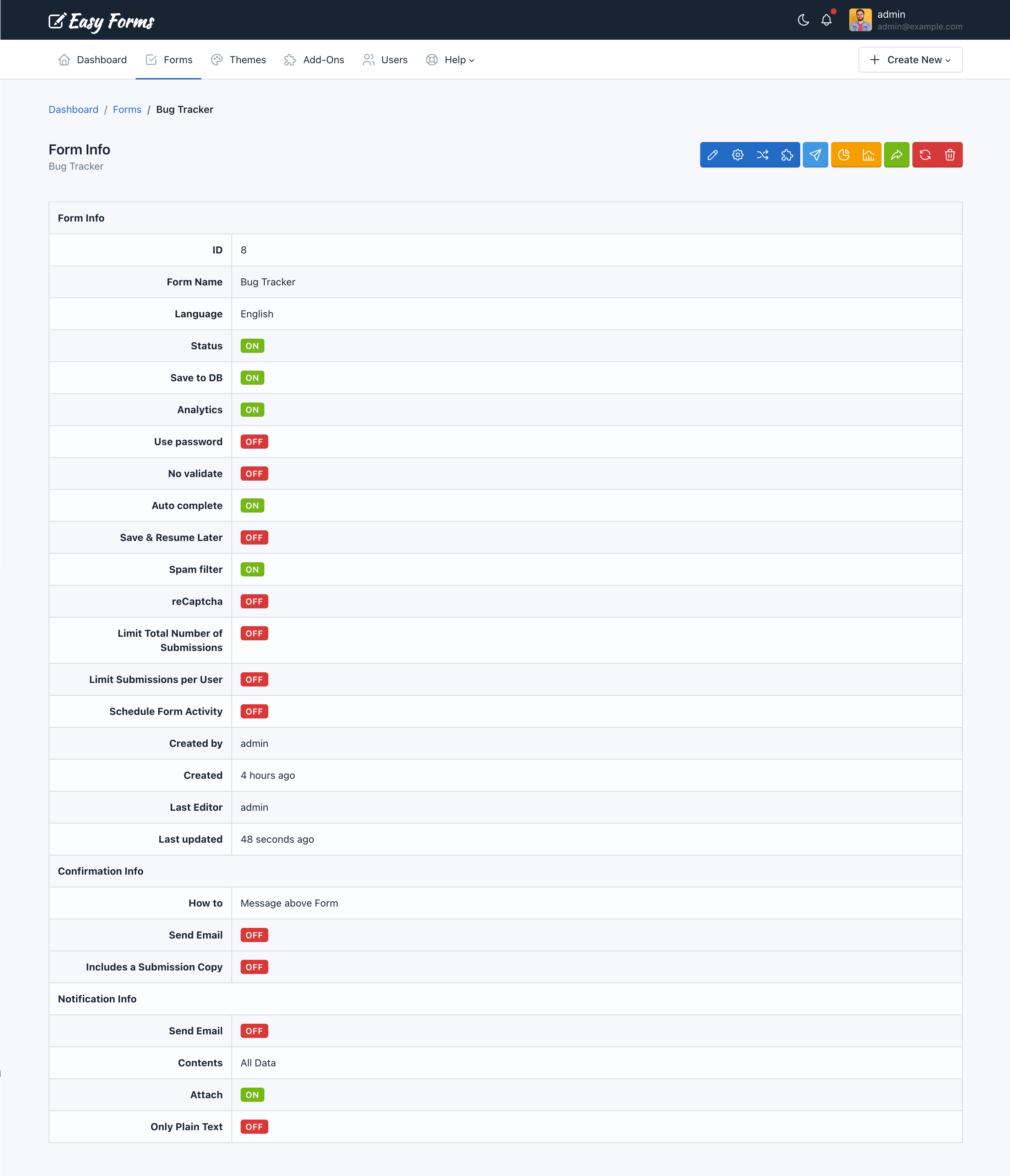
View Form Record
To view the Form Record, click on the form name in the Form Manager. You can view from here its configuration and access all your options.
Update a Form
If you have questions about updating your first form, please read the Form Builder documentation.
Updating a form can be done in two ways:
- From the Form Manager
- Locate the form to update
- Click on the “Actions” button and select “Update”
- From the Form Record
- To access the Form Record click the name of the form
- Then click the “Update” button (the pencil icon)
- Drag and drop one button or more, according to your needs.
- Click “Save Form”.
Note: While you can update a form at any time, the information gathered by them (submissions and reports) may be affected or lose coherence.
Using Folders to Organize Forms
You can organize your forms in folder. Click here to read more.
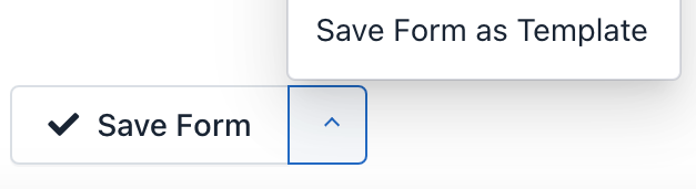
Save Form as Template
To save your Form as a Template, follow these steps:
- Go to the Form Builder
- Click the Up Arrow (At the right side of the “Save” button)
- Click “Save Form As Template“
- Then you will be redirected to the Template Manager.
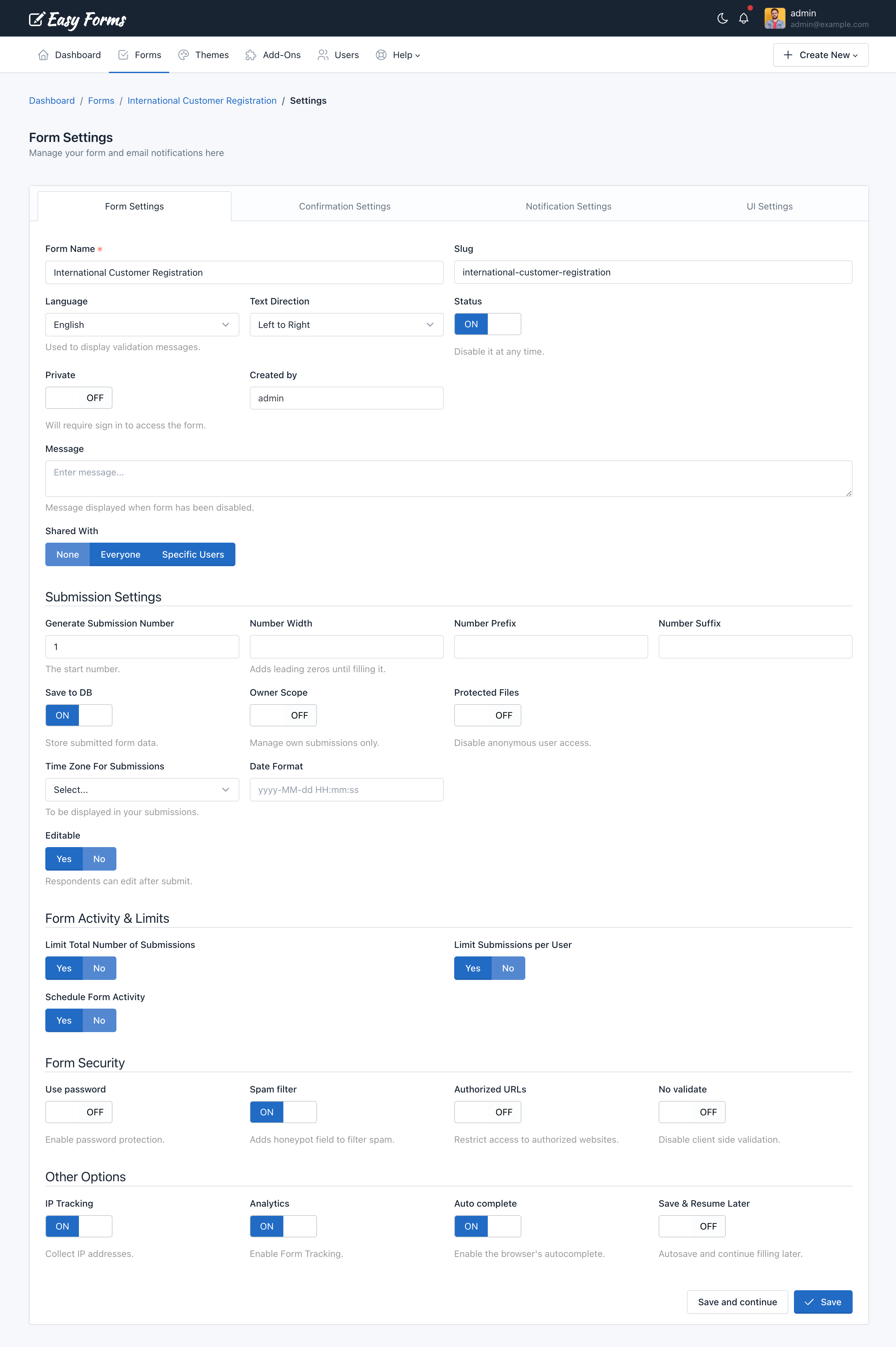
Advanced Form Settings
To access the Form Settings, you must be in the Form Manager. Then perform the following steps:
- Click on the name of the form you want to set
- Click on “Settings” (the gear icon)
In Settings, you will see 4 tabs. Each of these tabs contains the setting of a form aspect:
1. Form Settings
It is the first tab of the Form Settings and is displayed by default. From here you can set up:
- Form Name: Displayed on the application administration pages and as the title of the form public page.
- Slug: This option allows you to customize your forms URLs. By default, slugs are created based on the name of the Form, but you can edit it here.
- Status: Indicates if the form is being shown. If set to Off, the form is no longer displayed to the user and instead appears a message indicating that the form is disabled and does not accept more submissions.
- Created by: Field available only for administrator users. Used to assign a form to a different advanced user.
- Language: This language will be used to display form messages. For example, validation errors. Note that you can add another language to the application.
- Text Direction: Allows you to set the direction in which the values appear in the form. By default, the text direction is Left to Right (LTR). But, you can change the text direction from Right to Left (RTL) from the dropdown.
- Private: Only logged-in users with the right permissions can access the Form page or Form Widget. If this option is enable, anonymous users will be redirected to the login page and users without permissions will be redirected to the Form Management page.
- Message: Sets the message to be displayed to the user when the form has been disabled (Off).
- Shared With: This feature allows you to share the form with other users. You have three options:
- None: The form will only be visible by its creator (without considering the administrator who can see all the forms).
- Everyone: The form will be visible by all users of the application. Only managers can share forms with everyone.
- Specific users: Allows you to select the users who will be able to see the form. Related permissions: Includes the word “Shared” in his name. For example, viewSharedForms, editSharedForms, deleteSharedForms.
Important! Keep in mind that although a user can share a form with another user, this user must have the permissions to view, edit, delete, etc. required for each action. For example, if you share the form with two users with different roles: Manager and Editor. The Manager user could only have access to view the reports and statistics of shared forms, while the Editor user could only have access to the Form Builder and Form Settings of shared forms.
- Generate Submission Number: This option allows you to set a custom sequential submission numbering for your form. The submission number will be increased by 1 always. Except, if you set a bigger number in form settings (In this case, we are going to use this number). So, only when the number is bigger than the submission number of the previous entry we are going to use it to prevent duplicates. Take into consideration that the Submission Number helps you to identify a Submission in your Form, but a Submission ID helps you to find a Submission in the entire application. Two different forms can have the same Submission Number, but never the same Submission ID.
- Number Width: Set the minimum width of number without a prefix (zeros will be added to the left side). This will change the minimum width of the submission number for new submissions. E.g. set to 5 to have submission number displayed as 00001 instead of 1. Leave empty to disable.
- Number Prefix: Prefix before submission number (optional). This will change the prefixes for new numbers.
- Number Suffix: Suffix after submission number (optional). This will change the suffixes for new numbers.
- Save DB: Indicates if form submissions must be stored in the database or not. In any case, this does not affect each emailing entry.
- Owner Scope: When this option is active, only the Form Managers can manage all the Submissions. The rest of the users who have access to the Submission Manager, will only be able to manage their own submissions.
- Protected Files: When this option is active, only Logged-In users with Form access can access or download the files.
- Time Zone For Submissions: When this option is enabled, the submission date will use this timezone, instead the user account timezone.
- Date Format: When this option is enabled, the submission date will use this date format, instead the application date format.
- Editable: When this option is active, form submissions can be edited by anonymous users by using the Form Widget. So, you will be able to allow your users edit form entries from your own website.
- During: It must be a number, for example: 1. This number defines the amount of time a user can edit a submission.
- Unit of Time: It can be Hours, Days, Weeks, Months or Years. This allows you to define exactly the time you can allow the edition. Eg. 1 hour or 1 day.
- If the Submission meets: Only Form Submissions that pass this condition can be edited. This allows us to enable/disable the edition depending on the value of form fields.
- Limit total number of submission: Specify the maximum number of submissions that the form will accept in a period.
- Action: The action to be executed when a form has reached its limit. It can be: Show error message (By default) and Show error message and Disable Form (This action is only available when “Per Time Period” is “All Time“).
- Total Number: Total number of submissions to be accepted.
- Per Time Period: Period in which the number of submission will be counted.
- Limit submissions per User: Sets the maximum number of submissions that the Form can receive from the same user in a period.
- Limit By: There are four options: IP Address, Browser Fingerprint, IP Address or Browser Fingerprint and IP Address and Browser Fingerprint. Use Browser Fingerprint when you disable IP Tracking or when you are running Easy Forms in an intranet and want to limit the entries.
- Max Number: Maximum number of submissions allowed.
- Per Time Period: Period in which the number of submissions will be counted.
- Schedule Form Activity: Set the start an end date in which the Form must be enabled (ON) Before and after it, the form will be automatically disabled.
- Start Date: Select the date on which the form will be activated.
- End Date: Select the date on which the form will be deactivated.
- Use password: Enable or disable the form protection by using password. If the option has been enabled, you should fill the Password field. Otherwise, the form will not be saved and instead, a validation error will be displayed. By default, this setting is OFF.
- Spam filter: Indicates if the form should use the honeypot technique to filter submissions made by real users from the ones made by bots (spam).
- Authorized URLs: To prevent a third party from embedding your Form on their own website, your form can be restricted to a list of URLs that you authorize.
- URLs: The domain names where the form can be embedded.
- Hide Form: This option let you to hide the form in unauthorized urls.
- Unauthorized Url Message: Enter a custom error message to be displayed when the form widget is embedded in an unauthorized domain.
- No validate: This option allows you to disable the Client-Side validation (by the browser). Take into account that the Server-Side validation won’t be disabled. It’s recommended to have this option in Off.
- IP Tracking: When this option has been enabled, IP addresses won’t be collected by the application. You can enable the Browser Geo-location to collect the Sender information with consent.
- Analytics: Enable/disable monitoring the form by the application. When, IP Tracking has been disabled, Form Stats will be collected with IP anonymization.
- Autocomplete: Enables the browser’s autocomplete to forms that have been previously filled. By default, this setting is ON.
- Save & Resume later: When this option has been enabled, the browser automatically will store the information entered by a user on each field to be resumed later, even if the user close the browser.
Note: There are conditionally required fields. For example, if you activate the Schedule Form Activity option, you must enter a Start and End Date. If you leave these fields in blank, you cannot save the Form Settings and instead, an error message appears.
2. Confirmation Settings
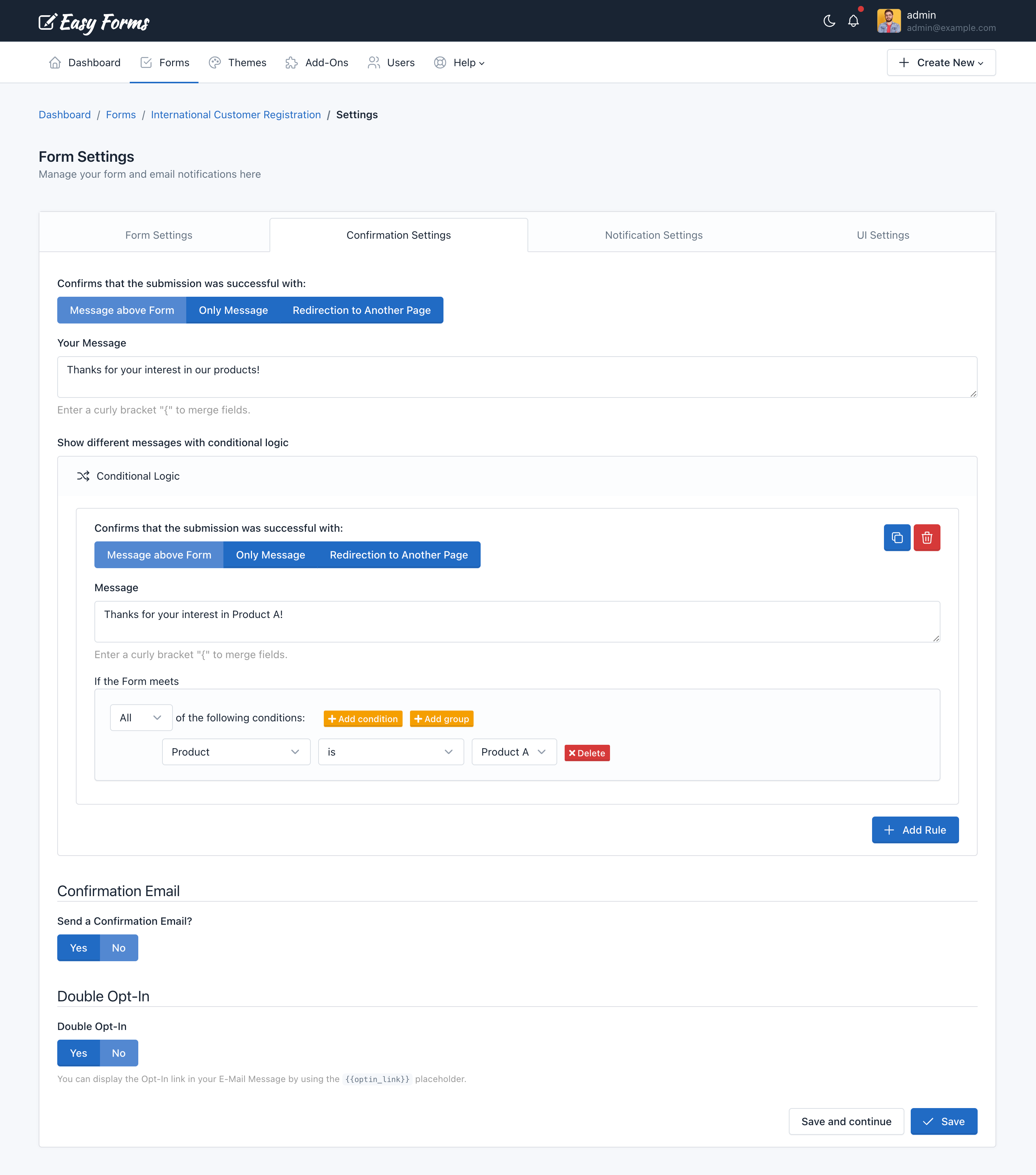
This tab allows you to configure four key aspects of the submission confirmation:
- Inform to the user immediately: Whether using a text message (alone or above the form) or redirect the user to another web page. In the first case, you must type the message to display and in the second, the full URL of the web.
- If you’d like to make the message more personal, you can insert field variables (placeholders) into a confirmation message or confirmation URL, in similar way as a confirmation message by email. Once the form has been submitted, the placeholder will be replaced with the information placed in that field. For more details, go to the ‘Customizing the message’ documentation.
- To Redirect the browser to another page, you can set up 3 additional parameters
- Show Message and Redirect After: Here you can enter a number of seconds to start the redirection.
- Append Submission Data to URL: This is useful for small forms when you want to append all the collected data to the URL. Eg. https://www.example.com/thanks.html?text_0=John&email_0=john@doe.com
- Replace Field Name with Field Alias when it’s available: If this option has been enabled, the collected data will be appended using the Field Alias. Eg. https://www.example.com/thanks.html?name=John&email=john@doe.com
- Conditional Logic With this tool you can customize the way that you handle and process your submissions, giving you more control once a user has submitted your form. A common example of this would be if you wanted to provide your end users the option to download a file. In this scenario you can redirect to the file to start the download process. But, if the user don’t want to get the file, we will show the Thank You message.
- Send confirmation email to the user: If you select this option, each time a user submit a form will receive an email that will thank him.
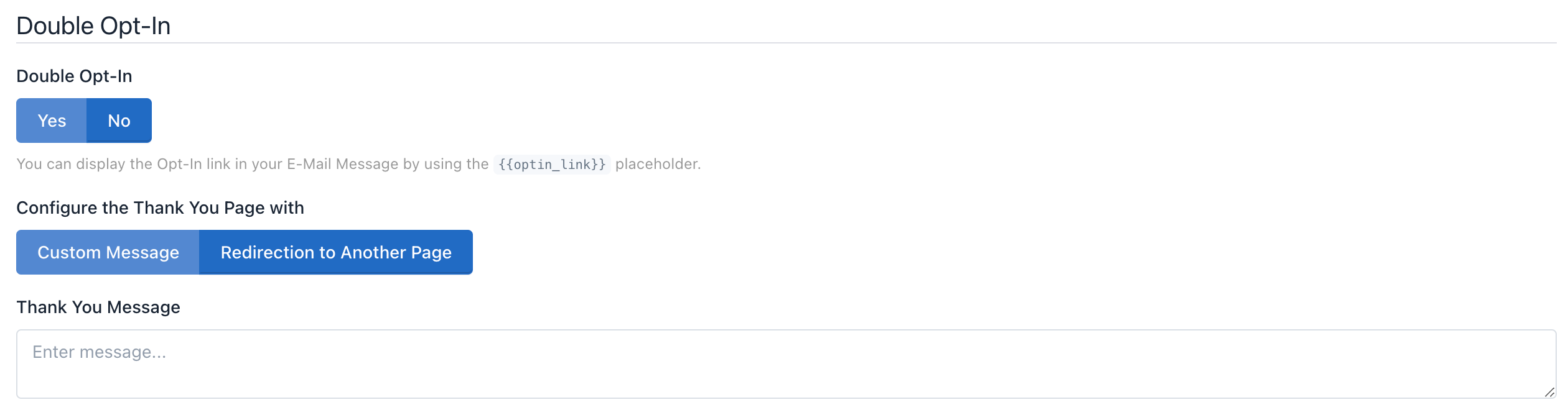
- Double Opt-In You can enable the double opt-in feature to confirm your form submission. Then you can use the placeholder:
{{optin_link}}to present the link to the Opt-In Confirmation Page. When the end-user clicks this link can be redirected to another web page or see a custom Thank You message.
Note: When the end-user confirms their Opt-In, the following event will be triggered: Email has been verified by double opt-in. This event can be used in different parts of the system, for instance to send email notifications.
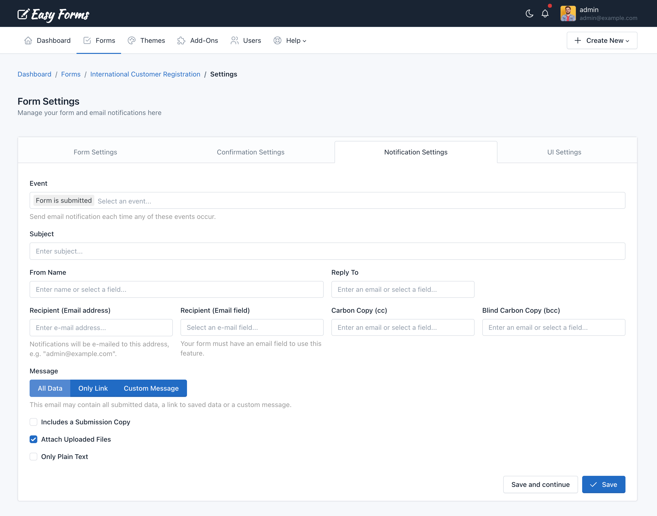
3. Notification Settings
In this tab you can configure how Form Submissions will be sent to your email (All data, only a link to the data or a custom message). Additionally, you can set the email subject, email addresses and more.
Four things to keep in mind:
- If the form has fields of “Email” type, you can select them as Send To and/or Reply To email address.
- If the form has fields of “File” type, you can attach uploaded files to emails.
- If you choose only Plain Text, a default message with all the submitted data will be sent in plain text.
- You can choose the event when the email notification will be sent:
- Email is verified by double opt-in
- Form is submitted (New Entry)
- Form is submitted (Edit Entry)
- Submission is created
- Submission is updated
Note: You can insert placeholders (field variables) into a notification email. For more details, go to the ‘Confirmation Settings’ documentation.
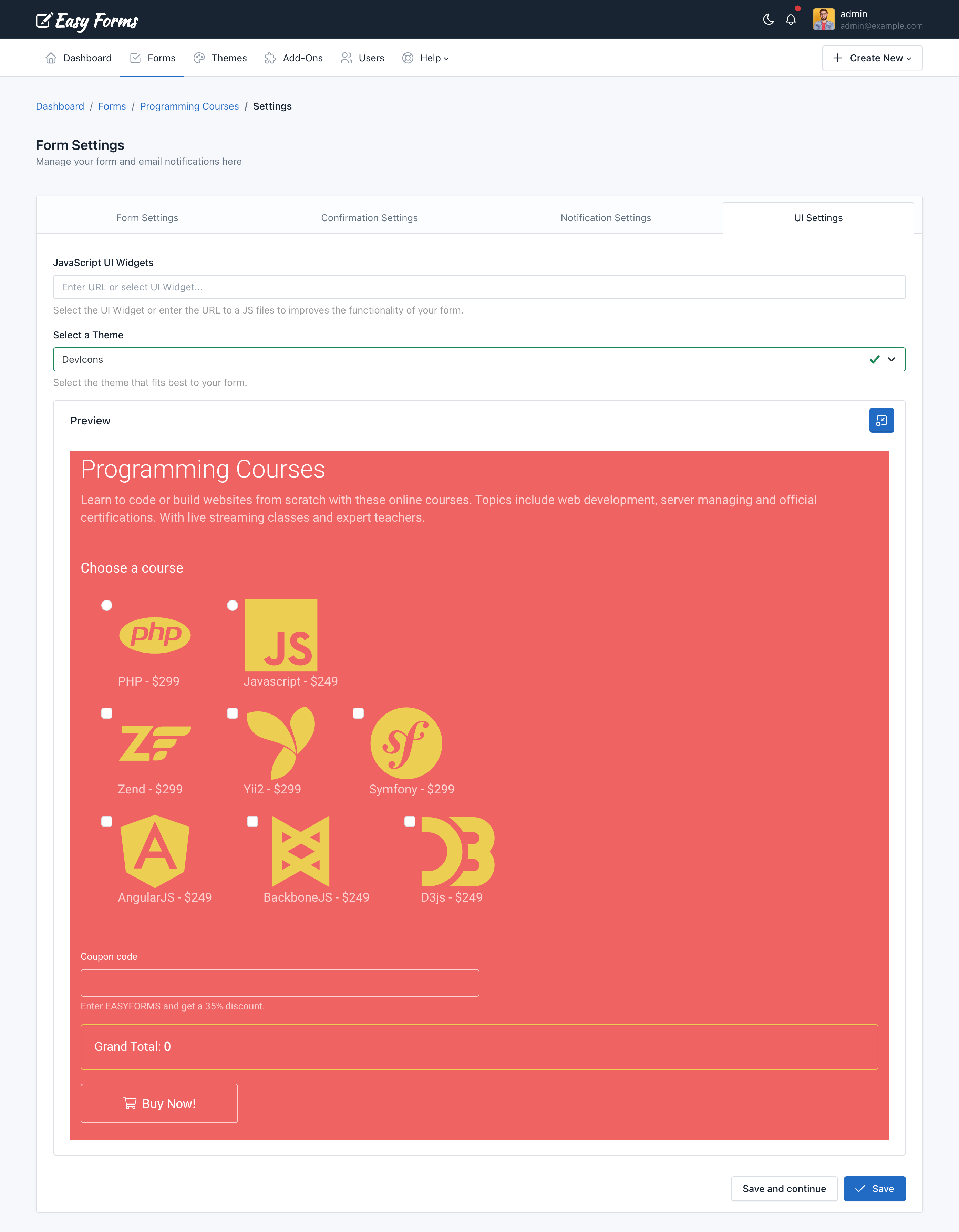
4. UI Settings
UI = User Interface.
From here you can modify the form appearance: The design by using themes, and the functionality by using an external JavaScript file.
- Javascript UI Widgets: Select a UI Widget or Enter the full URL of the JavaScript file that will be loaded with your form. By default, the jQuery library is available for you to make use of it when interacting with the form.
- Select a Theme: You can select the theme that best fits your form or one you have created yourself. When you select a theme from the list, the form will be automatically displayed with the design chosen theme. You can change the themes over and over again to see differences.
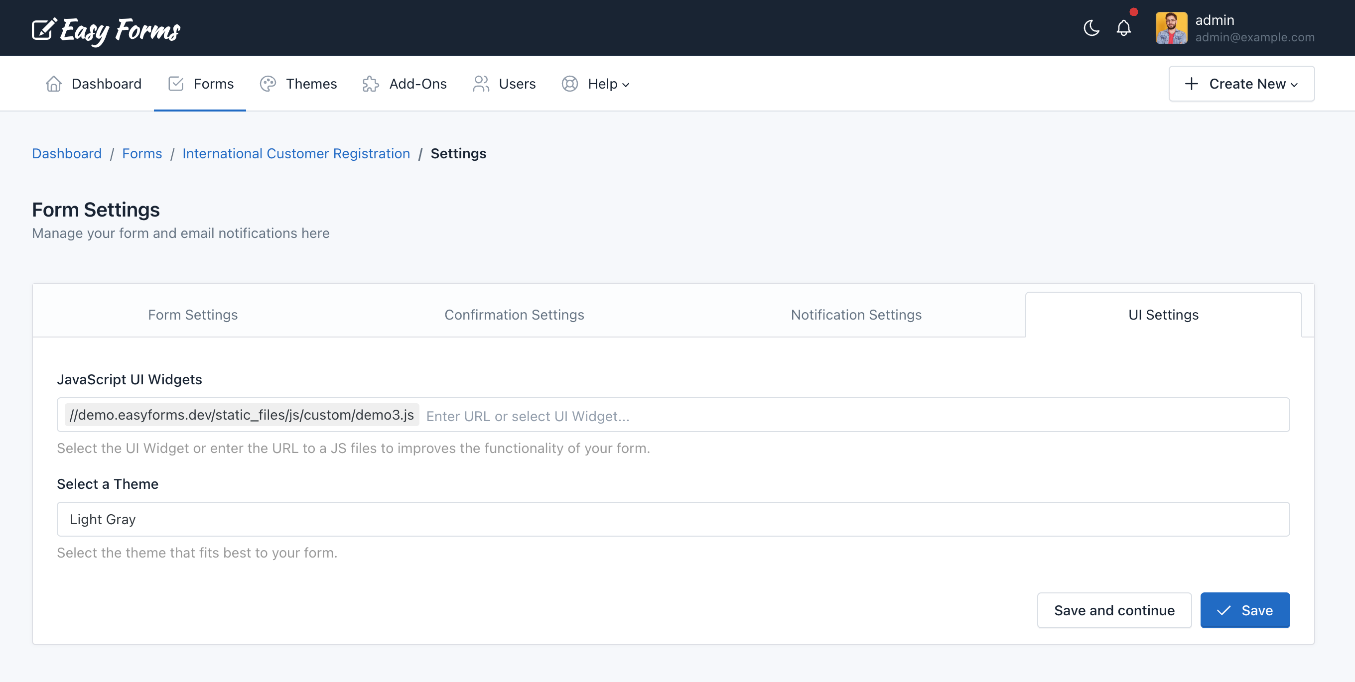
Note: To save all the changes you make on any tab, click the “Save” button.
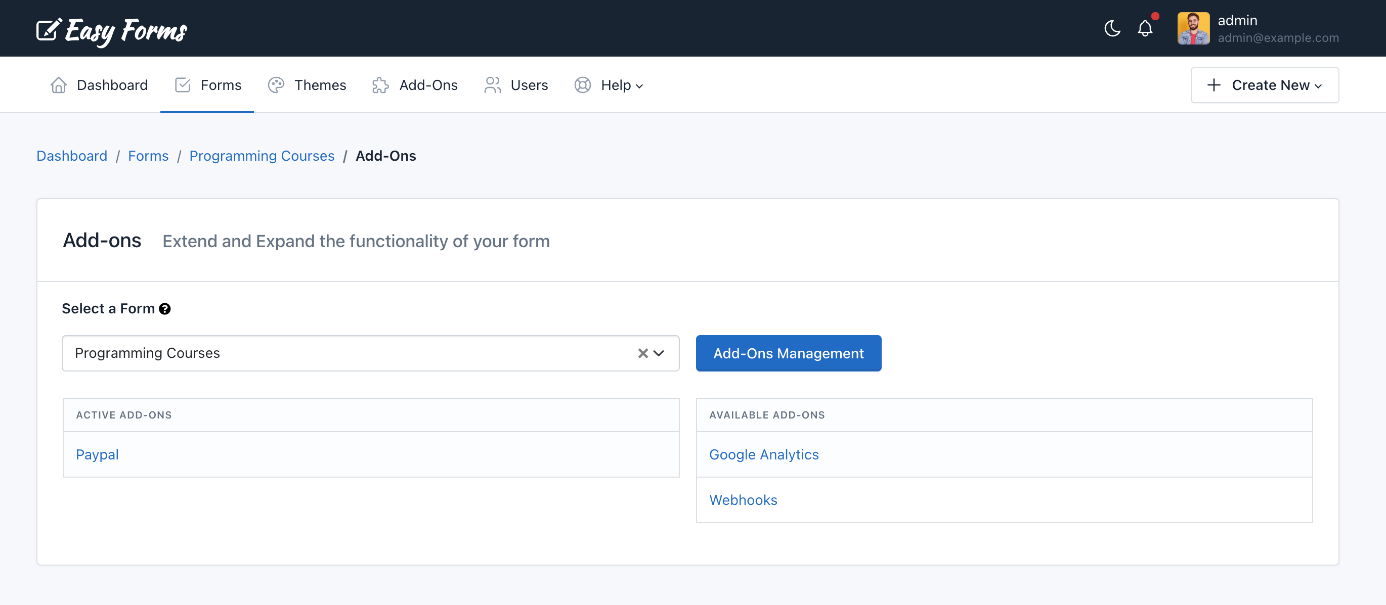
Add-Ons
You can use add-ons to do more with your Forms. If a user has permission to access the add-ons, the option “Add-Ons” will appear in the Form Manager (Forms > Actions > Add-Ons), from here you can manage the add-ons configuration that are active and are available for each form.
Reset Stats
You can reset the form stats from the Form Manager, by clicking the “Actions” button and “Reset Stats“. Then it will show a popup asking you to confirm your decision to delete the stats.
Copying a Form
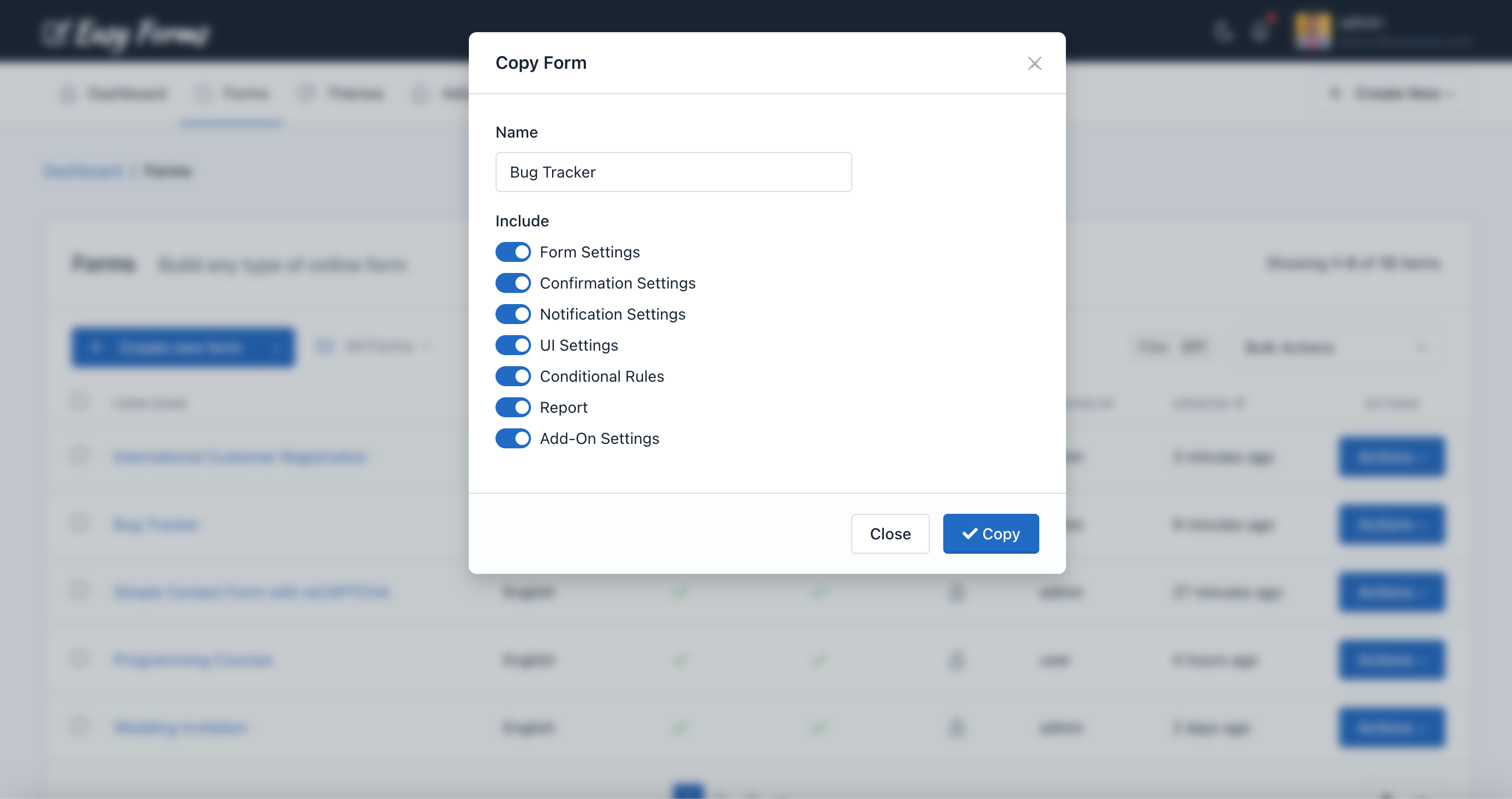
If you want to copy a form to save time, we make that process easy for you.
- To copy a form, click on the “Forms” link.
- Then, click on the “Actions” button next to the form you would like to copy.
- Then, click Copy and popup form will appear. The form name will be given by the name of your original form with “- Copy” added to it.
- You can change the name of your form
- You can select what settings should be included in the new form
- Finally, click “Copy“.
The Form Manager will display the copied form on the top of the list.
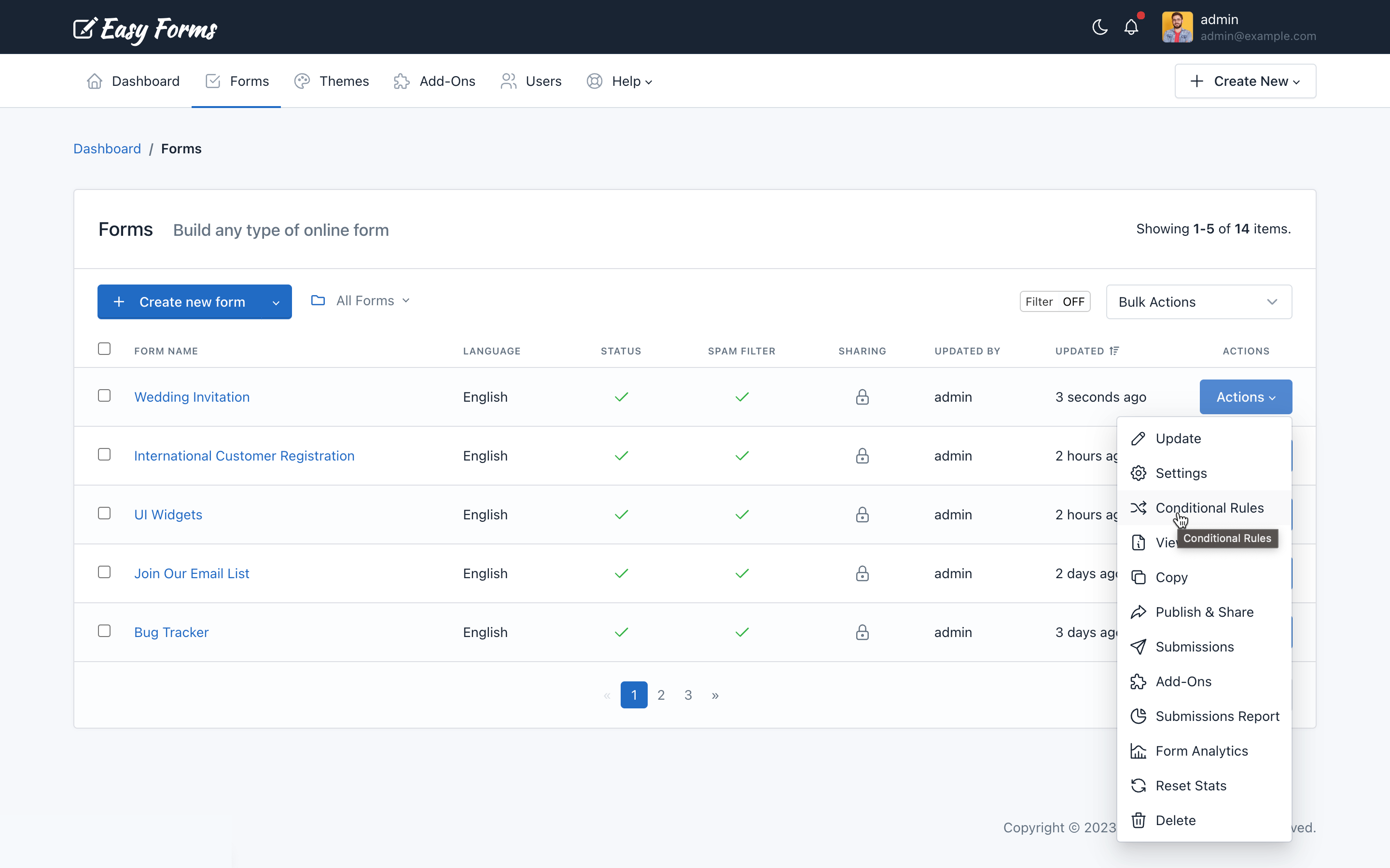
Delete a form
You can delete a form from the Form Manager, by clicking the “Actions” button and “Delete”. Then it will show a popup asking you to confirm your decision to delete the form.
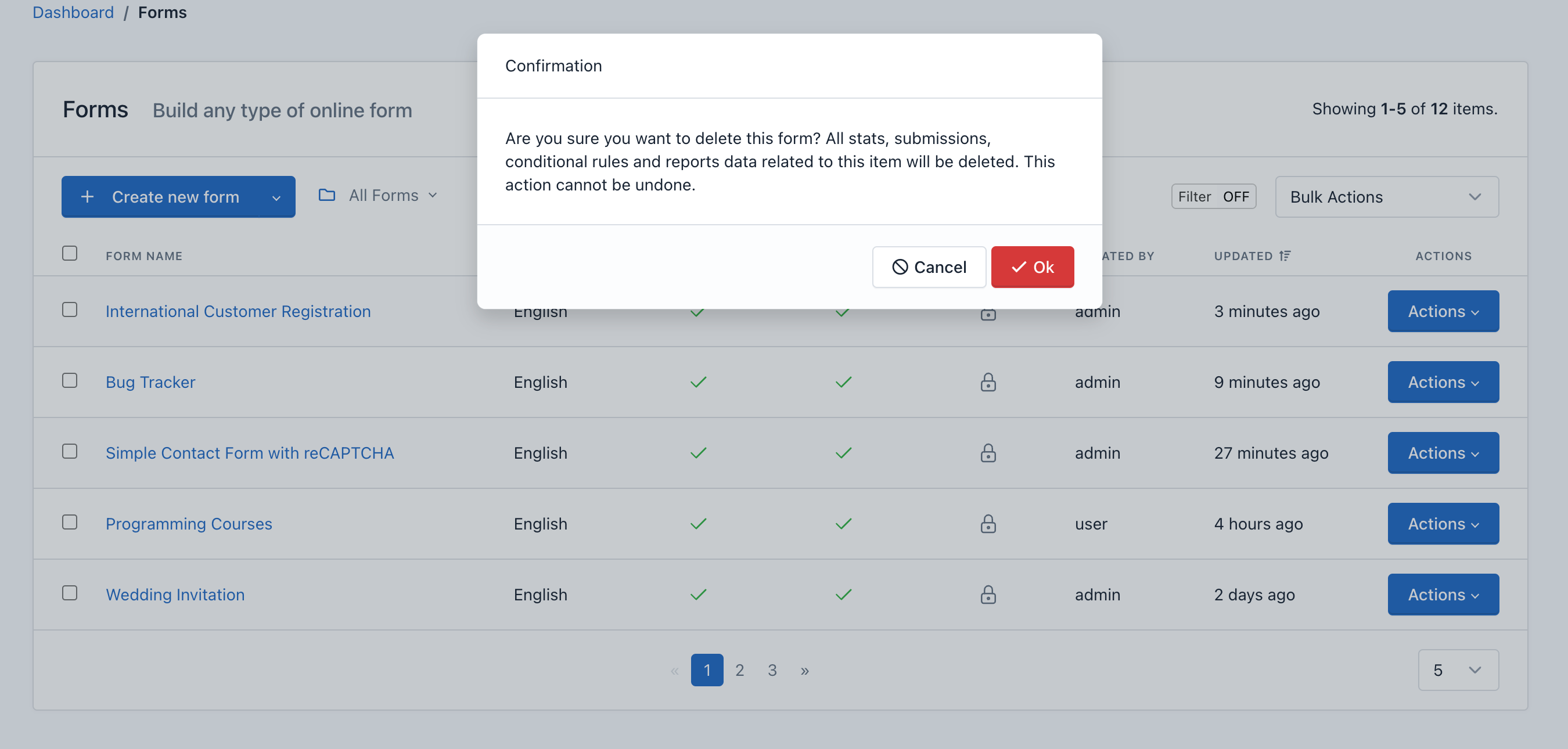
Important! When you delete a Form, all content related to it will be deleted too, including: Submissions, reports and graphs, statistics, configurations and more: This action cannot be undone.
Add conditional logic to a form
Easy Forms features a powerful and intuitive tool to add conditional logic to a form.
The rules are based on the information that the form fields have at any given time and allow you to disable or enable and show or hide fields and other elements in the DOM. In addition, you can also do math and skip pages with this powerful tool.
You can access the Rule Builder from the Form Manager:
- In the navigation bar, click “Forms”
- Click on the form name
- Click on the button “Conditional Rules” (Flow Graph icon)
Note: If you have questions about your first conditional rule, please read the Rule Builder documentation.
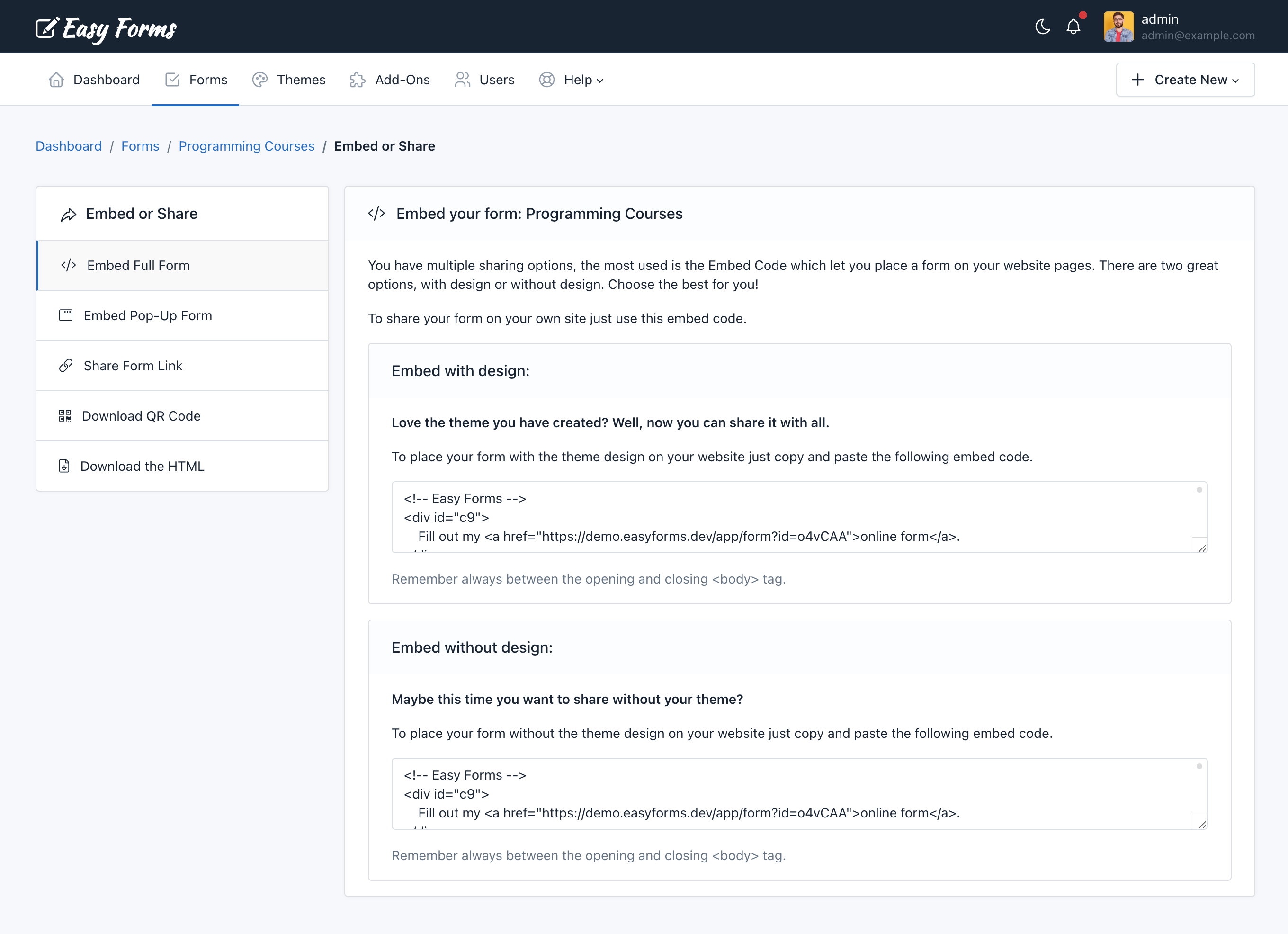
Publish and Share a Form
You can access to publish and share a form using the Form Manager:
- In the navigation bar, click “Forms”
- Click on the form name you want to share
- Click on the “Publish and Share” button (the green arrow icon)
- This allows you to get the code to be placed on the website which will display the form (inline or in a modal pop-up). You can also copy the form permanent link and share it via email or social networks. And now, with the 1.1 version you can also share links with friendly URLs to your forms, immediately!
Note: Keep in mind that if you are going to share your form with a friendly URL, you must also update your theme background-image (if using one).
In addition, the forms can be published in two formats: With or Without design (no theme) and can be shared in different ways, depending on the configuration you assigned. For example, you can share the Form in complete page and without the application logo.
PopUp Designer: Place the form inside a popup
You can place the form inside a popup and design the look and feel of this popup without writing a single line of code.
To use the PopUp Designer, follow the next steps:
- In the navigation bar, click “Forms”
- Click on the form name you want to share
- Click on the “Publish and Share” button (the green arrow icon)
- Click on the “Embed Pop-Up Form” menu.
In this page you can create popups that will get your visitors attention.
You can customize a lot of options like colors, borders, radius, backgrounds, button placements and many more.
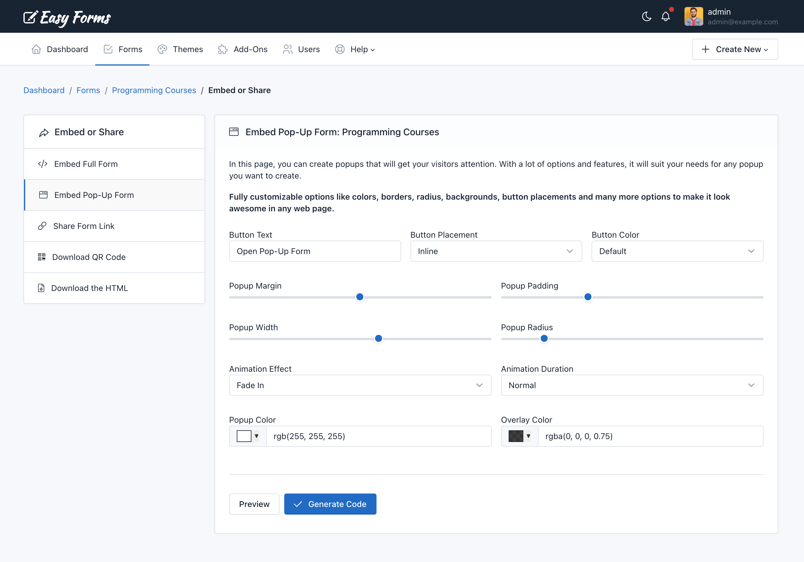
To finish, click on the “Generate code” button to open a modal and copy the HTML code that you must insert in your web page.
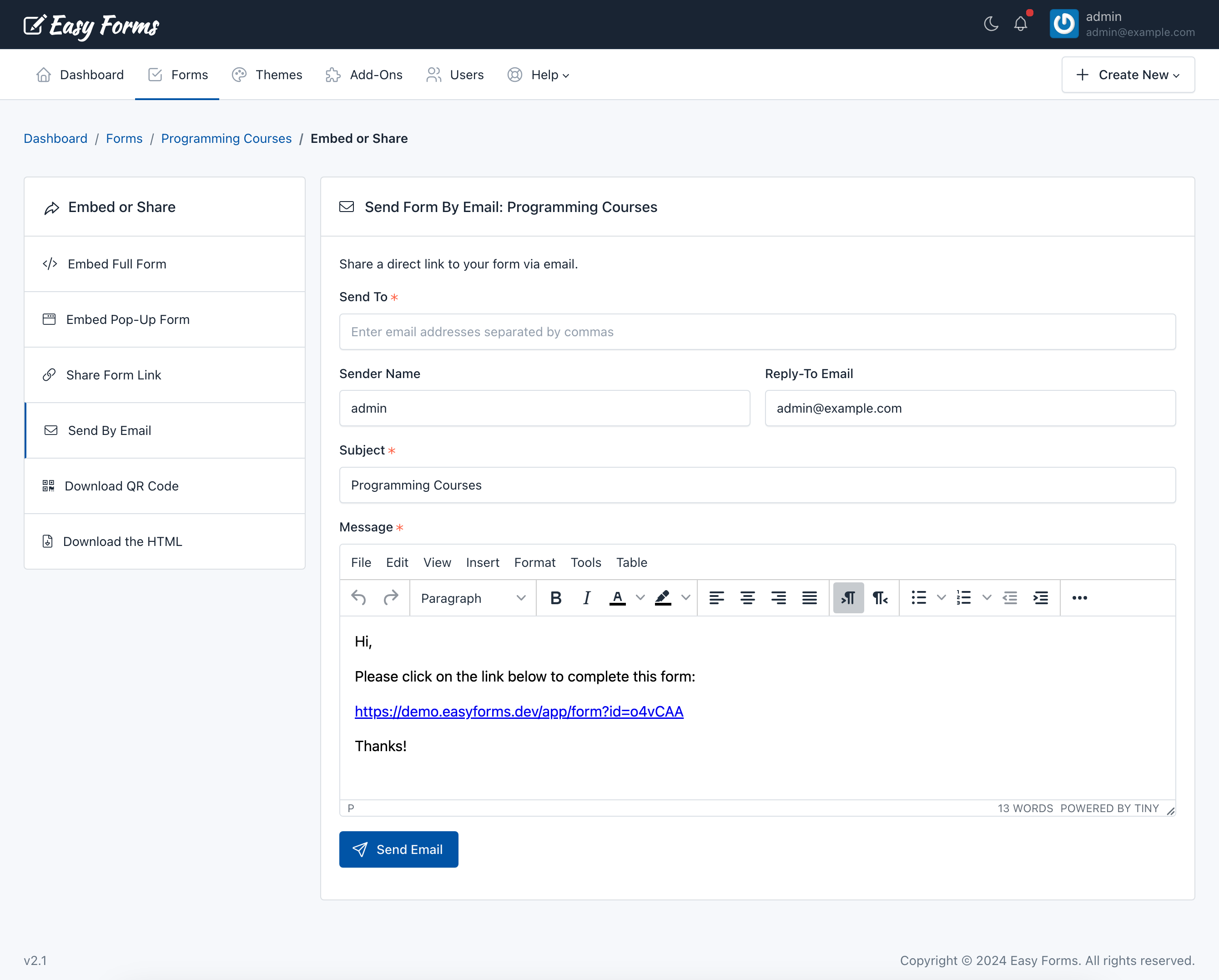
Share Form By Email
Easy Forms offers a straightforward way to send an email to your users and include the Form URL.
To send a form by email, follow the next steps:
- In the navigation bar, click “Forms”
- Click on the form name you want to share
- Click on the “Publish and Share” button (the green arrow icon)
- Click on the “Send By Email” menu.
In this page you can define the Recipients email addresses, Sender Name, Reply-To Email Address, the Email Subject and Email Body.
Download QR Code
QR Codes are an excellent way to connect people from print media or invite people in a mobile world to complete your form.
To download the QR code, follow the next steps:
- In the navigation bar, click “Forms”
- Click on the form name you want to share
- Click on the “Publish and Share” button (the green arrow icon)
- Click on the “Download QR Code” menu.
In this page you can see the QR Code to the friendly link of your Form. Also, you can click the “Download” button to share it with your users.
Form’s Backend Endpoint / Download the HTML
Easy Forms has the ability to generate endpoints, then you can use them to make fully customizable forms.
You can download the HTML code of your Form to integrate it directly on your webpage or mobile app, and use the form’s backend endpoint to collect data.
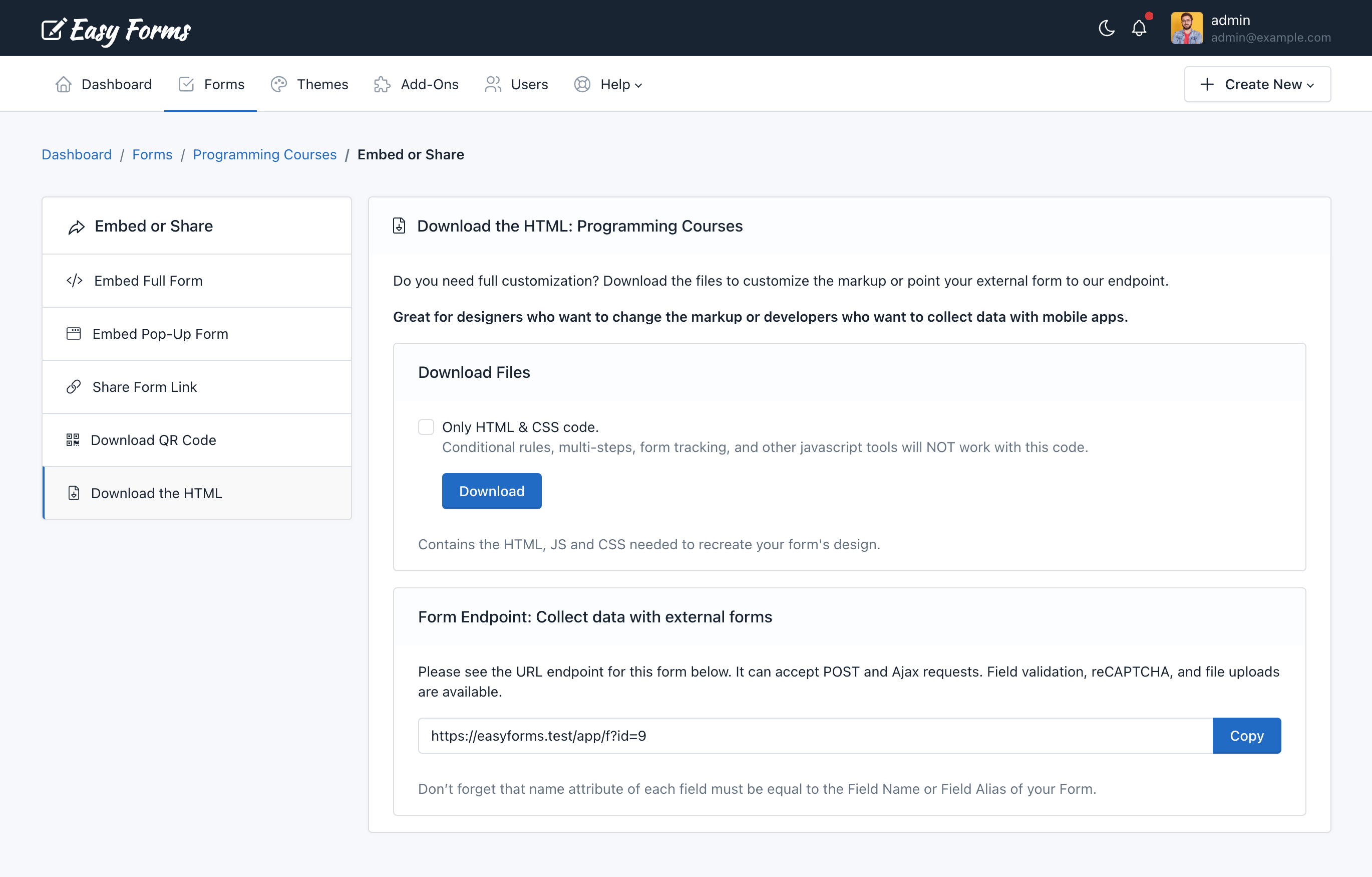
Download the HTML
To download the HTML code, follow the next steps:
- In the navigation bar, click “Forms”
- Click on the form name you want to share
- Click on the “Publish and Share” button (the green arrow icon)
- Click on the “Download the HTML” menu.
In this page you can see the button to download the HTML code as a ZIp file. Also, you can copy the Form Endpoint directly.
Note: If you want to replace the “name” attribute of each field, you need to set it as a Field Alias in the Form Builder.
Form Endpoints
To collect data with the Form Endpoint just copy the URL and change your landing page’s form ACTION url or point a Webhook to this URL. Just take into account two things:
- The field alias of each field should be equal to the field name of your form.
- If your POST request has an associative array format, you can use a Dot Notation. For example, Elementor Forms sends webhooks as associative arrays with this format:
[
  'fields' => [
    'name' => [
      ´value´ => 'John'
    ]
  ]
]
So, instead of using the alias: ‘name’, we need to use the dot notation. For this example, to capture “John” we need to use the following alias: fields.name.value.
Apply a theme to the form
To apply the theme you have created to a form, go to the Form Manager. Then, perform the following steps:
- Click the “Actions” button of the form in which you are going to apply the theme
- Click “Settings”
- Click the “UI Settings” tab
- Select a theme from the menu
- Click “Save”
Form Page Settings
To customize the landing pae where the form is displayed inside the application, go to the Form Manager. Then, perform the following steps:
- Click the “Actions” button of the form in which you are going to customize the landing page
- Click “Publish & Share”
- Click “Share Form Link”
- Click “Go”
Now you can see the Form Page with a “Settings” button in the top left-hand corner. When you click on that button, the form page configuration options will appear on the left side.
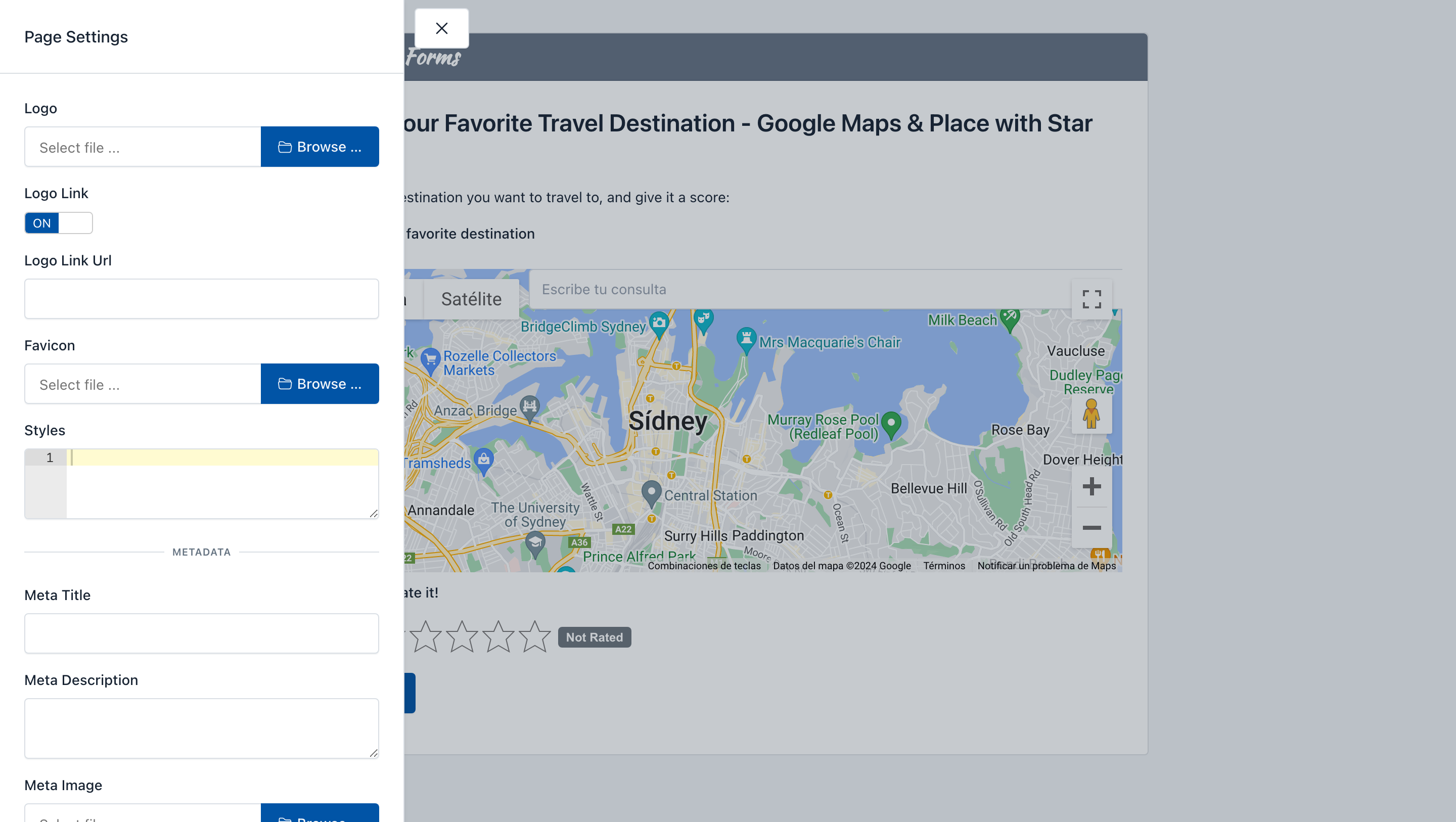
From here you can customize the following elements of the web page:
- Upload a custom logo
- Option to remove the link in the logo
- Option to customize the logo link
- Upload a custom favicon
- Define the CSS Styles for the form page
- Set a Meta Title, Meta Description and Meta Image
This way you can customize the look and feel of the entire landing page and customize the design when the form link is shared in social networks.
Form Builder
Introduction
Form Builder is an Easy Forms key piece. It’s where forms are created and updated. The form builder provides the necessary tools for add and remove fields as other HTML elements.
User Interface
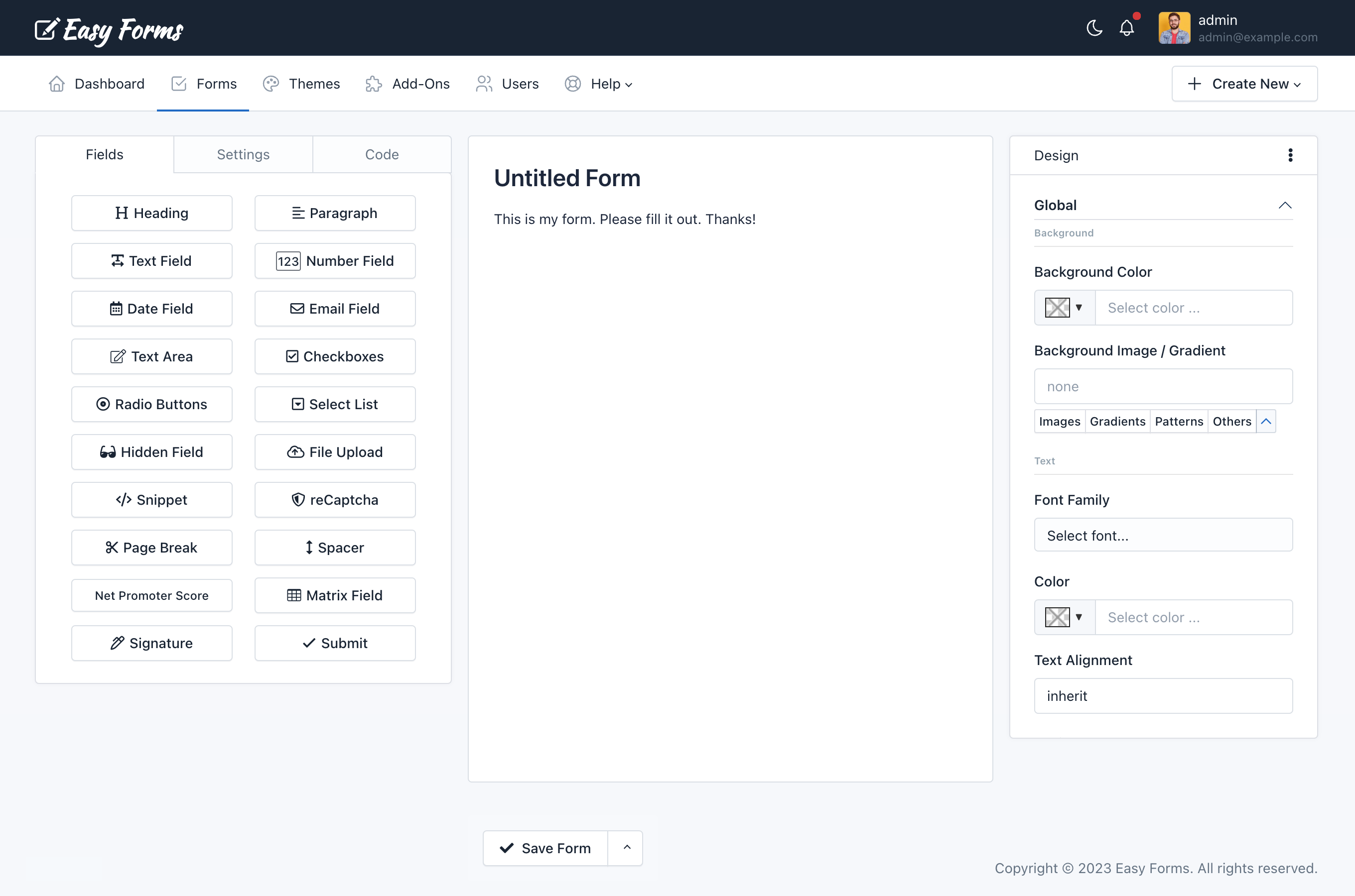
The Form Builder interface is divided into three areas: On the left the form fields, on the right the theme designer and in the center the form preview.
The left panel has three tabs:
- The tab Fields displays all fields and elements that can be added to the form. Simply drag and drop them to the right area.
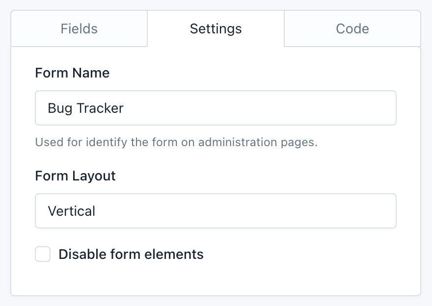
- The tab Settings let set the form name, the form layout (labels position) and disabling all fields.
- The tab Code let see in real time the HTML code that is being generated with the Form Builder. From here you can recognize each element ID to manipulate the Form in a more advanced way. A “Copy” button allows you to copy the entire source code easily.
The center area is the Form Preview from where you can manipulate each of the components.
The right panel is the Theme Designer from where you can customize the look and feel of your form:
- Backgrounds: Change the background of different elements on your form.
- Typography: Choose the font, style, size, and color of all the text elements on your form.
- Borders: Set the thickness, style, and color of the borders around certain elements on your form.
- Shadows: Add or remove a drop shadow around your form.
- Buttons: Change the text of the Submit button.
- And much more!
– Add a field
There are two ways to add a field:
- Clicking a widget on the left panel. That’s all! The form component will appear in your form, below all other components.
- Or, if you want to add a field in a specific placement.
- Click a widget on the left panel and Drag it to the right area.
- At the time you enter the Form Builder’s active area, a box will indicate where will be placed the Field.
- Once you placed it where you need, drop the button.
– Edit a field
To edit a field:
- Click on the field to edit, and a pop-over will appear with field information
- Edit the information according to your requirements.
- Click Save.
Note: Pressing ESC will close the popovers.
– Reorder the fields
To reorder a field (component):
- Click on a component and hold
- Drag the component up or down according to your requirements.
- According to where you drag the component, an active zone where the component will be placed will appear.
- Once placed in the required place, release the component.
– Drag fields to create columns
To create columns with a field (component):
- Click a widget on the left panel and Drag it to the form builder canvas.
- Drag it to the left or right of an existing field.
- A border will indicate where will be placed the field.
- Once you placed it where you need, drop the widget.
Within the form builder, you can drag existing fields into the “column drop zone” – the builder will then automatically resize all fields within the drop zone to create columns of equal width.
You can create until four columns with this method. However, you can design forms with/until 12 columns that fit perfectly with the space available on your website by using the Container Css Class feature.
– Copy a field
To copy a field (component):
- Click on a component and hold.
- Click the ‘Copy’ button in the Popover window
You’ll notice that the copied field will appear below the original field.
– Delete a field
To delete a field (component):
- Click on a component and hold.
- Drag it out of the active zone.
- Release.
You’ll notice that the component has disappeared.
– Copy Field ID
To copy the Field ID follow these steps:
- Click on a component and hold.
- Click the 3 vertical dots (in the Popover heading)
- Click Copy ID.
Now you can paste it in other place like a custom email message or a CSS design.
Basic Form Settings
By clicking on the Form Builder’s Settings tab, you will access a very basic version of the form configuration. From here you can:
- Change the form name: The form name is to recognize the Form in the administration pages and is also display as the Form public page title at Easy Forms.
- Change the form layout: The form layout is based on Bootstrap CSS and is used to locate the labels position on the form.
- The Vertical layout displays the field labels above,
- The Horizontal layout displays the labels on the field left side, and
- The Inline layout hides the labels and displays the fields next to each other. For example, you can use it on a mail registration form, to place an Email field and a button by the side.
- Disable form elements: Let you disable all form fields. It is an advanced option that can be useful if you plan to interact with the form from an external javascript file.
These basic options are intimately related to the form builder. However, you have other Setup options much more advanced that can be accessed from the Form Manager.
Field Settings
Each form field has many Setup options, for example, the label, the default value, the CSS class, etc. To set up a field, go to the preview and click on it.
Setup Options
Next, all the Setup Options are shown in alphabetical order. Not all are in all fields, but if you have any problem, use this list as a reference.
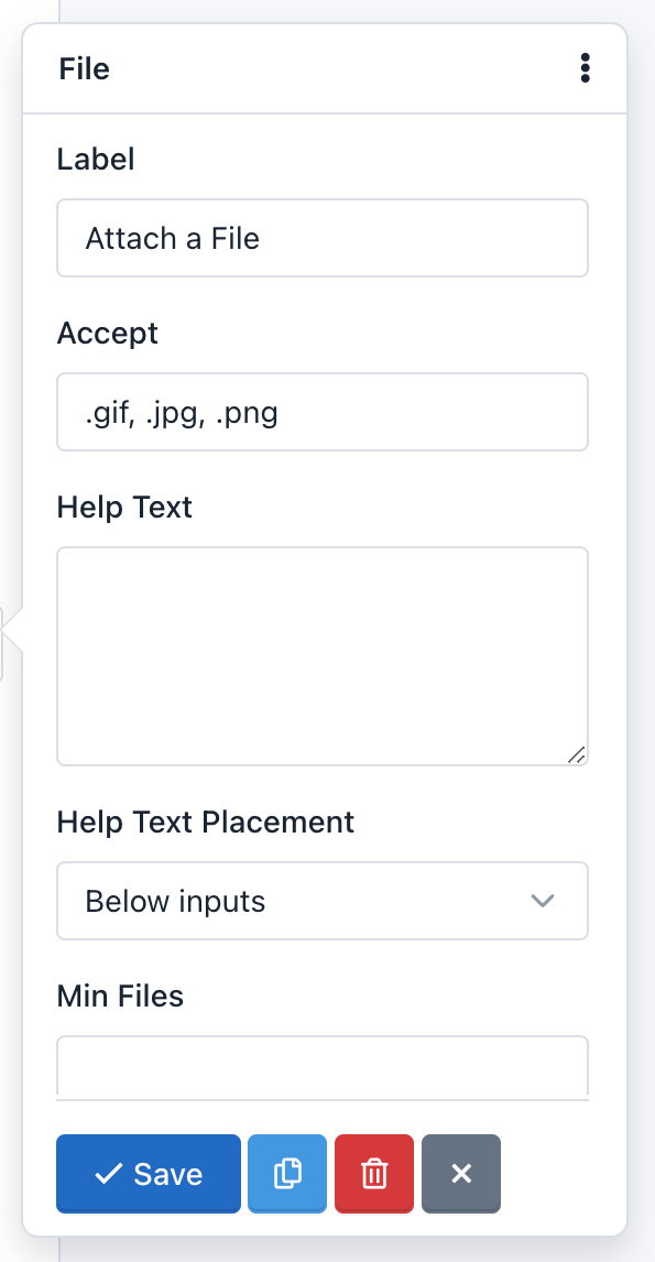
– Accept:
This option is in the File Upload field. With it you can limit the type of files the field can accept. You should consider the following
- You must add the file extensions starting from the dot and separated by commas.
- By default, all files will be validated and will only be accepted image files with extension ‘.gif, .jpg, .png’.
- For example, to accept text files, you can change this option to: ‘.doc, .docx, .txt’.
- If you want to accept all types of files, you must leave this blank.
- This option enables the ‘accept’ attribute from the HTML5 standard, so the field validation is performed both on the client side (browser) and server side.
– Alias:
The Alias option let you send WebHook notifications using the Field Alias instead of the Field Name. For example, we’ll be able to re-send POST data by using “name” or “age” instead of “text_0” or “number_0”.
– As Button:
The “As Button” option let you display Radio Button fields and Checkbox fields as Buttons.
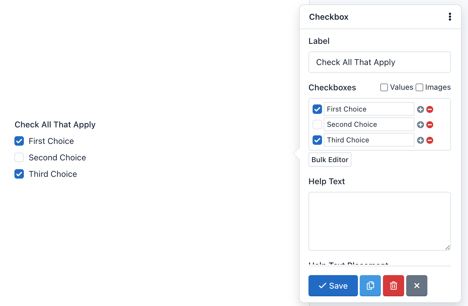
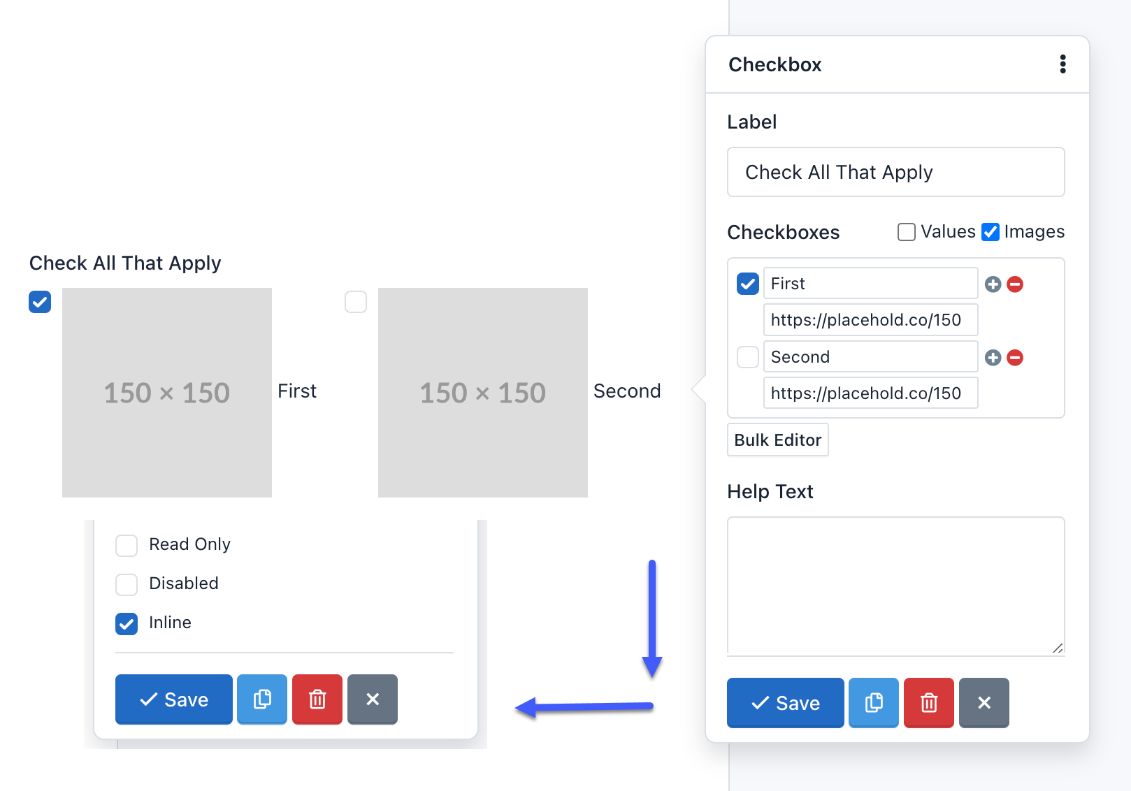
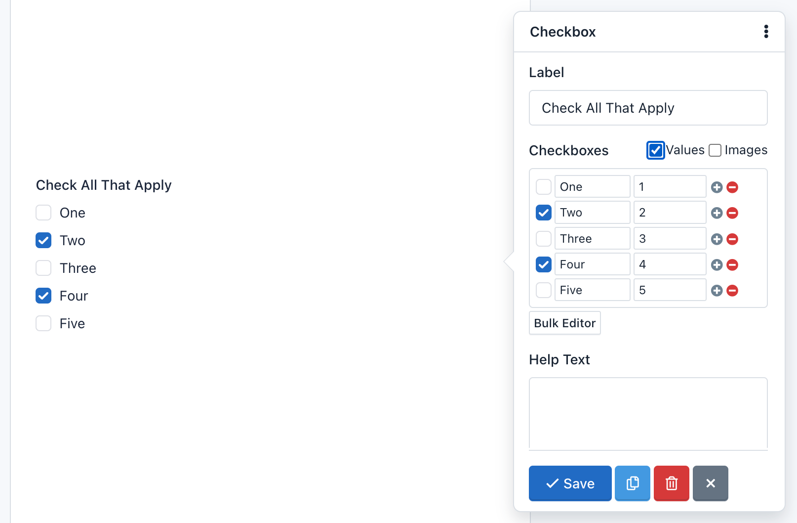
– Checkboxes:
The Checkboxes option is only available in Checkbox fields, and it’s used to add checkboxes to the component.
For example, enter the Bulk editor and add the following “Checkboxes” and click “Save”:
First Choice|1
Second Choice|2|selected
Third Choice|3
Fourth Choice|4|selected
Fifth Choice|5
The form preview will show a Checkbox component with 5 checkboxes: First Choice, Second Choice, Third Choice, Fourth Choice and Fifth Choice. The “Second Choice” and “Fourth Choice” checkboxes will be checked. And finally, if the user submits the form without making any changes, he will be sending the values: 2,4.
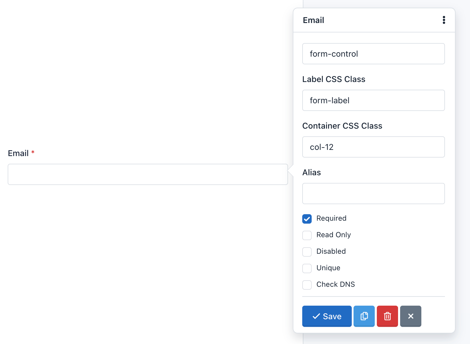
– Check DNS:
This option tells the application that in the process of Email Field validation verify that the email domain really exists and has ‘A’ and ‘MX’ records.
Caution! This is an advanced option and should be used with caution. Verification may fail due to a problem with the DNS servers even when is a valid email. By default, it is disabled.
– CSS Class:
Let you add one or more CSS classes to the Form Field.
– Container CSS Class:
Let you add one or more CSS classes to the container of the whole component.
You can create multi-column forms by defining the class col-xs-* (the asterisk represents the number of columns, between 1 and 12).
For example:
If you want to place two fields in two columns you must do the following:
- Add the container CSS class to the first field: `col-xs-6
- Add the container CSS class to the second field: `col-xs-6
In this example, we are using the “no-padding” predefined CSS classes to remove the padding that Bootstrap CSS adds to the columns. You can add them or not according to your design. If not, you can add the container CSS class col-xs-12 to the rest of fields, to preserve the same padding on each field.
Important! You can go to the Bootstrap CSS documentation for more information.
Note:
- By default, all fields except Button, come with the class:
form-group. This class cannot be edited.- By default, the field Button comes with the class:
form-action. This class cannot be edited.
– Custom Attributes:
You can add custom attributes to a field. These attributes have two parts: The attribute name, and the attribute value. This feature allows you to create more accessible forms, specially because you can use it to add:
- Data attributes: Useful to integrate form fields with javascript libraries
- Aria attributes: Useful to describe form fields in a better way and offer more accessibility.
– Default Value:
You can add a default value to a field. This value appears by default, but the user can modify. If the user submits the form without having modified the default value, this value will be collected to process the submission.
– Disabled:
You can disable a field if you want it to be displayed to the user, but not be edited. (Note that you can also disable a hidden field). Unlike the Read Only option, a disabled field is not sent to the server. That is, the information stored in a disabled field is not received and therefore not appear on the Submissions Manager.
– Field Size:
A Text Area field allows its size configuration. The size must be an integer and indicates the number of rows displayed or, in other words, the field height. By default is 3.
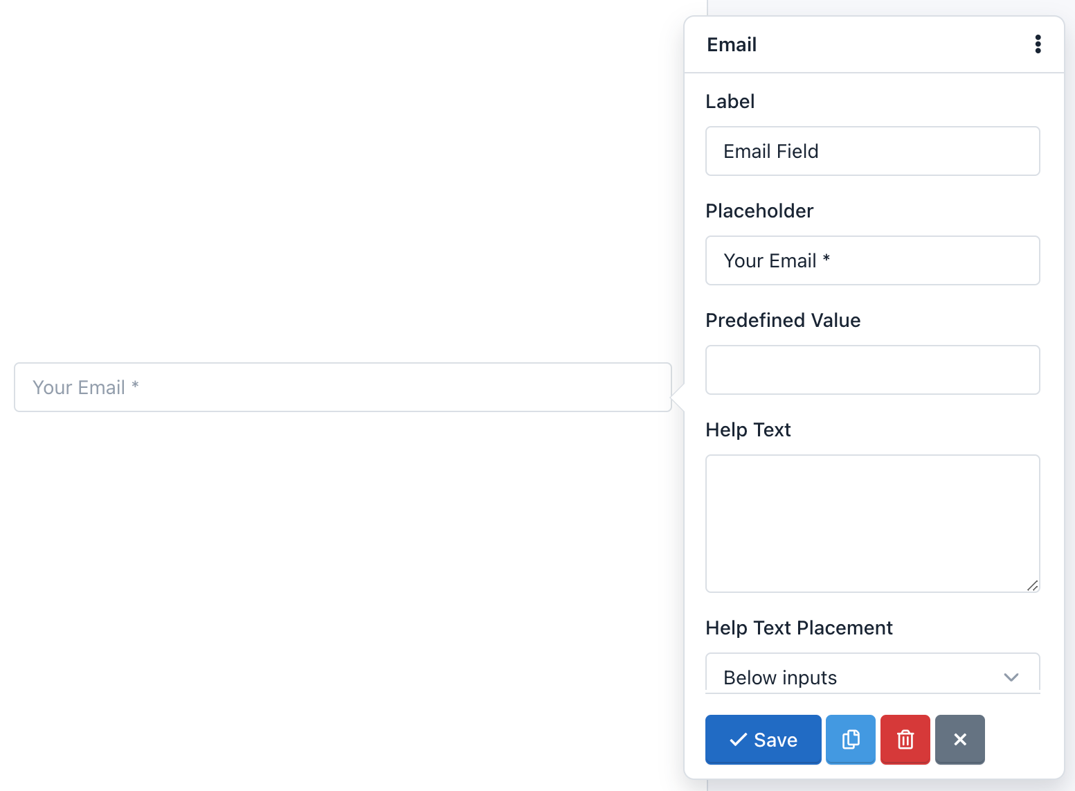
– Help Text:
The text you type here will appear below the field and is often used to give the users instructions on what to put in it.
– Help Text Placement:
This Drop Down menu allows you to move the Help Text above or below the form field.
– Inline:
The Inline option is in the Checkbox fields and Radio Buttons and is used to change the vertical position of the checkboxes or radio buttons for a horizontal position.
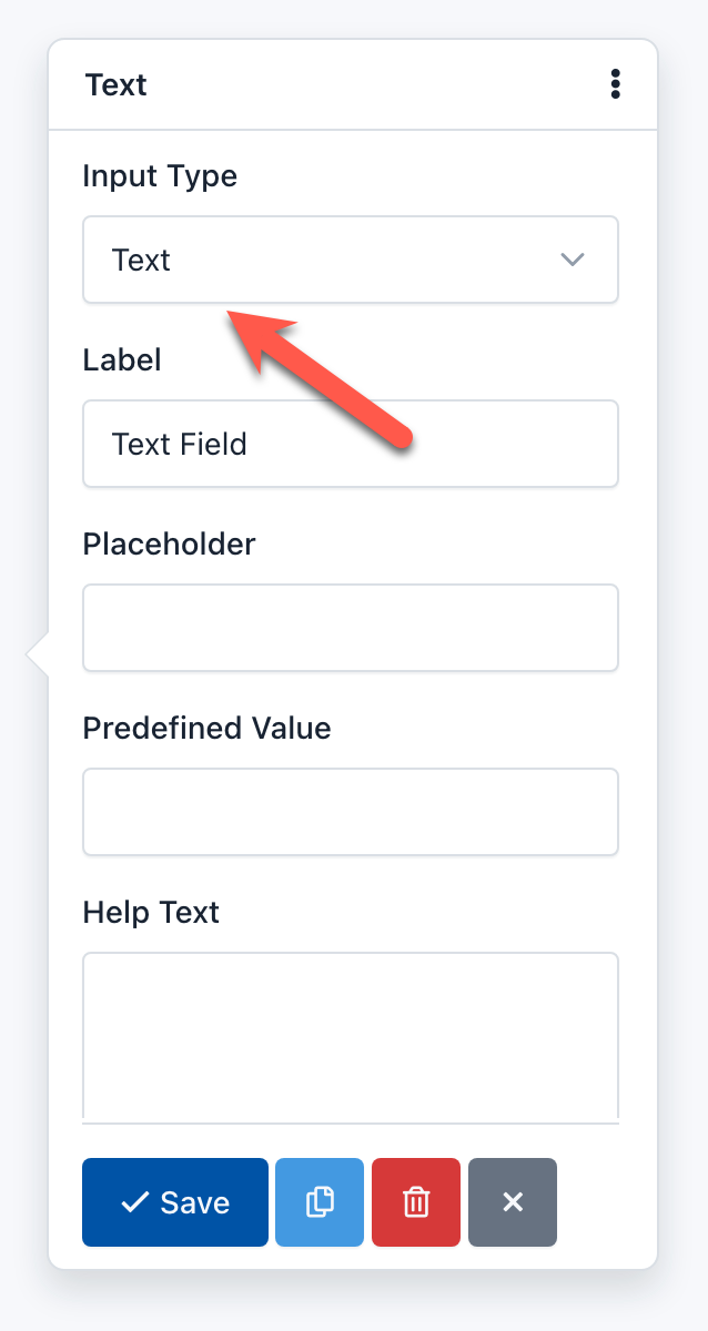
– Input Type:
Many fields allow you to change the Input Type to specify the type of data you will receive. For example, a Text Field can have an Input Type “URL”, to ensure that the text you type here is an absolute URL that starts with the letters ‘http’.
– Integer Only:
You can activate this option if you want the value of this field to be only an integer. If the user enters a floating point number, the Form would not be processed and instead a validation error appears.
– Integer Pattern:
Is an advanced option of the Number Field that allows you to customize the regular expression that accepts only integer numbers (0-9) and will be used in the Form Validation process. The regular expression used by default is ‘/^\s[+-]?\d+\s$/’;
– Label
It is the most common way to inform the user the value he must enter in the field. Generally it is shown at the top of the field, but you can modify this position by changing the form layout.
– Label CSS Class:
Let you add one or more CSS classes to the label. Keep in mind that if you want to hide a label, you can add the Bootstrap 3 css class ‘sr-only’.
Note: By default all fields come with the CSS class: control-label. It is recommended not to remove it.
– Min date:
You can define a date as the minimum date to be taken into account in the validating field process. If the user enters a earlier date, the form will not be sent and instead, a validation error will appear. If this option is not defined, this limitation will not exist.
The date must keep the following format: yyyy-mm-dd (HTML5 standard format) for static dates. Also, you can use tags to validate relative dates:
{today}: Today is the minimum date.{today:+1}: Tomorrow is the minimum date.{today:-1}: Yesterday is the minimum date.
– Max date:
You can define a date as the maximum date to be taken into account in the validating field process. If the user enters an later date, the form will not be sent and instead, a validation error will appear. If this option is not defined, this limitation will not exist.
The date must keep the following format: yyyy-mm-dd (HTML5 standard format) for static dates. Also, you can use tags to validate relative dates:
{today}: Today is the maximum date.{today:+1}: Tomorrow is the maximum date.{today:-1}: Yesterday is the maximum date.
– Min number:
You can define an integer or floating-point number as the minimum number to be taken into account in the validating field process. If the user enters a lower number, the form will not be sent and instead, a validation error will appear. If this option is not defined, this limitation will not exist.
– Max number:
You can define an integer or floating-point number as the maximum number to be taken into account in the validating field process. If the user enters a larger number, the form will not be sent and instead, a validation error will appear. If this option is not defined, this limitation will not exist.
– Min Size:
You can define an integer number as the minimum size to be taken into account in the process of validating the field. If the user uploads a file with a smaller size than the one you have defined, the form will not be sent and, instead, a validation error appears. If this option is not defined, this limitation will not exist.
The integer number represents the number of bytes allowed. For example, Min Size: 10311680 (resulting from the multiplication of 1024 x 1024 x 5), the minimum file size should be 5MB.
– Max Size:
You can define an integer number as the maximum size that will be taken into account in the process of validating the field. If the user uploads a file with a size larger than the one you defined, the form will not be sent and instead, a validation error appears. If this option is not defined, this limitation will not exist.
The integer number represents the number of bytes allowed. For example, Max Size: 10311680 (resulting from the multiplication of 1024 x 1024 x 5), the maximum file size should be 5MB.
– Min length:
You can define an integer number as the minimum length of the input string. If not set, it means no minimum length limit.
– Max length:
You can define an integer number as the maximum length of the input string. If not set, it means no maximum length limit.
– Min files:
You can define an integer number as the minimum number of files that the end user must upload to pass the validation.
– Max files:
You can define an integer number as the maximum number of files that the end user must upload to pass the validation. Use this feature to allow multiple uploads with the same File field.
– Max length:
You can define an integer number as the maximum number of files that the end user must upload to pass the validation.
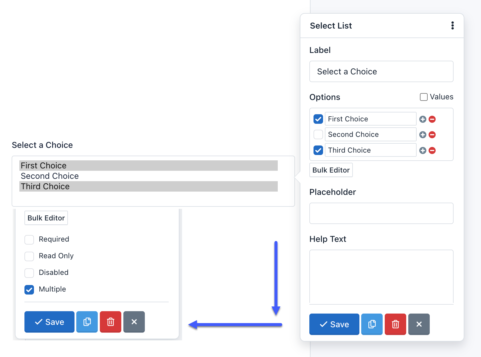
– Multiple:
This option indicates that the user can enter multiple values. You can find this option in the Email and Select List fields:
- If Multiple option has been enabled on an Email field, you can add several valid email addresses separated by commas. For example: ‘name@example.com,name2@example.com’.
- If Multiple option has been enabled on a Select List field, you can select several options. The collected information will have a comma-separated format. For example: ‘Option One, Option Two’.
– Number Pattern:
Is an advanced option of the Number Field that allows you to customize the regular expression that accepts any number and will be used in the Form Validation process. The regular expression used by default match with a floating point number and optionally an exponent part (eg -1.23e-10): ‘/^\s[-+]?[0-9].?[0-9]+([eE][-+]?[0-9]+)?\s*$/’.
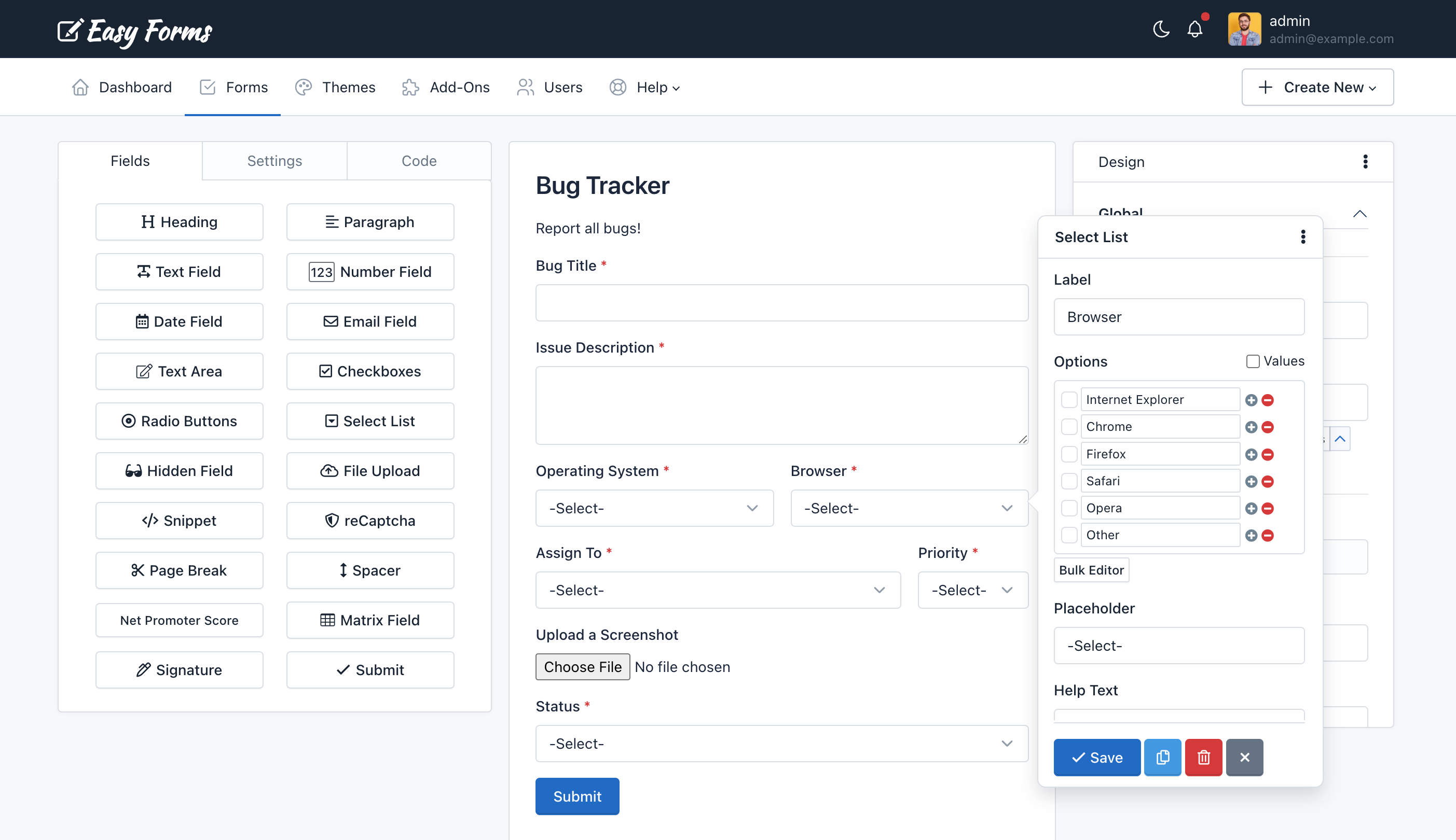
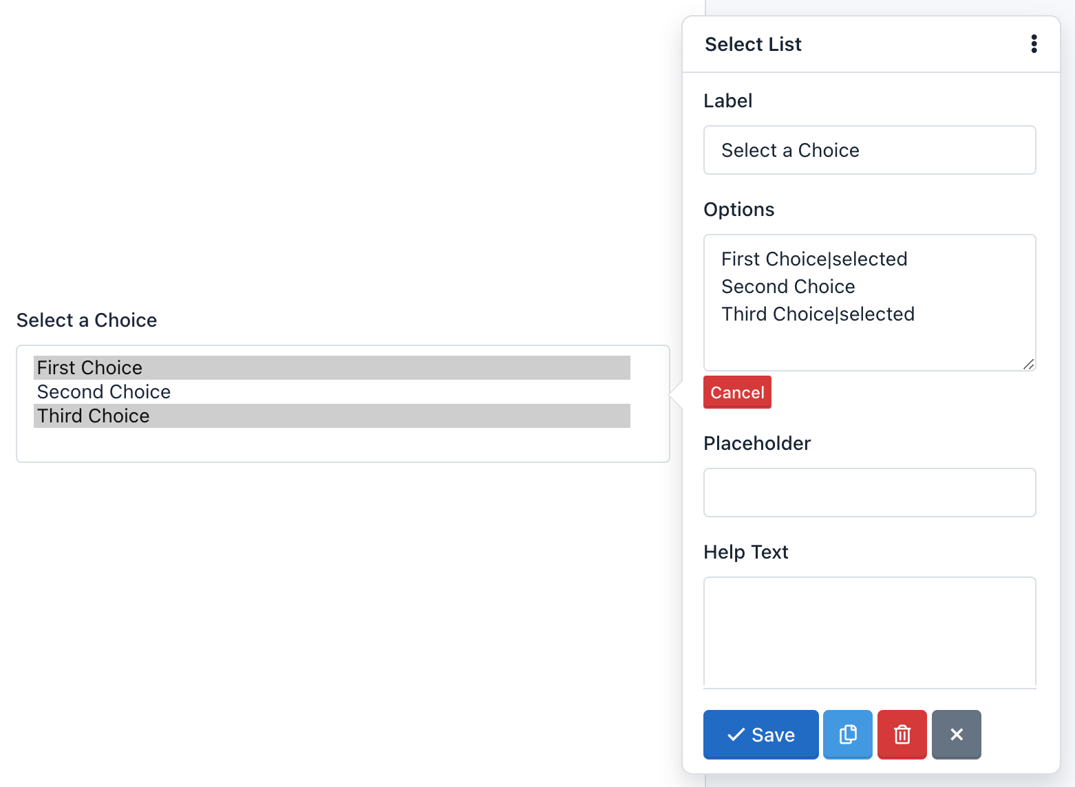
– Options:
The Options option is only in the Select List fields and are used to add selection options to the component.
For example, if you enter in the Options field of the pop-up Form:
One|1
Two|2|select
Three|3
Four|4
Five|5
The Form Preview will show a box with the text “Two”. And if the user submits the form without making any changes, he will be sending the value: 2.
– Pattern
It is an advanced option and allows you to add a regular expression to the field to be used in the Form Validation process. If the value sent by the user does not match this pattern, the form will not be processed and instead a validation error appears.
– Placeholder
It is the alternative way of describing the value that the user must enter in the field. By default, the placeholder appears in the field until the user start to enter data.
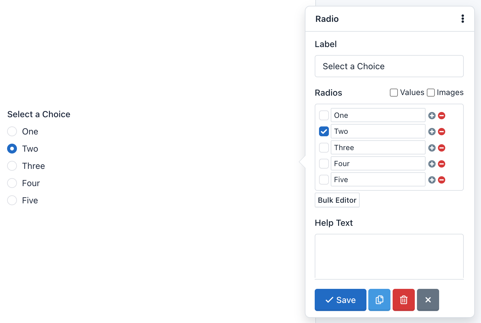
– Radios:
The Radios option is available in Radio Button components, and it’s used to add radio buttons to the form.
For example, if you click Bulk Editor and enter the following radios:
One|1
Two|2|selected
Three|3
Four|4
Five|5
The Form Preview will show five radio buttons with the words: One, Two, Three, Four and Five. The option Two will be selected. Then, if the user submits the form without making any changes, he will be sending the value: 2
– Read Only:
When you enable this option, the field will be displayed to the user but he cannot edit. The information in a Read Only field is received and validated by the server when the Form is submitted. It will also be collected by the Submission Manager.
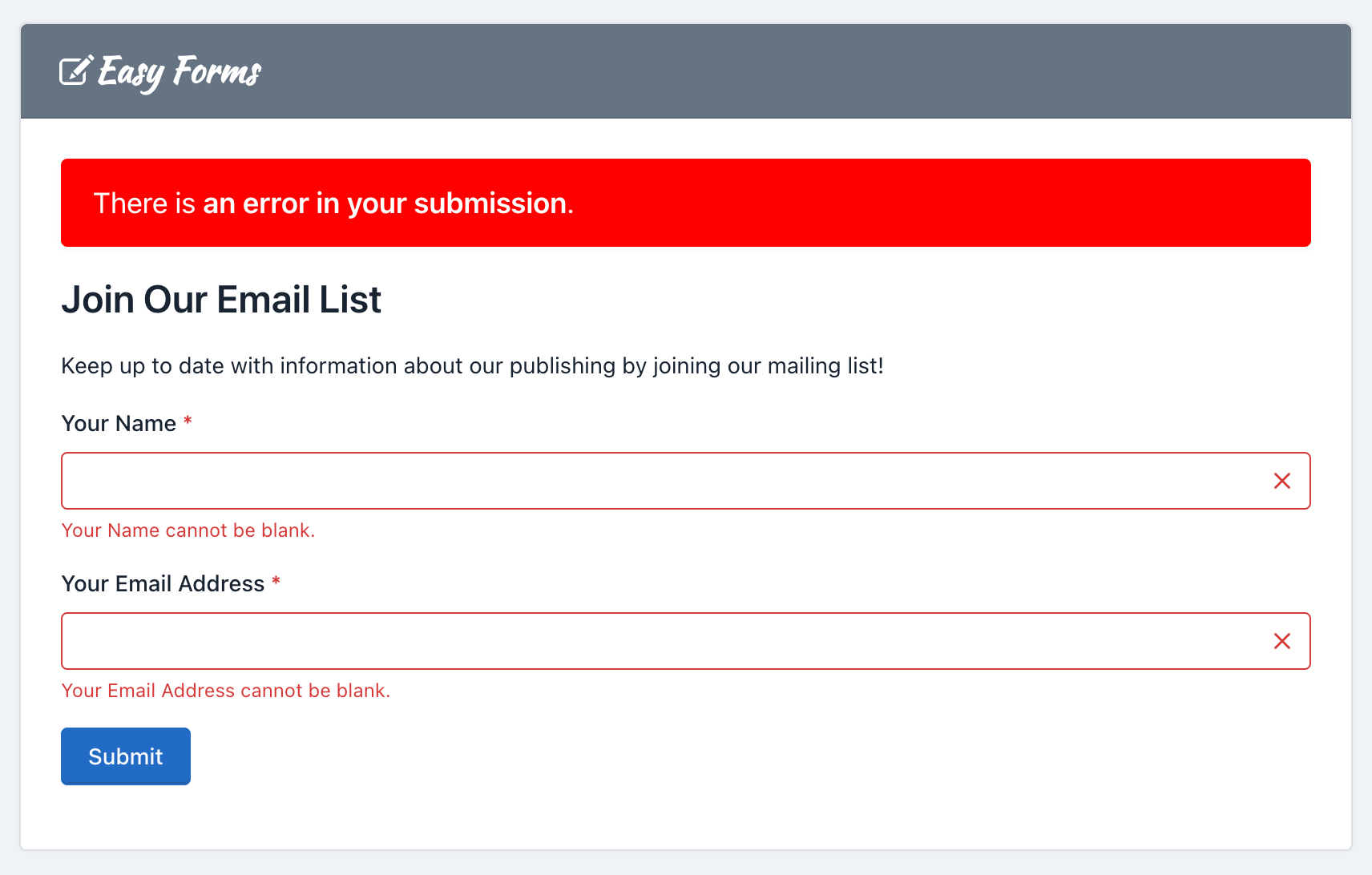
– Required
This property allows you to ensure that the user complete a specific field before sending the form. If the user submits the form with an empty required field, the form is not processed and instead an error message is displayed. By default, the required fields labels have a red asterisk on the right.
– Step number:
With this option, you can set the HTML5 ‘step’ attribute of the Number and Date fields. The ‘step’ attribute specifies the valid number to be use as an interval when changing the values of this field using the browser controllers. Modern browsers recognize this attribute.
Important! If the Number field has the ‘Integer Only’ option enabled is recommended to set your ‘Step number’ to 1.
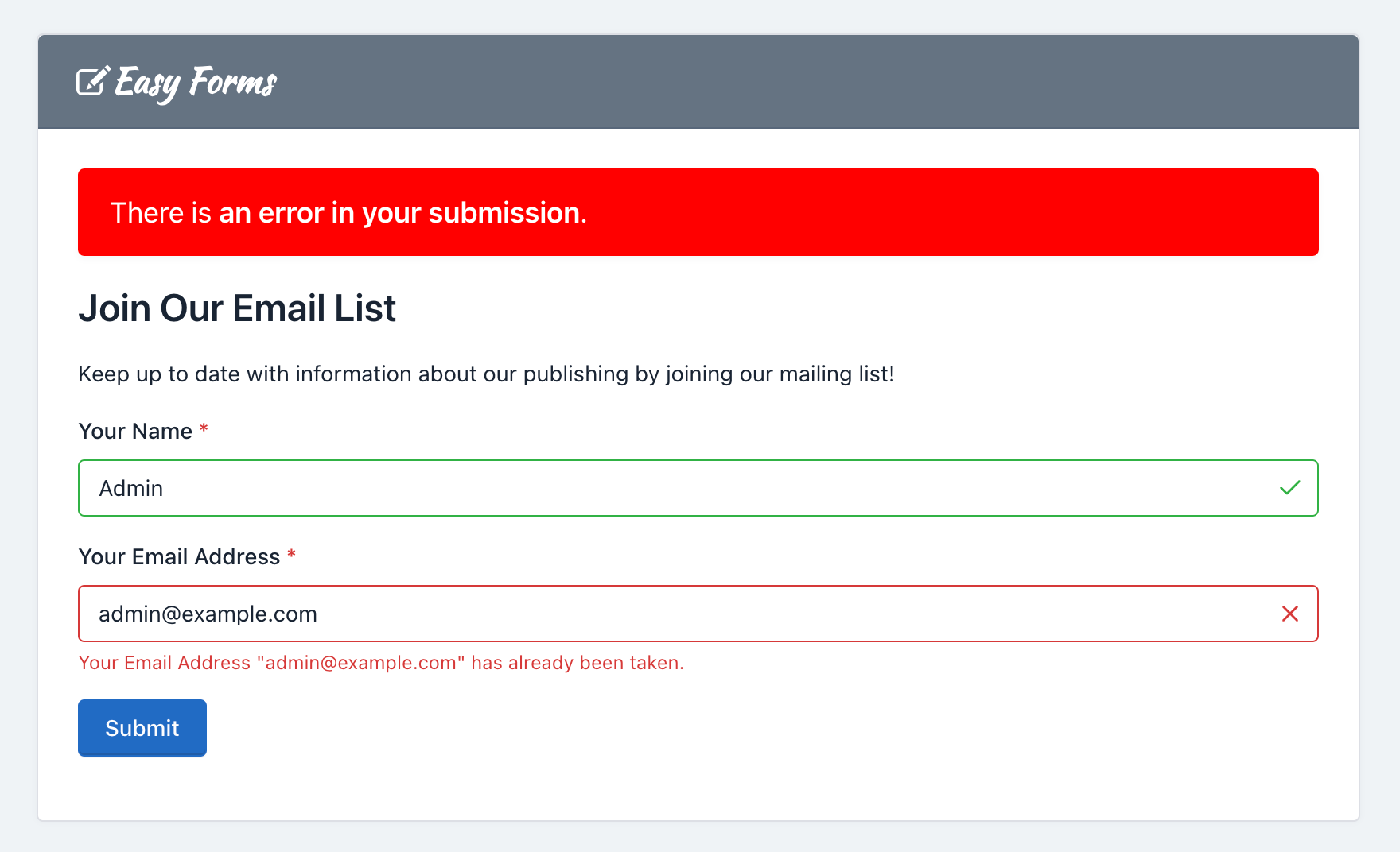
– Unique:
This option allows you to check that the information entered into this field is unique and has not been submitted previously. Useful for mailing lists and registration forms, where preventing the users from entering the same information more than once is often needed.
Field Types
– Heading
Headings are used to mark Form sections, also as to give it a title. For example, when you enter the Form Builder to create one, you will see a heading (h3) with the text “Untitled Form”. To modify this text, just click on it. Immediately a form will appear with all the options to customize it.
– Paragraph
Paragraphs are components used for fleshing out a form. For example, you can use them to invite your users to fill out the form or to give directions. When you enter to the Forms Builder to create one, you will see a paragraph with the text “This is my form. Please fill it out. Thanks!” To modify this text, simply click on it. Immediately a form will appear with all the options to customize it.
– Text Field
A text field is a component that allows you to write only one line of text. Web browsers consider the text field as the standard default field from others more specialized such as URL or color. The text field can have five different input types, each of which is used to validate data differently. The five types are:
- Text: This is the default type for this component. And it is one that is commonly used in forms, because it does not offer any validation and will accept all data sent by the user. If the browser does not recognize any other type, such field will be displayed instead.
- Url: This type was introduced by HTML5 and now modern browsers accept it. Use the URL type if you want to collect absolute URLs that starts with ‘http’.
- Color: This type was introduced by HTML5 and modern browsers that accept it, displays an automatically color palette when you click on it. Use the Color type if you want the collected data to be the hexadecimal value of a color, starting with a ‘#’ sign. For example, ‘#FFFFFF’.
- Tel: This type was introduced by HTML5 and now modern browsers accept it. Use this type if the data to collect is a phone number.
- Password: All browsers recognize this type of entry. Use this entry type if you want the user to enter data not shown on screen. Note that Easy Forms is not meant to store passwords, mainly because the data is stored as plain text. If required, use this input type with caution.
– Number Field
A number field is a component used to collect numbers as content. Following the HTML5 standard, this component can be of 2 types:
- Number: This is the type that should be used when you want the user to type the number. For example, you may ask: “How old are you?” If the user enters ‘Five years’, they are notified that they must write only numbers: 5, in this case.
- Range: This type of entry is also used to collect numerical data, but unlike Number, modern browsers display a slider the user can use to enter his data. For example, you can ask “From 1 to 10, how good are you at math?” Depending on how you drag the slider, the value will be higher or lower.
Unlike Text components, Number components offer many different validation options. For example, Integer Only indicate that the field must collect only numerical integers data: Decimals are not accepted! You can also set the minimum and maximum number to be entered and more. All these options follow the HTML5 standard and are also validated on the server.
– Date Field
A date field is a component used to collect valid dates. Date fields were introduced by HTML5 and modern browsers that recognize them display a calendar by clicking on the field. This component can have 5 different types of input:
- Date: The input type to use if you want to collect dates. You must have the format: yyyy-mm-dd.
- DateTime-Local: The input type to use if you want to collect dates and times. The collected data will have the standard ISO format: yyyy-mm-ddThh:mm:ss.
- Time: The input type to use if you want to collect times in the format: hh:mm:ss.
- Month: This type of entry is supported by modern browsers and should be used if you want the user to select the month or month and year. The input format is yyyy-mm.
- Week: This type of entry is supported by modern browsers and should be used if you want the user to select the week of the year in numerical format.
Note: Indeed some modern browsers don’t yet show the Datepicker when the field is a date. But, in the future all of them will do. For now, browsers that don’t support it are Safari, Firefox and previous versions of IE. For these cases, we can use a jQuery UI Datepicker widget as fallback.
– Email Field
An email field is used to collect valid emails. By default it validates that the text contains a ‘@’ and ‘.’ plus two or more characters for the e-mail domain. In addition, you must use this field to send notifications that have your users mails as senders (Reply-To).
An advanced option of this field is the ability to verify the mail DNS to confirm that the domain really exists and has an A and MX record. Care should be taken that this validation can fail due to problems with the DNS servers even when mail is valid. By default, this option is disabled.
– Text Area
A text area is a component that allows you to collect multiple lines of text, with multiples paragraphs. It is a suitable field if you want users to draft a comprehensive text. Also, you can change some settings. For example, you can change the height of the text area, to display more space to your users. To do this, click on the text area and change the size of the field that by default is 3.
– Checkbox
The Checkbox component adds checkboxes to the form. This component provides an option list with a checkbox next, so your users can check all, some or none. You can use it if you want to get several answers, for example: Which of the followings are fruits?
To add, edit and delete checkboxes, you must click on the component. Then a form appears with the “Checkboxes” field. Note that each line of this field represents a different choice. Each choice can be composed of three parts: Label, Value and Image. Additionally, you can check them.
Also, you can choose the Bulk Editor tool to insert choices separated by a vertical bar or pipe line. The format should be as follows: Label|Value|selected. The second and third part of this format is optional.
For example, click Bulk Editor and add the following “Checkboxes”:
One|1
Two|2|selected
Three|3
Four|4|selected
Five|5
The Form Preview will show 5 checkboxes with the words One, Two, Three, Four and Five. The “Two” and “Four” option will be selected. And, if the user submits the form without making any changes, it will be sending the values: 2,4.
Also, you can add pictures or icons to the checkboxes to give a more dynamic touch to your forms.
To insert a picture on a checkbox label you must add the image url as the third setting parameter of the checkbox. For example, if we set up our component as:
One
Two|2
Three|3|selected
Four|4|http://example.com/image-4.jpg
Five|5|http://example.com/image-5.jpg|selected
We’ll be creating five checkboxes:
One: Creates a checkbox with the value: ‘One’ and the label: ‘One’Two|2: Creates a checkbox with the value: ‘2’ and the label: ‘Two’Three|3|selected: Creates a checkbox with the value: ‘3’, the label: ‘Three’ and will be checked by default.Four|4|http://example.com/image-4.jpg: Creates a checkbox with the value: ‘4’, the label: ‘Four’ and the image will appear next to the checkbox.Five|5|http://example.com/image-5.jpg|selected: Creates a checkbox with the value: ‘5’, the label: ‘Five’ and the image will appear next to the checkbox and will be checked by default.
To add icons instead of images, you should only replace the images URLs by the icons’ CSS classes. For example: glyphicon glyphicon-user, will display the user icon. Keep in mind that by default, the application has the Glyphicons Pro set of icons; however, you can use other icons like Font Awesome or DevIcons. For this, you just have to add the fonts to the CSS theme of your form.
Important: To add an image or icon to the checkbox setup, you must have the first two parameters, even if they are the same.
Note: Remember that you can display your checkboxes horizontally by activating the ‘inline’ attribute.
– Radio Button
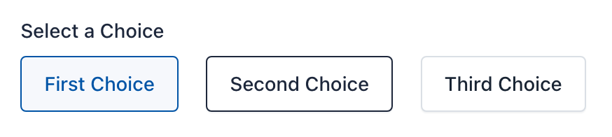
Radio Button is a component that lets you add a group of radio buttons to the form. This component gives users a list of choices, but they must select only one of them. For example: What is your favorite color?
To add, edit and delete options, you must click on the component. Then a form appears with the “Radio” field. Note that each line of this field represents a different option. And each line can be composed of three parts, separated by a vertical bar or pipe line. The format should be as follows: Label|Value|select. The second and third part of this format is optional.
For example, if you enter in the field “Radio” of the pop-up Form:
One|1
Two|2|selected
Three|3
Four|4
Five|5
The Form Preview will show 5 check boxes with the words One, Two, Three, Four and Five. The “Two” option will be selected. And if the user submits the form without making any changes, it will be sending the value: 2.
Also, since version 1.3 you can add pictures or icons to the radio buttons to give a more dynamic touch to your forms.
To insert a picture on a radio button label you must add the image url as the third setting parameter of the radio button. For example, if we set up our component as:
One
Two|2
Three|3|selected
Four|4|http://example.com/image-4.jpg
Five|5|http://example.com/image-5.jpg|selected
We’ll be creating five radio buttons:
One: Creates a radio button with the value: ‘One’ and the label: ‘One’Two|2: Creates a radio button with the value: ‘2’ and the label: ‘Two’Three|3|selected: Creates a radio button with the value: ‘3’, the label: ‘Three’ and will be selected by default.Four|4|http://example.com/image-4.jpg: Creates a radio button with the value: ‘4’, the label: ‘Four’ and the image will appear next to the radio button.Five|5|http://example.com/image-5.jpg|selected: Creates a radio button with the value: ‘5’, the label: ‘Five’ and the image will appear next to the radio button and will be selected by default.
To add icons instead of images, you should only replace the images URLs by the icons’ CSS classes. For example: glyphicon glyphicon-user, will display the user icon. Keep in mind that by default, the application has the Glyphicons Pro set of icons; however, you can use other icons like Font Awesome or DevIcons. For this, you just have to add the fonts to the CSS theme of your form.
Important: To add an image or icon to the radio button setup, you must have the first two parameters, even if they are the same.
Note: Remember that you can display your radio button horizontally by activating the ‘inline’ attribute.
– Select List
A Select List is a drop-down menu that allows the user to select one or several options, depending on the configuration you choose. The main difference with the Radio Button component is that you can add a lot of options without changing its size. So its use is recommended when there are plenty of options for example: Select your country of origin?
To add, edit and delete options, you must click on the component. Then a form appears with the “Options” field. Note that each line of this field represents a different option. And each line can be composed of three parts, separated by a vertical bar or pipe line. The format should be as follows: Label|Value|selected. The second and third part of this format is optional.
For example, add the following “Options”:
One|1
Two|2|selected
Three|3
Four|4
Five|5
The Form Preview will show a box with the text “Two” and if the user submits the form without making any changes, it will send the value of 2.
Select List with option groups
To create an option group <optgroup>, enclose the text with double square brackets, for example:
[[Swedish Cars]]
Volvo
Saab
[[German Cars]]
Mercedes
Audi
– Hidden Field
By adding a hidden field to the form, this will not be shown on the form. However, hidden fields are useful for mathematical calculations or send default values without changing the form interface.
Note: You can add a label to a hidden field to work in a more comfortable way in the Form administration, for example to create conditional rules using this field.
– File Upload
The File Upload field is a component that enables users to attach files in the form submission. Once sent, the files will appear in the detailed submission information. There are two details that must take into account:
- Allowed file types: You can limit the types of files that can be uploaded in each file field. By default, allowed file types for picture are: ‘.gif, .jpg, .png’. To modify the allowed file type, you must click on the component and on the ‘Accept’ form field that appears, change file extensions allowed, eg, ‘.doc, .pdf, .txt’ to accept text files.
- Size limitations: You can limit the file size as define a minimum or maximum size for each field. To modify the allowed file size, click the component and then expand the pop-up form by clicking on the ‘More’ link. Then locate the Minimum and Maximum Size fields and enter the digit that represents the number of bytes allowed. For example, Max Size: 10311680 (resulting from the multiplication of 1024 x 1024 x 5 = 5MB).
– Snippet
The HTML Snippet field is an advanced use component that allows you to add HTML code to your forms. It will display a Wysiwyg editor able to recognize keyboard shortcuts to style your HTML code quickly.
Be careful of entering a valid HTML code, otherwise, the Form Builder won’t save the form and, it will display an error message indicating the line of code where the error was made. For example, a common mistake is to add more of one HTML element with the same ID.
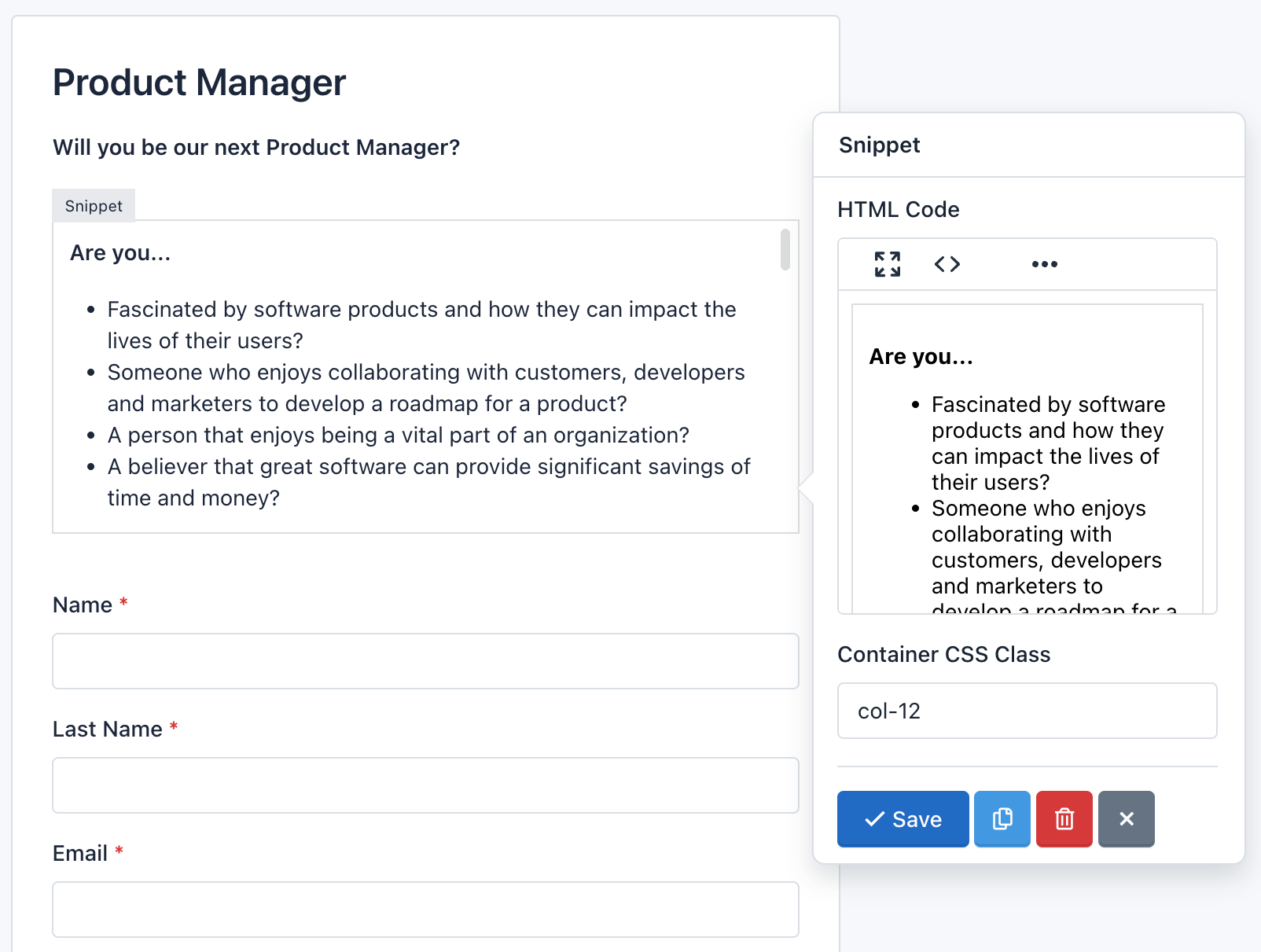
To add an HTML table, enter a link or display an image, first, you will need to click the Fullscreen button. This will open the Wysiwyg editor over the Form Builder, so you will get more space to enter all the needed content. Also, you can click the Code button to display the content as HTML code.
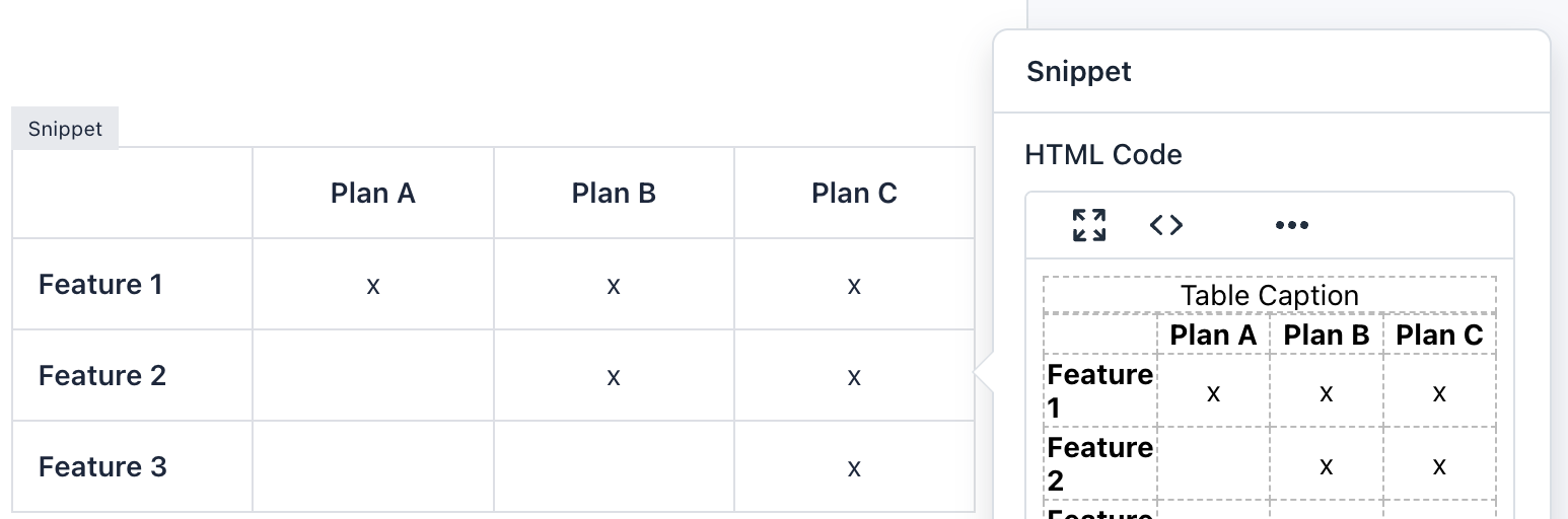
Note: Although you can add CSS and JavaScript code in a form. It is not recommended to do so, in these cases you can create a CSS Theme and/or Load external javascript file. Remember that the form you created is also displayed in the Submission Manager and its code could be incompatible.
– reCaptcha
The reCaptcha field is an advanced component that allows you to use Google technology to verify that users are not bots and/or spammers. You can modify the reCAPTCHA configuration, like changing the theme color, type of captcha and size. A detail to keep in mind is that you can only add a reCaptcha component per Form.
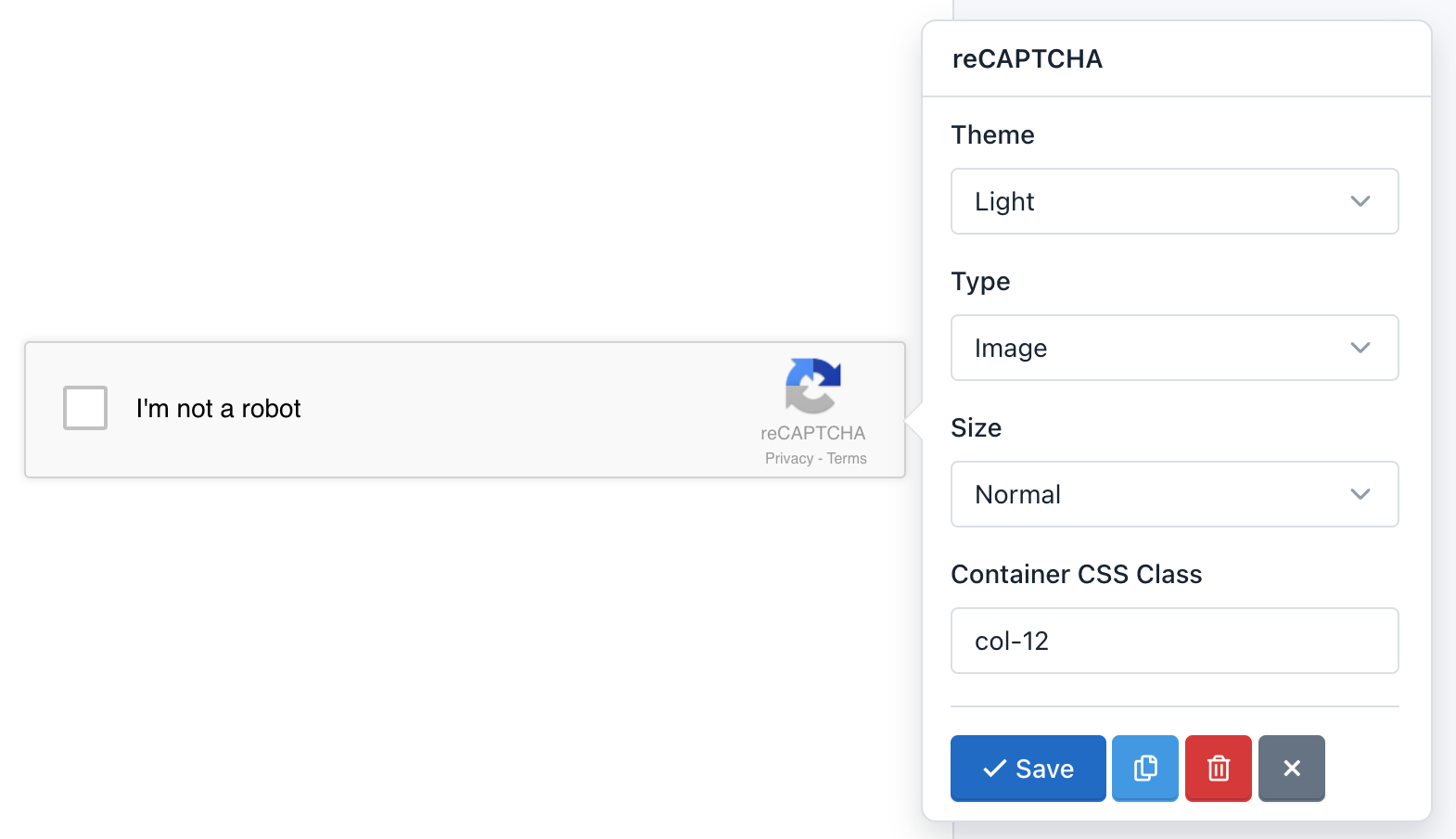
Important! Before adding the reCAPTCHA component to your Form, you must first add reCAPTCHA keys in the site configuration. Otherwise, reCAPTCHA will not operate. If you created the form before adding the keys, you must update the form.
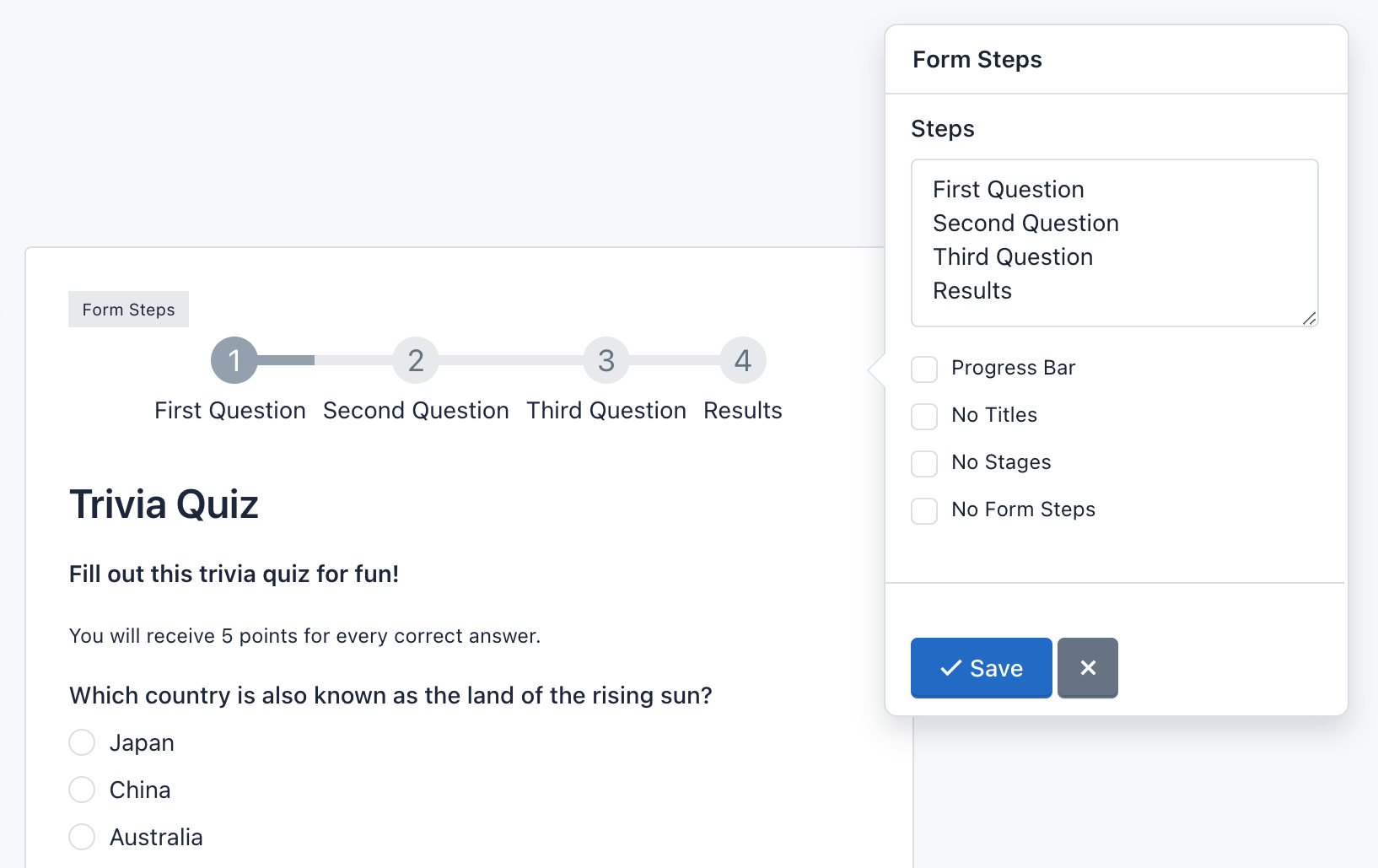
– Page Break
The Page break field is an advanced component that allows you to create multi-step or multi-page forms. For each page break created you will add a new page. In addition, a header will be displayed above the form to let users know in which step they are and how many steps must follow to submit the form. There are two details that must take into account:
- The Page Break component adds two buttons to allow Form Navigation. You can customize the text on the button ‘Next’ or ‘Previous’ by clicking on the component.
- Form Steps: Appear above the form. Settings:
- Click Form Steps to check its settings. You can change the titles of each step in the field Form Steps. Each line matches a title.
- You can specify to display only the titles or steps (numbers).
- You can change the step numbers by glyphicons icons. To use Glyphicons in stages, you should add to each line of the Steps fields, a vertical bar or pipe line followed by ‘icon-[name of icon]’. For example, if I want to replace the number 1, I write it in the first line of Steps: ‘Untitled Step|icon-user’. Go to Glyphicons to view the name of the icons you can use.
- You can change the design of the steps for a progress bar indicating the percentage that has been achieved.
- Finally, you can hide the Form Steps by checking the ‘No Form Steps’ option.
Note: You can go to a specific page by appending the page number to the URL, for example to go to the second page add the “p=2” query string.
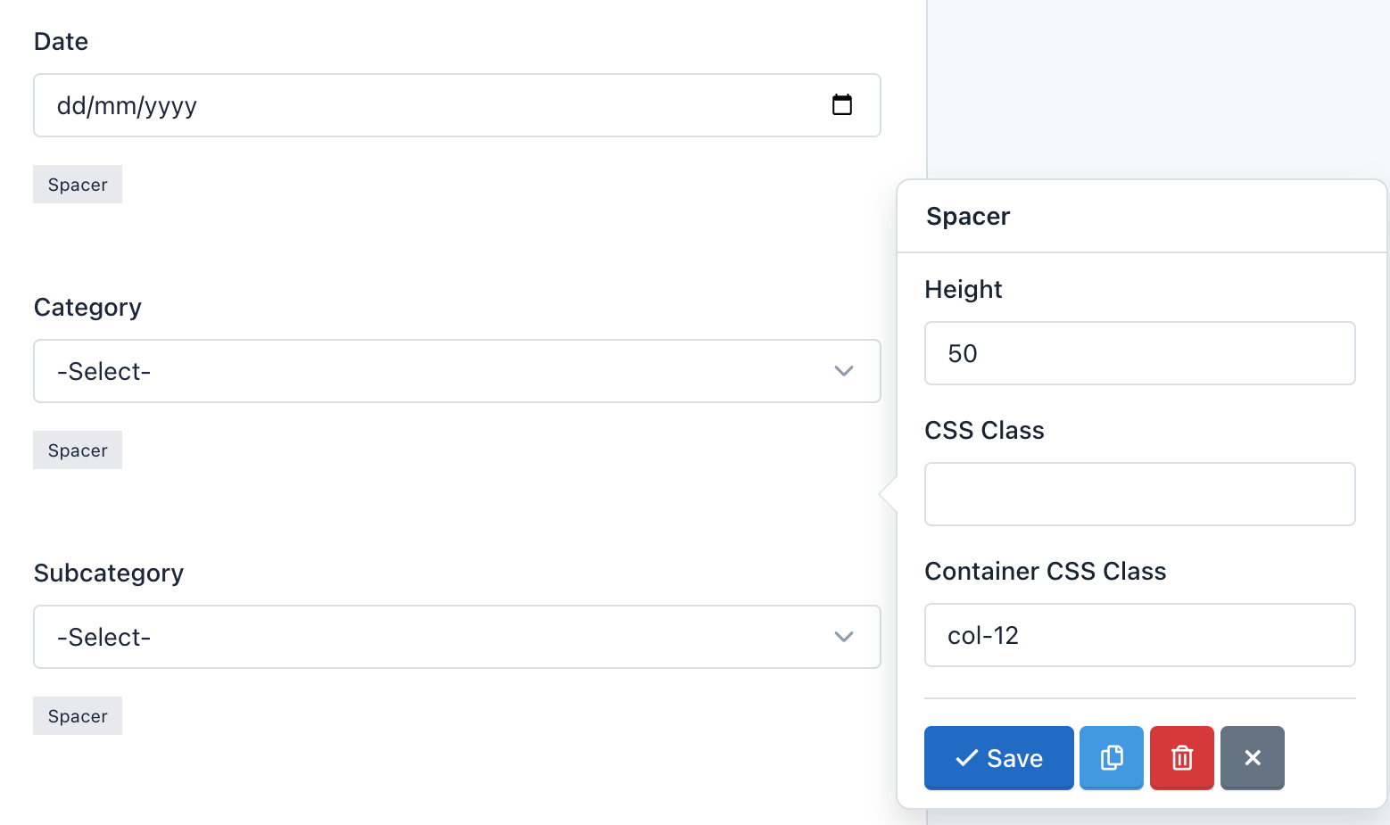
– Spacer
The Spacer component allows you to add precise vertical spacing between fields on your forms. Just drag and drop a Spacer between your fields and set the number of pixels between they.
Options:
- Height: Is the space defined by the number of pixels.
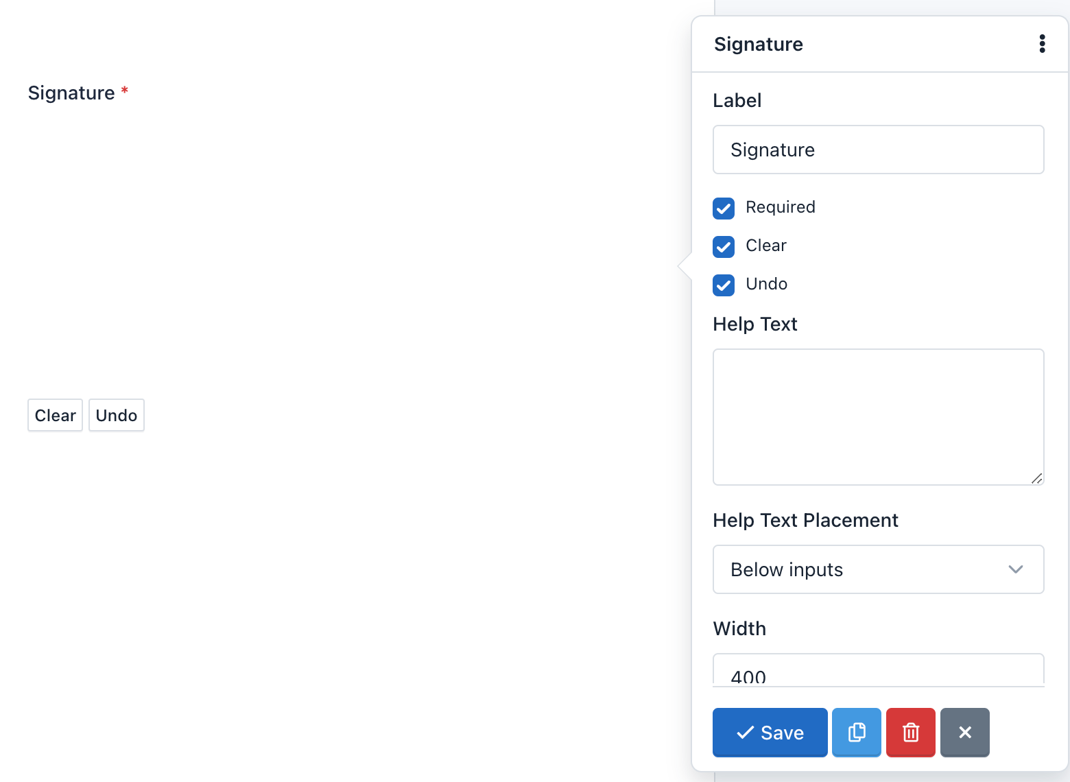
– Signature
The Signature component allow your end users to sign your form – either with their mouse or finger on an iPad/smartphone – their John Hancock directly onto the form. So, you can securely capture signatures for contracts, legal documents, and other forms in which you need a physical autograph.
There are two details that must take into account:
- The Signature component adds two buttons to allow Canvas Interactions. You can customize the text on the ‘Clean’ and ‘Undo’ buttons by clicking on the component.
- Field Settings: The Signature field has the following special options:
- Clear: Enable / Disable the “Clear” button. When an end user clicks the “Clear” button, the signature will be removed. And the canvas will be clean to start again.
- Undo: Enable / Disable the “Undo” button. When an end user clicks the “Undo” button, the last stroke of his signature will be removed. He can continue pressing this button to undo his signature step by step.
- Additionally, you can define the width and height of the canvas, the color of the pencil, as well as change the text of the buttons between other common settings.
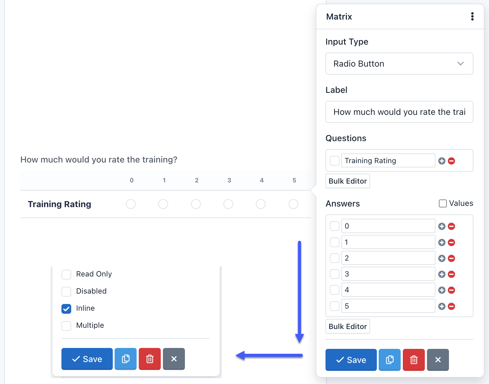
– Matrix Field
The Matrix field is an advanced component, allows you to group multiple form controls with the same input type within a table. You can create a matrix field with the following input types:
- Radio Button (By Default)
- Checkbox
- Select List
- Text
- Text Area
- Number
- Range (Slider)
- Tel (Phone)
- URL
- Color
- Password
- Date
- DateTime-Local
- Time
- Month
- Week
All the form controls are fully customizable and according to its type, the correct input validation will be applied.
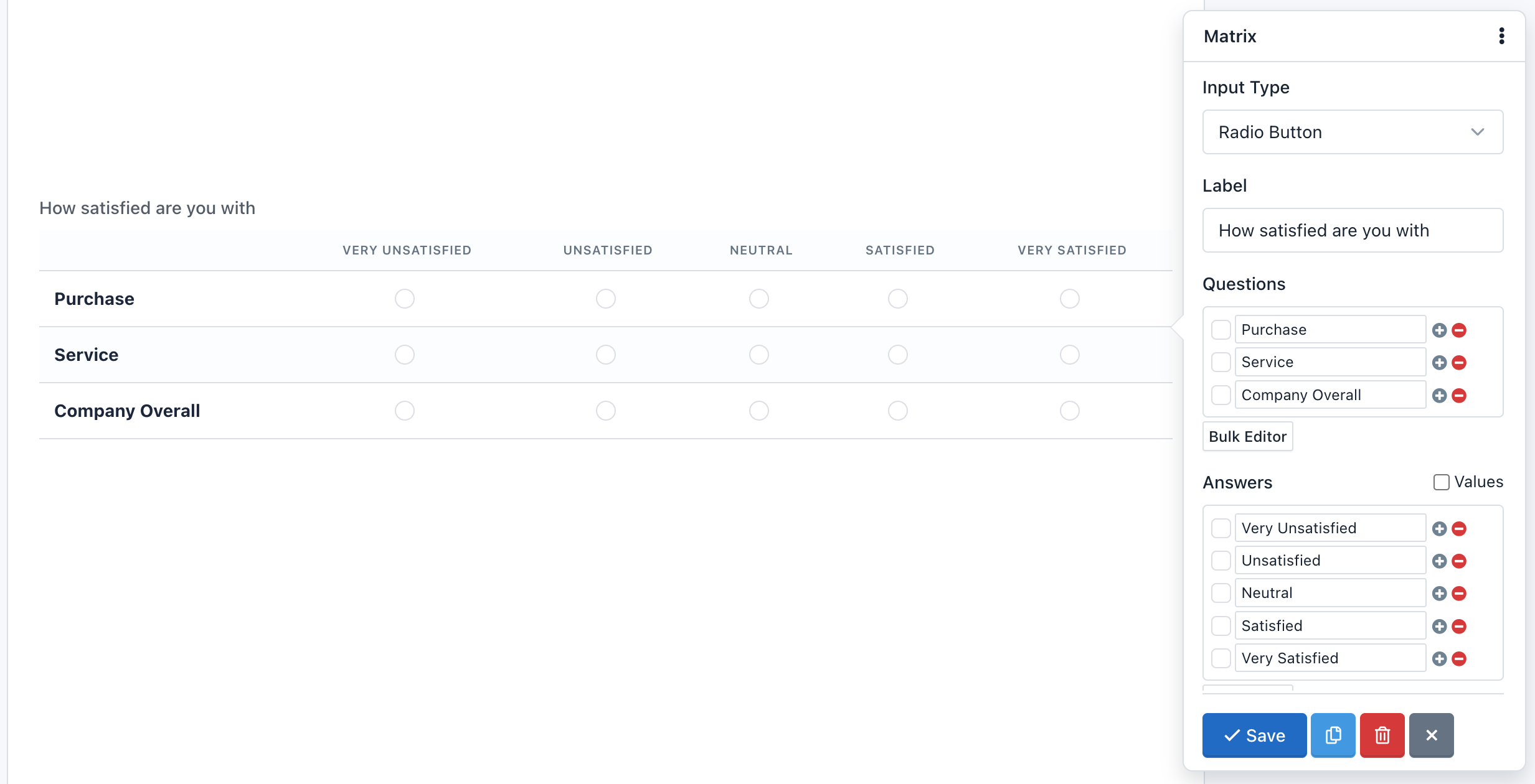
A Matrix field can have any number of questions (rows) and answers (columns), then you can set different values to each answer.
A special input type for the Matrix is Select List, because you need to add different values (options), to do this just check “Values” and in each “Value” field enter slash separated values (“/”). If you want to enable a default empty option, you need to use the Placeholder setting.
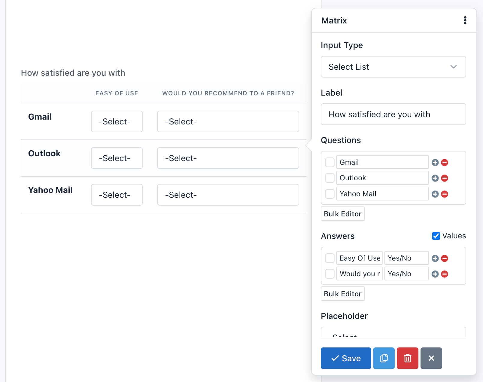
You are able to make open questions too, with the Text Input variation, each row contains a set of text entry boxes. This variation looks and acts similar to the Text Field. The same applies for other input fields based on text, like a text area or number fields.
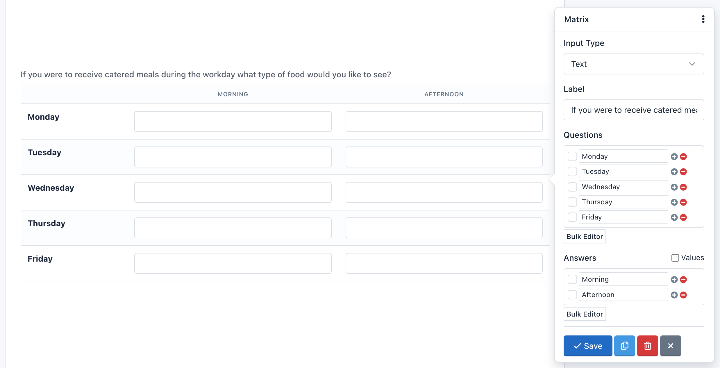
A special feature in the Matrix field is the ability to hide the questions. Just check the “Inline” option and questions will disappear. You can use this feature if you only want to do a single question in a tabular format.
Note: When a table is very big, we will need to add the “table-responsive” class within the “Container CSS Class” setting.
– Net Promoter Score (NPS)
NPS is probably the most important customer satisfaction and customer loyalty metric to track and now it’s available in Easy Forms.
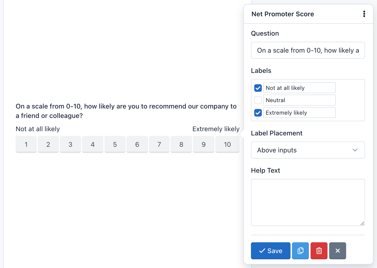
Easy Forms NPS helps you collect authentic customer feedback, so you really understand how your organization is performing. It’s a way of recording what your customers think, their satisfaction levels, and whether they’d recommend you.
Ask them things like:
“On a scale of 1–10, how likely are you to recommend us to your friends?”
This gives you qualitative insight into ‘why’ your customers feel that way, which tends to work better than those generic annual customer satisfaction surveys.
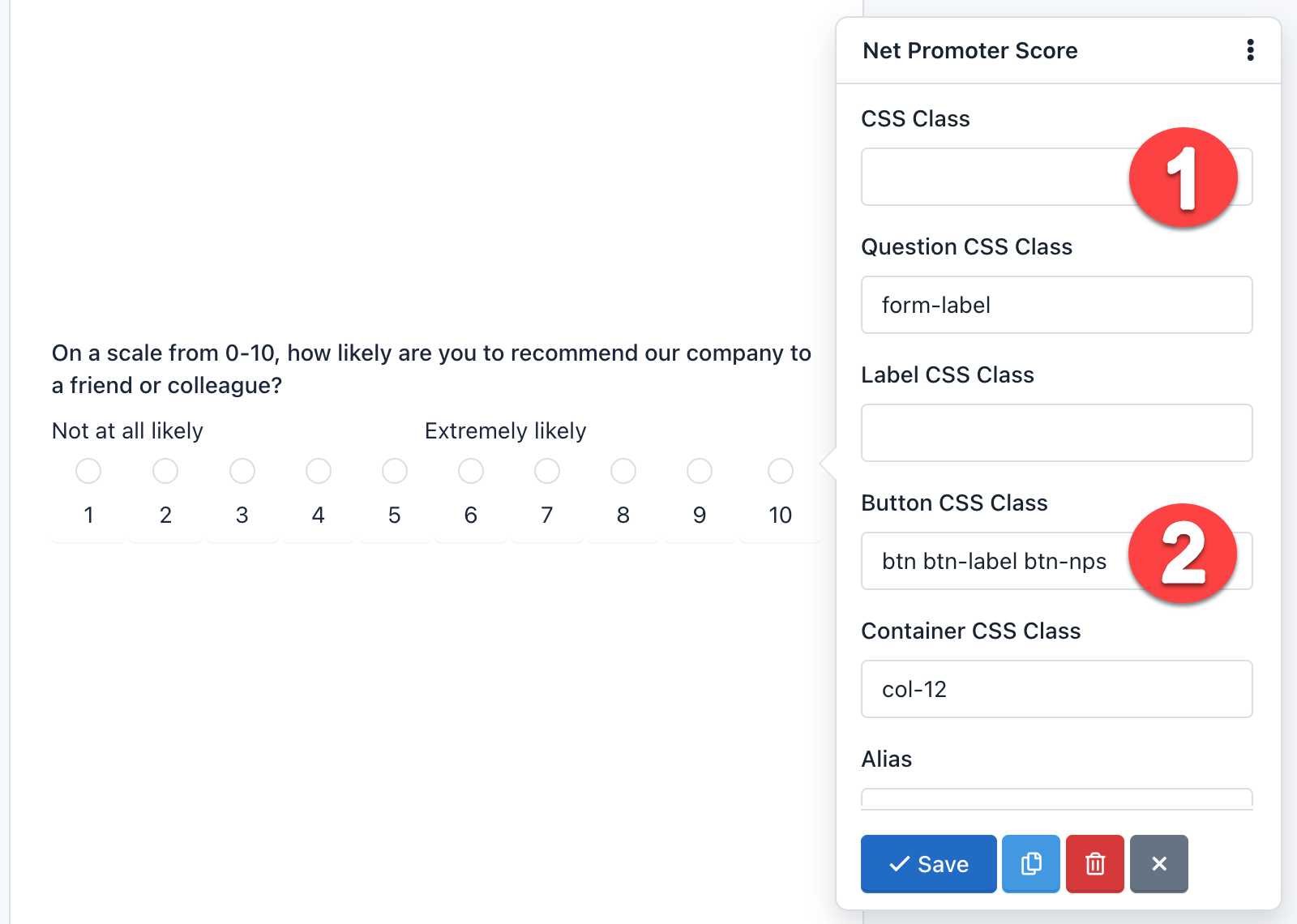
This component allows you to customize the question, show labels, help text and more. Also, it can be displayed as buttons or as radio buttons. By default, the design shows buttons. Just remove the CSS Class: hidden and replace the Button Css Class with: btn btn-label btn-nps.
– Button
The button field is a component that allows you to send the forms. While it is normal to add one button per form, nothing prevents you to add more, for example at the beginning and end of the form. This component can be of 3 types:
- Submit: To submit the form. It is selected by default.
- Reset: To reset the form to their default values.
- Image: Displays an image on the button and like Submit is used to submit the form. If you use this type of button you need to add the URL of the image and also remove the CSS class.
- Button: This type doesn’t send the form, but it can be used to interact with the fields via javascript.
You can add an icon to the buttons type ‘Submit’, ‘Reset’ and ‘Button’, writing in the attribute ‘Button Text’ the icon label. For example:
<span class="glyphicon glyphicon-shopping-cart"></span> Buy Now!
It will display your button with a nice icon at the beginning:
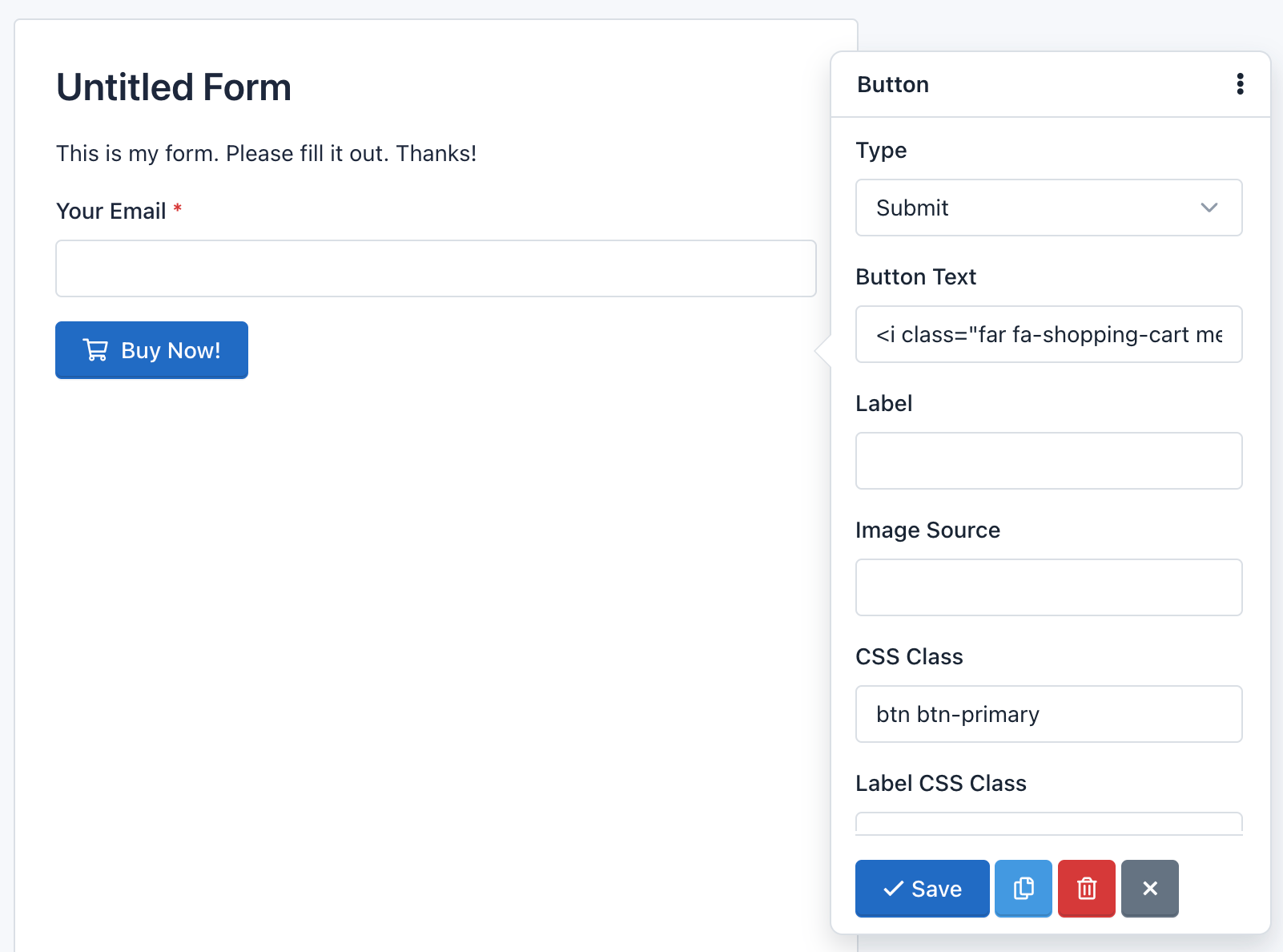
Note: The CSS class: ‘btn btn-primary’ add the default design to the button. Go to Bootstrap CSS for more information.
Field Validation
A very important point to consider is the field validation that runs when users submit a form.
Field validation is the process by which it is verified that the data submitted by users meet certain requirements. For example, a Date Field requires that the value sent to the server has the following format yyyy-mm-dd. Validation ensures that this happens.
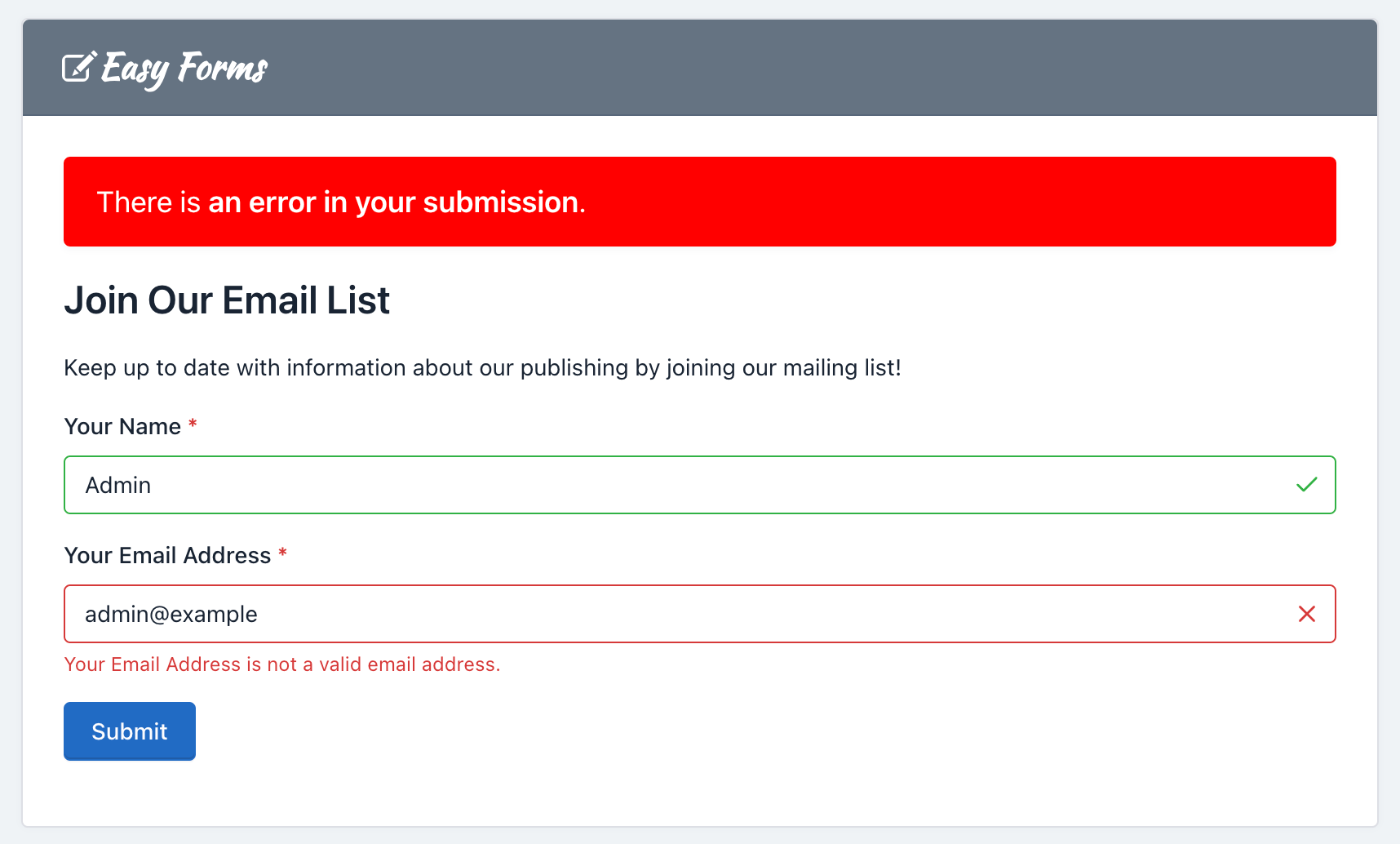
You should note that Easy Forms works with standard HTML5 fields, so you can always go to HTML5 documentation for more information. In addition to validation by type, fields may have other requirements, such as ‘Required’ and ‘Unique’.
Many of these requirements are validated at the client, by the browser; but they are all validated on the server, by Easy Forms.
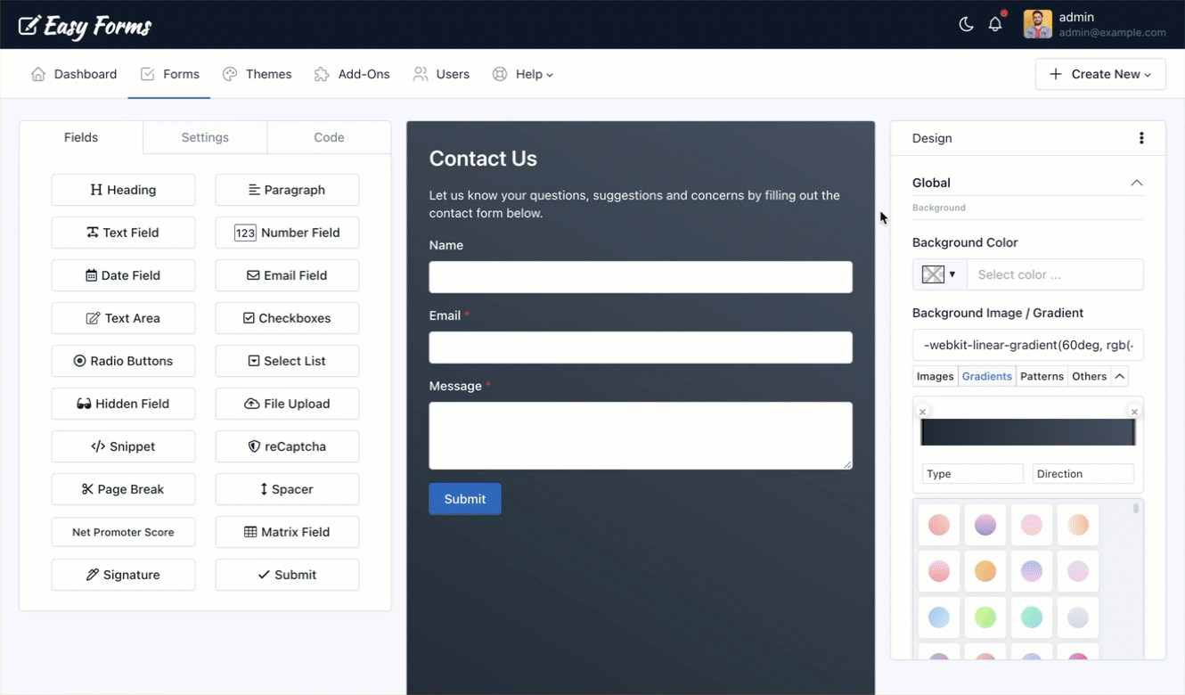
Theme Designer
Introduction
The Theme Designer is a feature that lets you design your form in minutes, removing the friction related to creating a new design, like writing and rewriting custom CSS.
To customize the look and feel of your form, just go to the Form Builder, on the right side you will see the “Design” panel. From there, set the different properties you want for your form design, the form preview area will be updated in real-time.
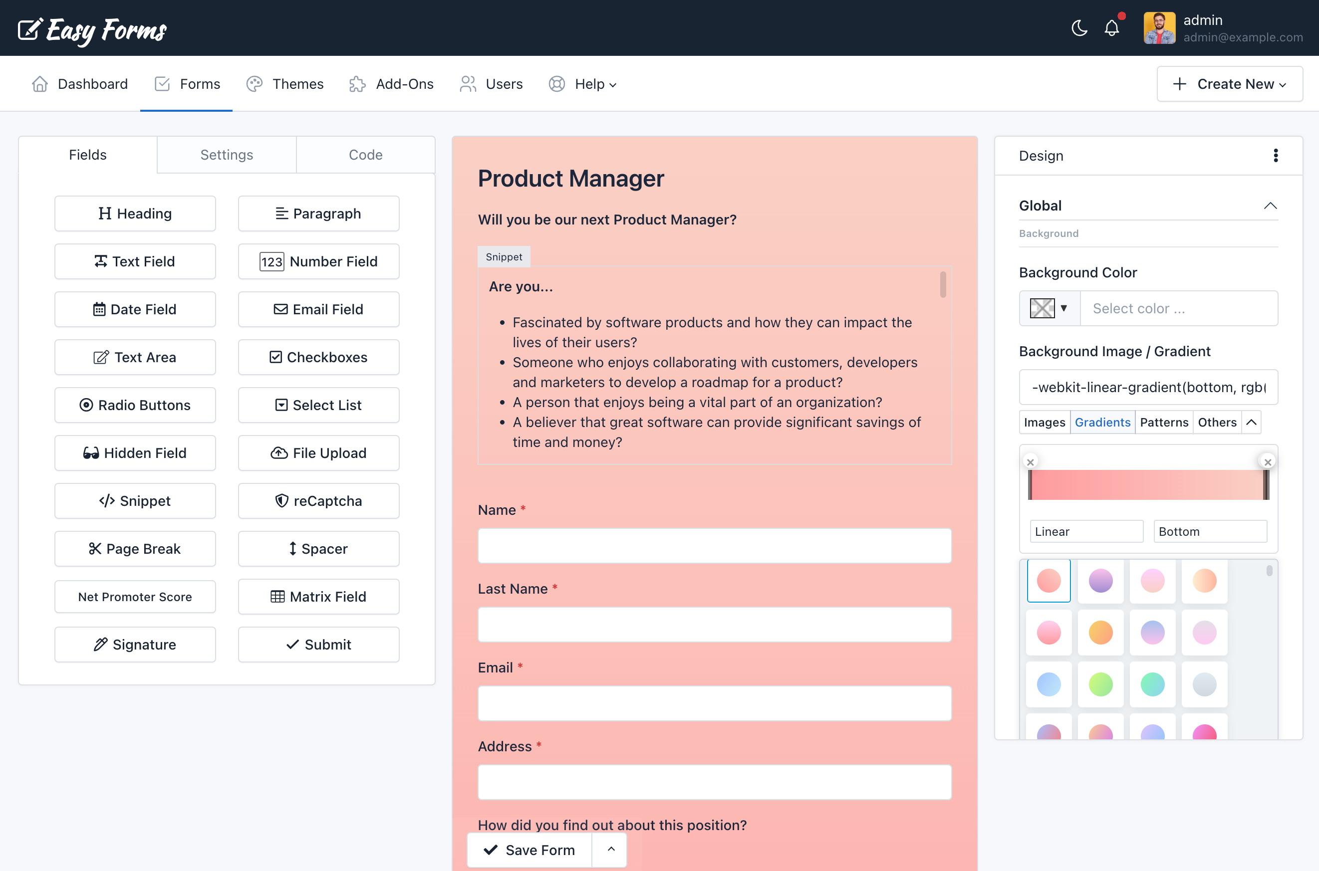
Design Sections
The “Design” Panel has the following sections. Each section focuses on a form class that can be applied to multiple elements.
- Global: It’s the Form Container.
- Form: The form itself. By default it doesn’t have a padding, to keep compatibility when a form widget is displayed in an external website.
- Form Group: Group of Label, Input, Help Text and Validation Message.
- Form Control: Input Field.
- Button: Submit Button (Bootstrap Primary Button).
- Label: Label Field (Bootstrap Control Label)
- Placeholder
- Heading
- Paragraph
- Help Text
- Link
- Form Steps: Appears when a PageBreak field has been added to the form.
- Form Alerts: Success or Error message that appears when a form has been submitted.
- Field Validation: To customize the error state of your fields.
- Other Components: Options for Custom Checkboxes, Custom Radio Buttons, reCAPTCHA, Signature Pad and Progress Bar are available, also.
Copy, Paste & Reset Design
If you’ve created a Form before, you know the process inherently includes a considerable amount of repetitive work. With the Copy Design & Paste Design features, you can copy and paste CSS styles from one form to another with a couple of clicks. Also, you can reset the design to the default styles with one click.
Main Tools and Features
The Theme Designer come with useful tools to make complex designs more easy.
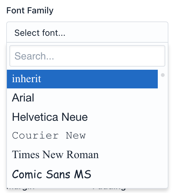
– Google Fonts Selector
Select Google fonts with live preview from a dropdown list.
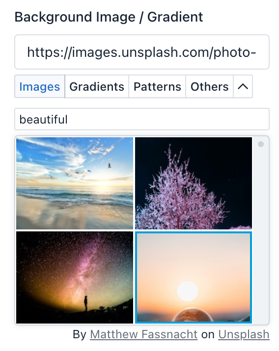
– Stock Images
Thousands of stock images are now in the Form Builder. With our Unsplash integration you can search and add stock images to your form with a couple of clicks.
You don’t need to license Unsplash images. Under Unsplash’s license, you can copy, modify, download, and distribute any of their images for free, even for commercial purposes. You don’t need to ask permission from or provide attribution to the artist, but we recommend crediting them anyway.
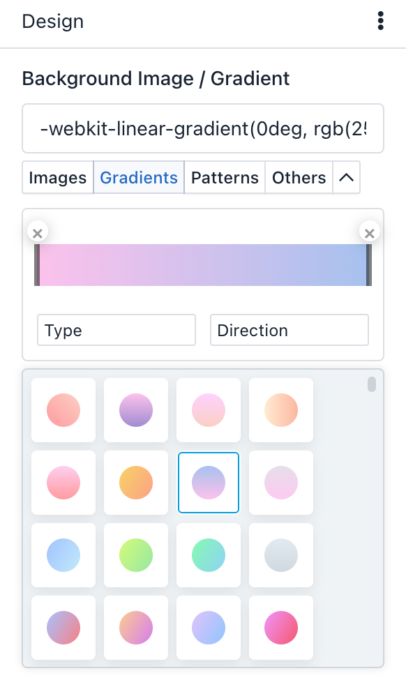
– Web Gradient Selector
You can find the gradient selector to build your own gradient (linear, radial, choose your colors and stops and more) or choose between 100+ ready-to-use beautiful web gradients.
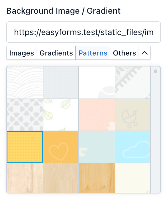
– Subtle Patterns
Choose between hundreds of Subtle Patterns selected to you by Toptal, beautiful textures for your forms.
Common Uses Cases
The Theme Designer is a flexible tool that let you customize different parts of the form to generate an stylesheet. Some common use cases are:
– Hide Field Labels
If you want to hide a field label, just click the field and enter the following Label CSS Class: sr-only
But, if you’d like to remove the entire form labels all at once, simply follow the next steps:
- In the Design panel -> Open the Label section
- Scroll down until Extra sub-section
- On Display choose None.
That’s it!
Note: Never leave a field without a label, as it will help you to identify your field within the entire system.
– Align Your Form to Center
If you want to show your form on a full page (Share Form -> Link without box) this tip will be very useful.
There are several ways to center a form, below we will describe the most common option:
- In the Global Section, Select Text Align: Center
- And In the Form Section, Select:
- Text Align: Left – Margin: Auto – Width: 80%
That’s all You can expand or reduce the Form width according to your requirements.
– Design Full Width Buttons
If you want to show a specific button with full width, just click the field and enter the following CSS Class: btn-block
But, if you’d like to design the entire form buttons all at once, simply follow the next steps:
- In the Design panel -> Open the Button section
- Scroll down until Size sub-section
- On Width choose 100%.
That’s it!
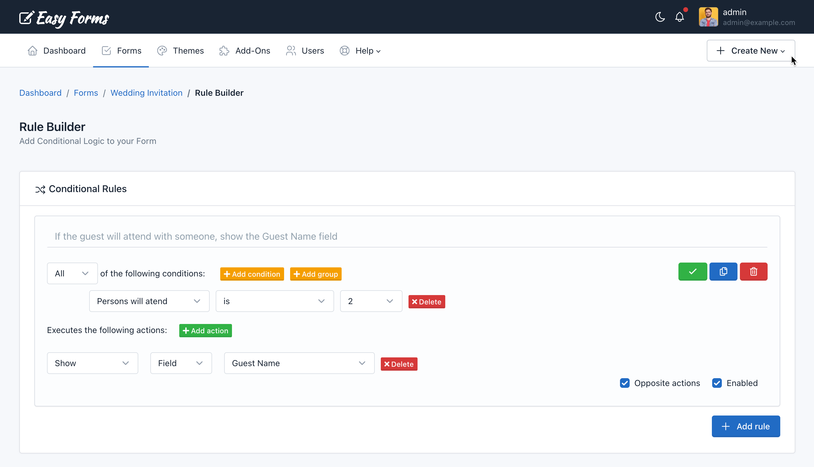
Rule Builder
Introduction
Rule Builder allows you to add conditional logic to your Forms in a quick and intuitive way without using a single line of code. You simply need to add a number of conditions to fulfill to implement a number of actions such as hide/show HTML elements, enable/disable fields, copy fields values, skip pages and do math.
To access the Rule Builder you must go to Form Manager, click the Actions button corresponding to the form you will work, then Conditional Rules.
Requirements
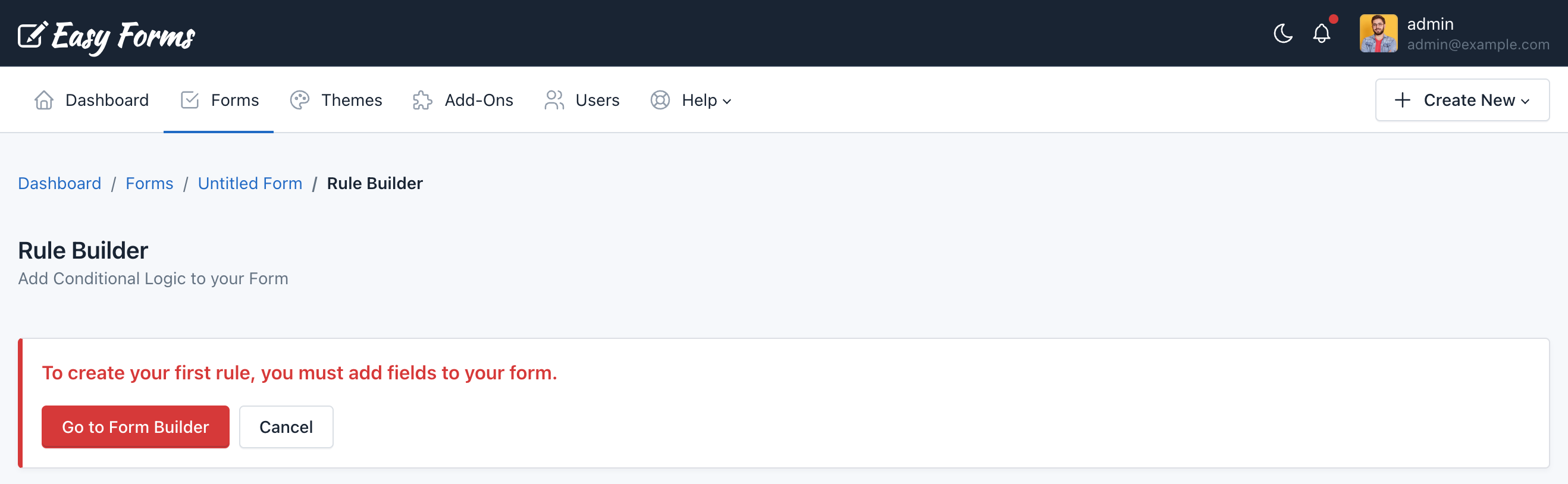
Before using the Rule Builder, your form must have at least one field. Otherwise, a warning message is displayed.
No limitations
You do not have any limitation to create conditional rules. You can create as many rules, conditions, sub-conditions and actions as required.
Add your first rule
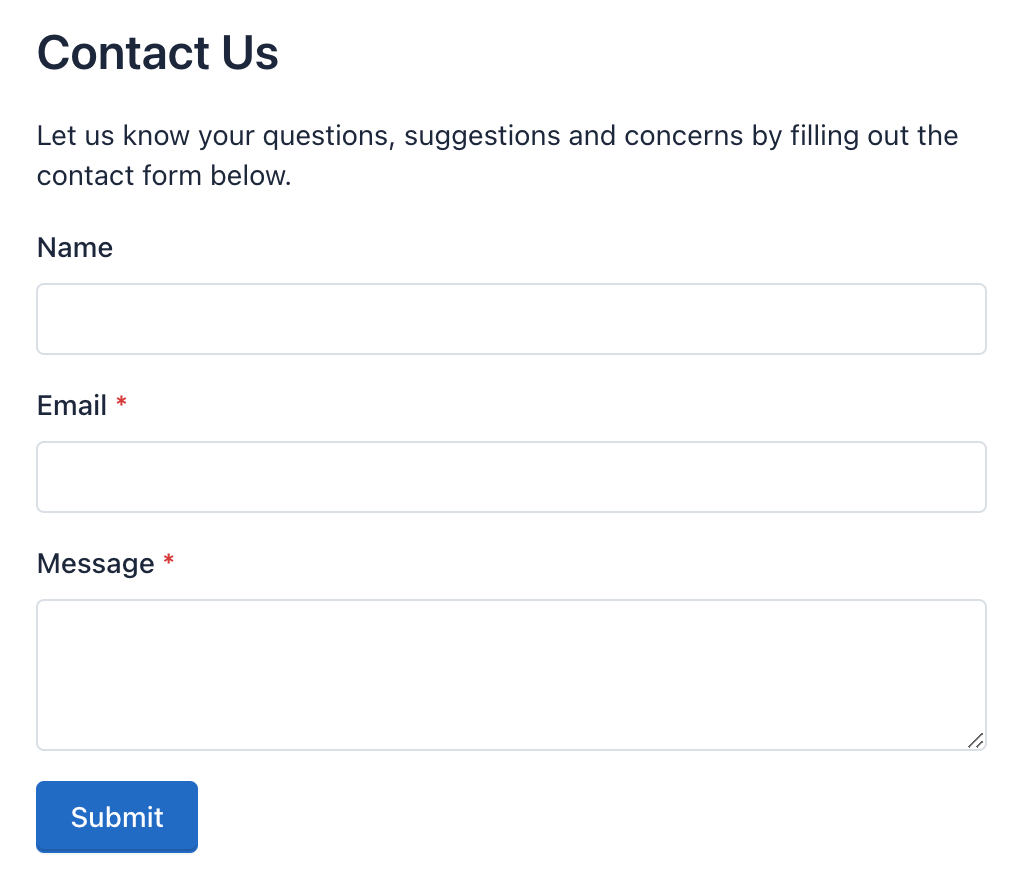
For this example, you should create a contact form with four fields:
- Name (text field)
- Email (email field)
- Message (text area)
- Button (with text Submit)
Then, go to Form Manager, locate your form, click on the Actions button, and then click Conditional Rules.
- Once in this Form Rule Builder, the first thing you will notice is a blank panel with the Add Rule button. Click this button to create your first rule.
- Then you will see two lines, the first refers to the conditions and second to actions.
- Click the button Add condition and the first field of the form will appear, followed by a statement. In our example, the first field of the Form is a Text field with the ‘Name’ label, so the Rule Builder will show the condition
'Name' 'is present'. - Now click the button Add Action and notice that several selection lists appears. The first list shows the action to perform (For this example, leave in ‘Show’); the second shows the Type of result (For this example, leave ‘Field’) and the third, the first field label: ‘Name’. For this example, you will change it for ‘Submit’ (The text ‘Submit’ refers to the button).
- Finally, in the top right of this rule you will see a small orange warning “Unsaved Changes” and next a green button with the Check icon. Click on this button to save this rule. The warning will disappear.
You have created your first rule.
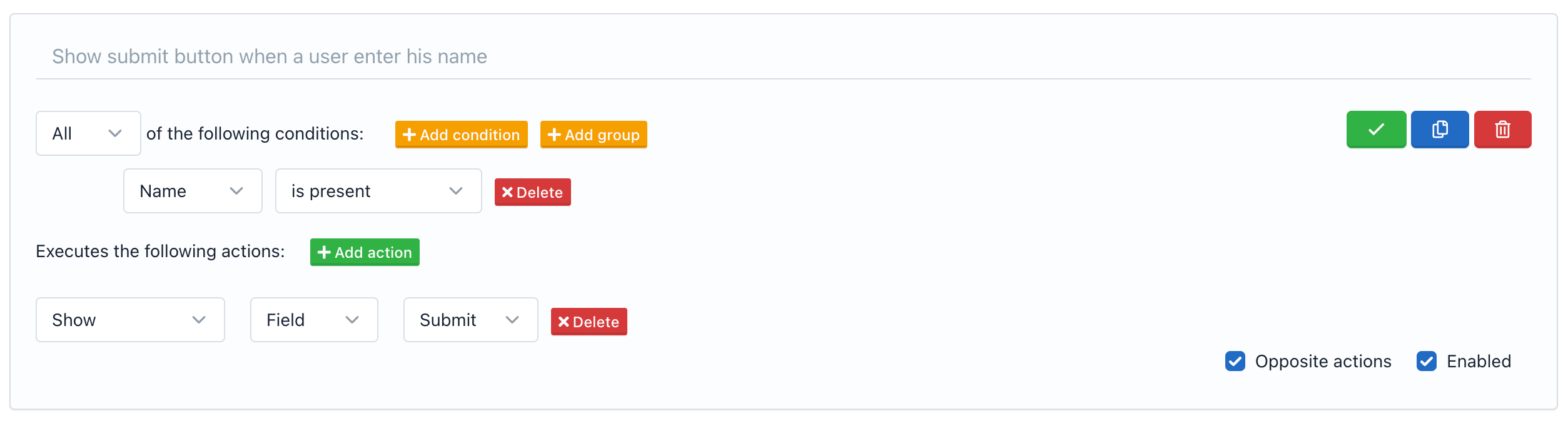
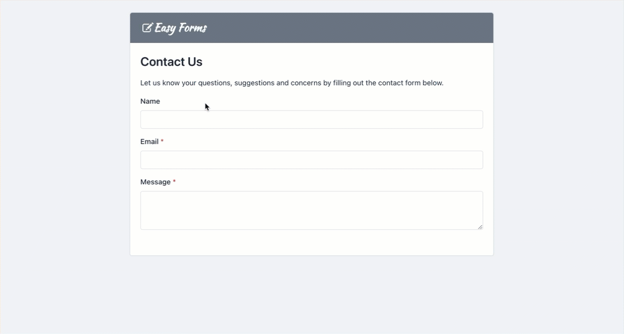
If you see your form, you will notice that the button has disappeared, but if you enter a text in the ‘Name’ field, the button appears.
You should be aware that some rules are met bi-directionally; that is, if the condition has been fulfilled the action will be executed. But, if the condition has not been fulfilled the opposite action will be executed (Show <=> Hide, Enable <=> Disable, Math <=> Reset to O).
You can add additional rules by clicking the “Add Rule” button, but this will not be saved until you press the green button. Remember that each rule will be stored separately.
Note: To delete a rule, click the red button with the Trash icon. Also, if you want to stop executing a rule for a certain time, you can disable it and then enable it when you need it.
Rule Anatomy
A conditional rule is composed of three parts: Name/Description, Conditions and Actions.
Name / Description
The first part allow us to describe the conditional logic. Just use a few words to name or describe what you want to achieve with this rule. (Optional. Max Length: 255)
Conditions
It is the second part of a rule, is at the beginning and let you specify the field or fields that need to be evaluated, as the type of evaluation.
- Type of Condition: The condition type indicates how many conditions must be met to execute the action. It can be: All, Any or None. The default is All.
- Condition: Is the statement refer to a form field and must be fulfilled. It consists of 3 parts.
- Name: The name of the form field on which the condition is based.
- Operator: The comparison operator used to evaluate the condition.
- Value: It is an arbitrary value that the user must enter to the Form. The way Values will be defined are going to vary according to the type of field and the type of operator.
- Multiple conditions: You can add multiple conditions to a rule. The type of condition will indicate if all must be met (AND), if any (OR) or none.
- Group of conditions: In addition of conditions, a rule can contain a group of conditions. A group of conditions differs from a condition that allows changing the type of condition. So a rule can be of type All (AND), but the group can be of type Any (OR).
- Evaluation Process: The conditions evaluation process is top-down. That is, the conditions at the beginning will be evaluated before to those who are at the end, in descending order.
Note: Conditions “Belongs To” and “Does not Belongs To” can analyze multiple values separated by “|”, this allows you to compare the field value with multiple values, if one of them matches the action will be executed.
Actions
The last part of a rule indicates the action to be performed if the conditions are met. As conditions, actions have a declarative easy way to understand.
An action consists basically of three parts:
- Action Type:
- Show / Hide
- Enable / Disable
- Copy: Let you copy the value of a field or another element or a static value and paste it to another field automatically. A great example of where this is useful, is on a Form where you might be collecting a Shipping and Billing address. The end user could enter their Shipping address and check the Copy option to automatically fill the Billing Address Fields with the same data. Another common use case is use a static empty value to clear a field by using conditional logic.
- Math: Allows Addition / Subtraction / Multiplication / Division / Remainder of fields and show the result in another field or HTML element.
- Evaluate: Allows the evaluation of math expressions (formulas) and set the result in another field. It is also compatible with date calculations. For example, if you want to calculate the multiplication of two fields and divide this value by 10, you use the following formula:
{{number_1}} * {{number_2}} / 100. Please take into account the evaluation of math expressions doesn’t work with opposite actions. You can read the full list of advanced calculations that the Rule Builder supports thanks to the excellent Math.js and date-fns libraries. - Number Format: Allows you to format a number in different ways and without any coding. For example, to give the currency format to a number: 10130.25 use the following format ‘$0,0.00’ and the number will now be displayed as $10,130.25. Also, by default, the format will take the locale of the language you have selected in the configuration of your form, so for example, if our Form Language is German, will get: €10 130,25. You can read the full list of formats that the Rule Builder supports thanks to the excellent Numeral.js library.
- Text Format: Allows you to select multiple fields to create a new formatted text string and set the result in another field or HTML element. Eg. To auto-generate an email address, select a Name field and enter the following format {{0}}@example.com, then select the Email field where the email address will be displayed. You can use number tokens to identify the field position in the field list, or you can use the Field ID or Field Alias, in our example: {0}@example.com or {{text_1234}}@example.com or {{name}}@example.com should work.
- Skip: Allows you to define which page to go to when we go to the next page. This action should only be used in a Multi Step Form.
- Form: Allows you to set actions related to the form:
- ‘Submit’: To submit the form.
- ‘Reset’: To reset the form.
- ‘Next Page’: To go to the next page.
- ‘Previous Page’: To go to the previous page.
- Target: Will vary depending on the type of Action. It can be of two types:
- Field
- Element
- Name:
- If the Target is Field it will be the field name.
- If the Target is Element it will be among several HTML elements selected by jQuery. For instance:
- ‘#abc’: The target is the HTML element with ‘abc’ as ID.
- ‘.abc’: The target is all HTML elements with ‘abc’ as the CSS class.
- Opposite Actions: By default, opposite actions has been enabled because they help the creation of common conditional rules and made them more logic. For example, if after meeting a condition I want to show a field then clearly by not meeting the condition I want to keep this field hidden. However, there are occasions when the disabling of opposite actions can be helpful. When this occurs, only the action described in the rule will be executed.
Note that the use of elements requires a basic knowledge of jQuery, but offers big advantages. For example, you could create an action to hide all the form fields; 'Hide' 'Element' '.form-group'.
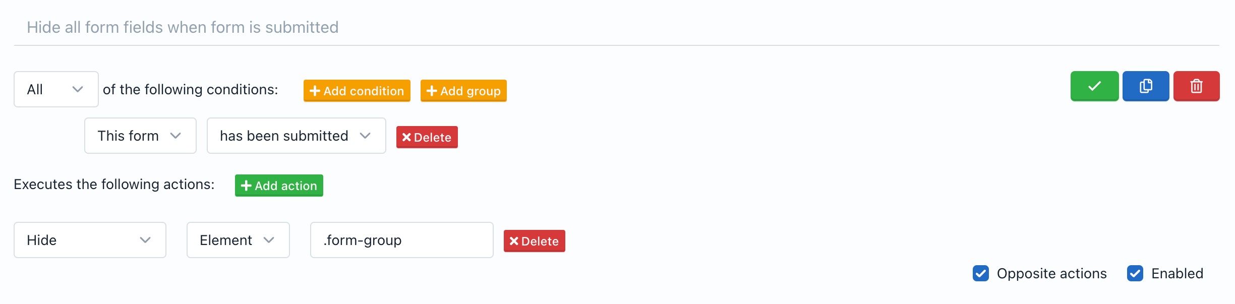
Note: You can identify the ID and CSS Class of the form fields using the Code tab of the Form Builder.
Conditional Validation
You can omit a required field validation by using conditional rules in two ways:
- When the field is hidden.
- When the field belongs to a page that has been skipped.
For example, if a field is created with the Form Builder and in the conditional rules is defined that this field should only be displayed if another field meets a condition and the condition is not met, then the first field will no longer be required (will not be validated by the server).
Note: To use Conditional Validation, the client side validation must be disabled. (See Form Settings -> No validate))
Submission Manager
Introduction
Submission Manager let you create, view, edit and delete data collected by your forms. To access the Submission Manager, you must go to Form Manager and click on the form name. From there click on Submission (Paper Airplane icon). Now you can check, edit or delete your submissions.
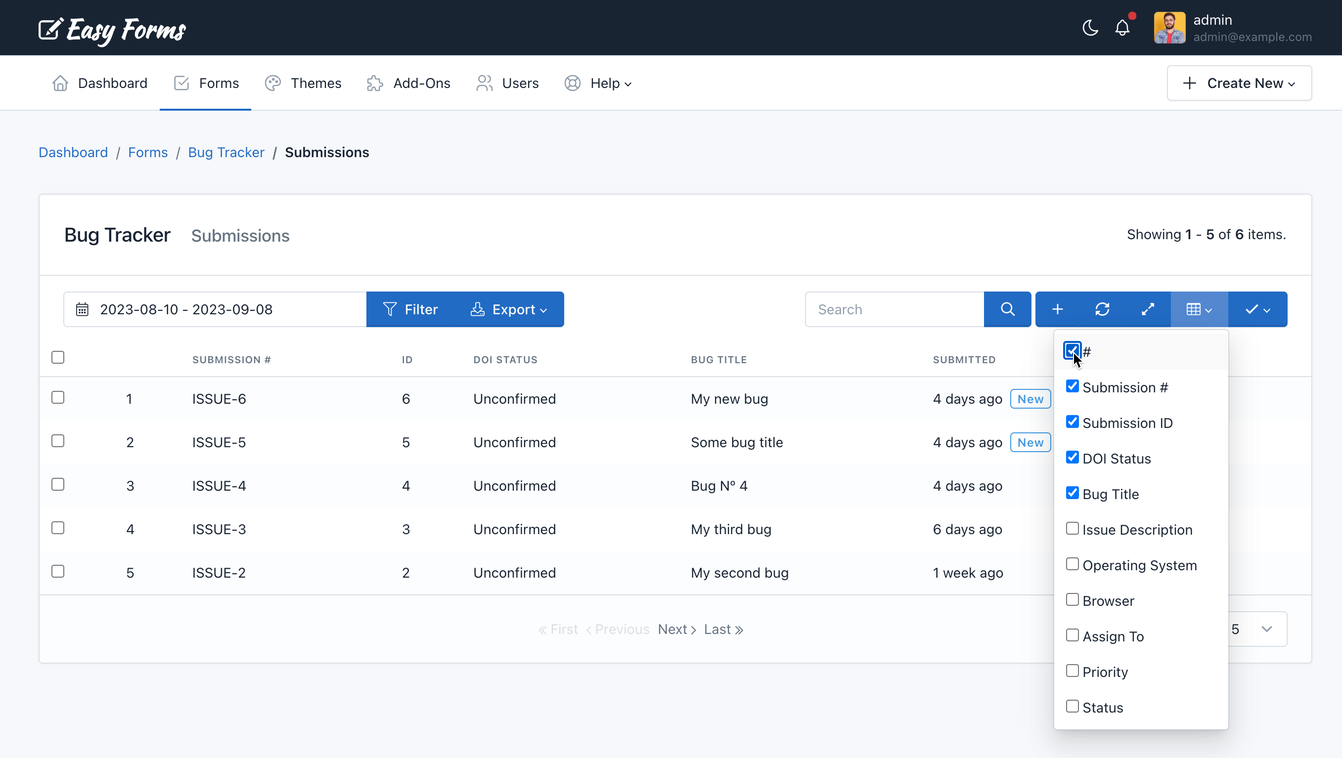
The Submission Manager, unlike other managers of the application, offers more features to adapt flexibly to the data collected by your forms. By default, it will display the first 4 fields to keep a perfect compatibility with the GridView. Then, you can use the tool to set up what columns to show or hide.
These are some Submission Manager features you should consider:
- Navigation: The Submission Manager displays submissions in tabular form. In the table upper cell, the form field label will be displayed and then the submission data corresponding to that field. Submissions have been sorted by creation date (when they were sent). You can sort your submissions by clicking on the cell “Submitted”. Also, the number of submissions displayed per page has been defined according to the number of rows for the entire application, default is five. To view more submissions, you can use the Next and Previous buttons to go forward or backward.
- Show / Hide columns: You will see a button with a Table icon to the search box right. If you hover the mouse over it, the message “Show / Hide Columns” appears. If you click on this button, a list with the name of each column will be displayed, remove the check of any column name, and the column will be hidden, check to the same name, and the column will be displayed. The only thing to keep in mind at this point is that you cannot hide the “Checkbox”, “Submitted” and “Actions” columns. Also, they must show at least two fields. If your form has many fields, use this feature to organize your manager to your preference. Take into account that the selected configuration will be saved in your User Preferences, so you will see the same configuration on any browser or used device.
- Submission ID vs Submission Number vs Serial Numbers: While the Submission ID is the number that identifies an entry in the entire system, the Submission Number identifies an entry in a form, that is, two different forms can have the same Submission Number, while they can never share the same ID. For its part, Serial Numbers is the number that identifies a row in the Submission Manager and is in accordance with the page we are visualizing. (See: How to create custom submission numbers).
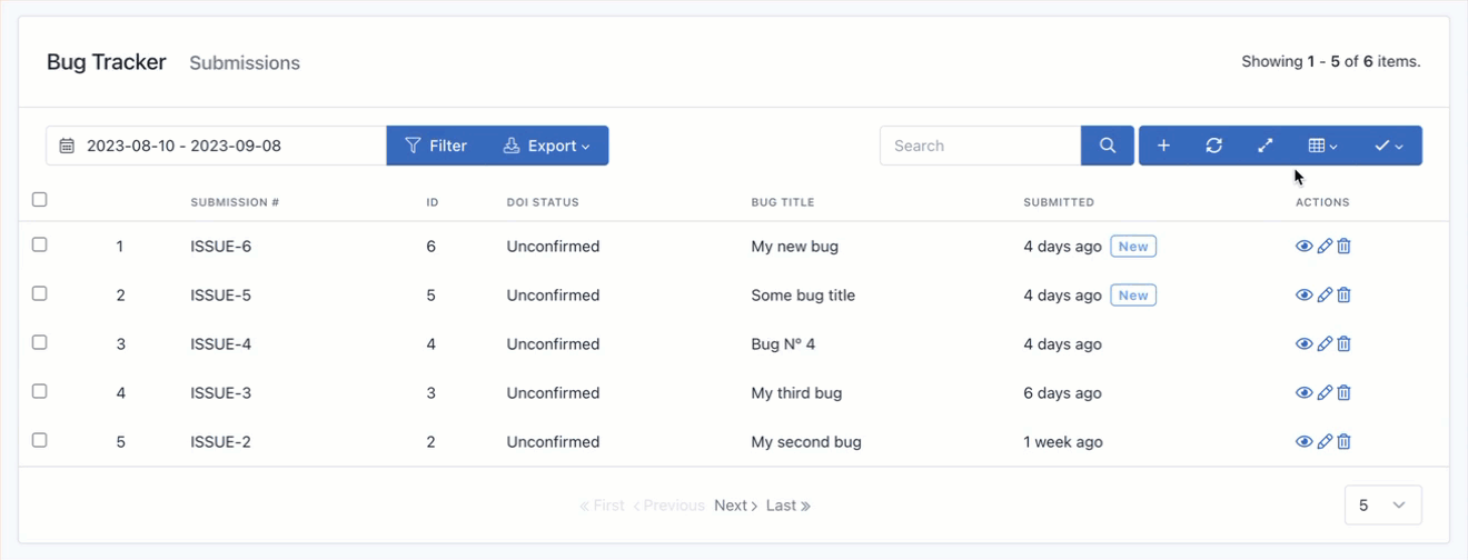
- Resize columns: If your form has a lot of fields, display them all can make the data look too close together. Use this option to expand the width of the columns to a predefined minimum. You should note that Easy Forms has a responsive design, so those fields that exceed the width of the page will be hidden. To view them you will be able to scroll horizontally.
- Reset the Manager: If you have made modifications in the manager, for example, hiding columns. You can return to the default view by clicking on the “Reset” button.
- Sort submissions: Sorting is one of the most common tools for data management. In Easy Forms, you can sort the submissions by columns, by ascending or descending order, by clicking the column header (Field Label).
- New submissions: Submissions with the “new” label next to the date are those unread. Once you enter to read the submission, the label “new” will disappear.
- DOI Status: This is a special column that shows when a form submission has been confirmed or not.
- Bulk actions: If you need, you can “delete” or “mark as read” or “mark as unread” multiple submissions at a time. For this, check the checkbox of each submission to modify and then click the top right button (Checkbox Checked Icon). It will show a menu with two options: Delete, Mark as Read and Mark as Unread. Click on the required action. You should note that to eliminate submissions, a popup will appear asking you to confirm your decision to delete. When you click OK, submissions will be deleted. This action cannot be undone.
Viewing a Submission Record
When you click an entry in the Submission Manager, a vertical table with all information collected will be displayed. By default, this entry is for view-only. To edit the entry, continue reading until you find the “Editing a Submission” section.
Submission information has been divided in three sections:
- Submission Details: Shows the information collected by your form fields.
- Sender Information: Shows sender information collected by the application. Including the country, city, geolocation map, ip address, user agent, landing page, referrer url. An icon will appear to indicate if the geolocation information has been obtained with the user’s consent.
- Additional Information: Displays the Hash ID of the Form Submission. If Submissions are editable (See: Form Settings), a link to the form page to edit this entry will appear. You can share this link with your end-users to allow the edition. Also, in this section you can see the date when the Submission has been sent or updated and if it was made by a logged-in users, his username will appear.
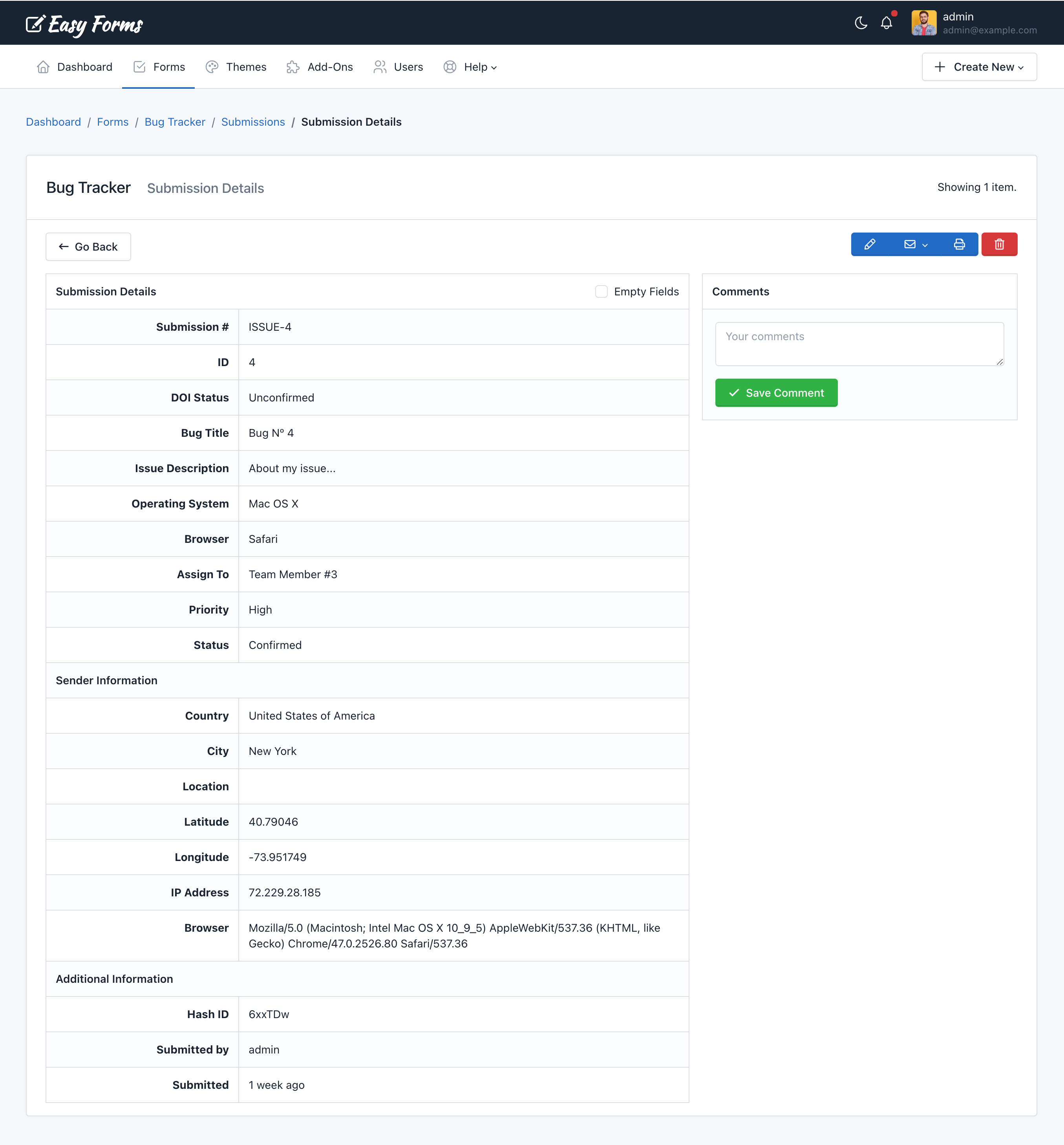
Note: Leave a comment about the submission. Comments can only be viewed in the Submission Manager—they aren’t included in exports.
Editing a Submission
To edit a Submission, go to the Submission Manager. Then, perform the following steps:
- Click on the submission to edit.
- You will see the Submission Information and at the right top see the “Edit” (pencil icon) button.
- Click the Edit button.
- The vertical table will become a similar form than the one you have created.
- Make the changes you need
- Submit the Form
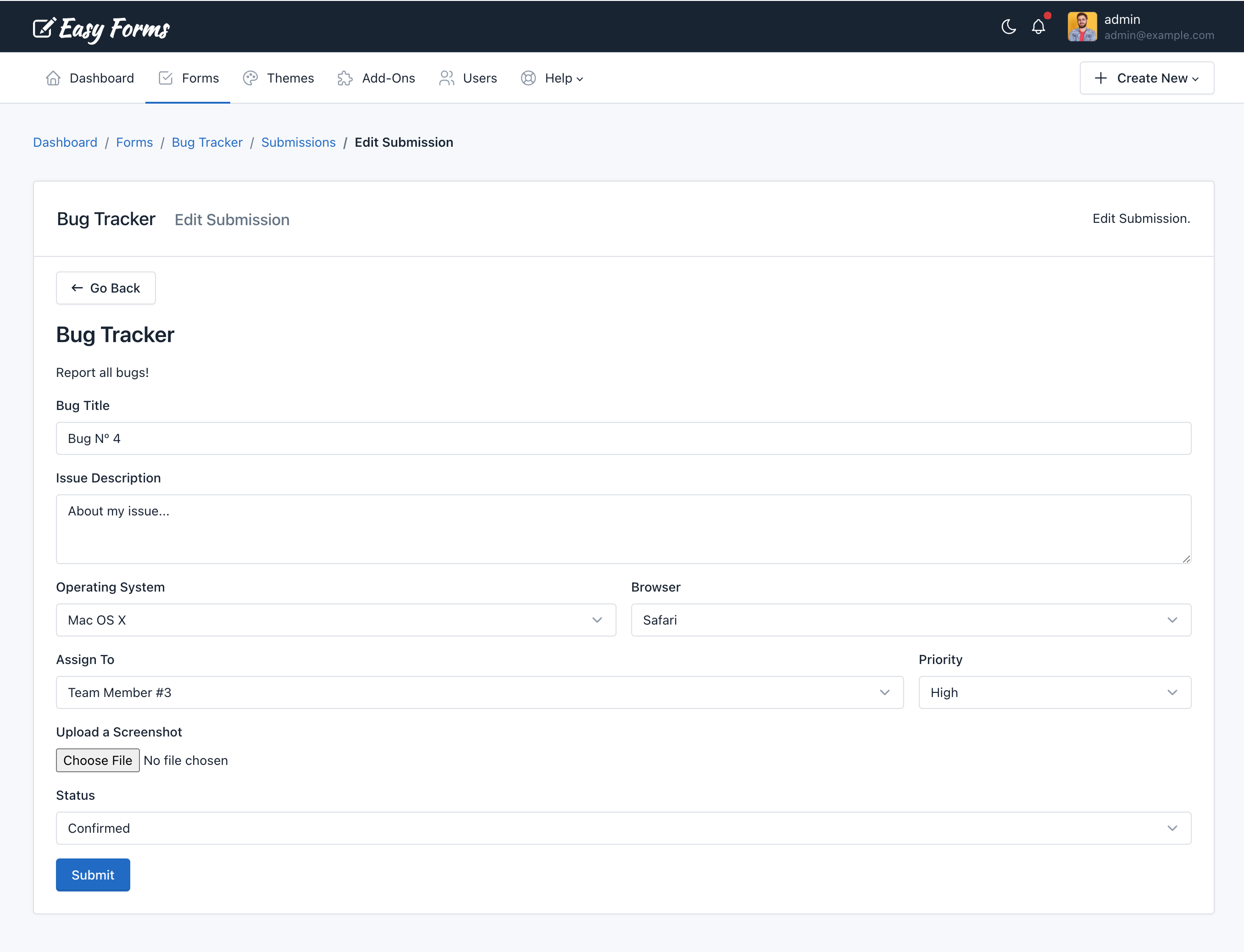
Note: Keep in mind that when you edit an item, the data related to that submission will be overwritten permanently.
Create a Submission
To edit a submission, go to the Submission Manager. Then, perform the following steps:
- Click the Add submission button (icon with the plus sign)
- You will see a similar form than the one you have created.
- Make the changes you need
- Submit the Form
- The new Submission will appear in the Submission Manager.
Deleting Submissions
To delete a submission, go to the Submission Manager. Then, perform the following steps:
- Click on the submission you want to delete
- Click on the Delete red button (trash can icon) at the top right.
- A pop-up will appear asking you to confirm your decision to delete the submission.
- Click OK.
Note: Keep in mind that when you delete an item, the data related to that submission (including attachments) will be removed permanently.
Printing a Submission
To print a Submission, go to the Submission Manager. Then, perform the following steps:
- Click on the submission to print.
- You will see the Submission Information and at the right top see the “Print” (printer icon) button.
- Click the Print button.
- The page preview to print will be displayed in black and white with submission details
- Make the changes you prefer in the printer dialog window
- Click on ‘print’
Filtering Submissions
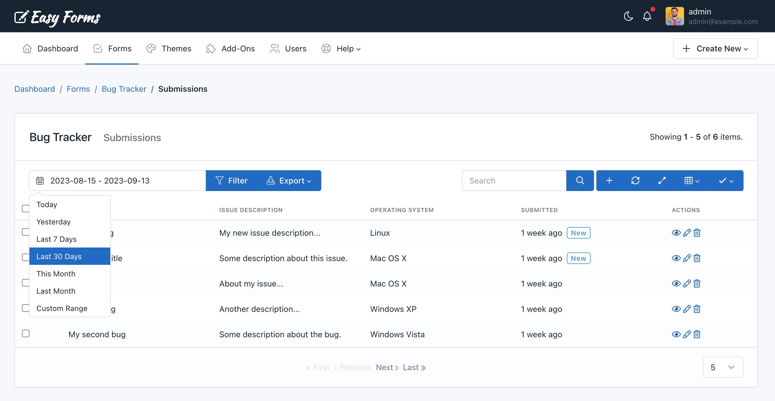
To filter the data collected by the form you must select the Date Range and click the “Filter” button.
Exporting Submissions
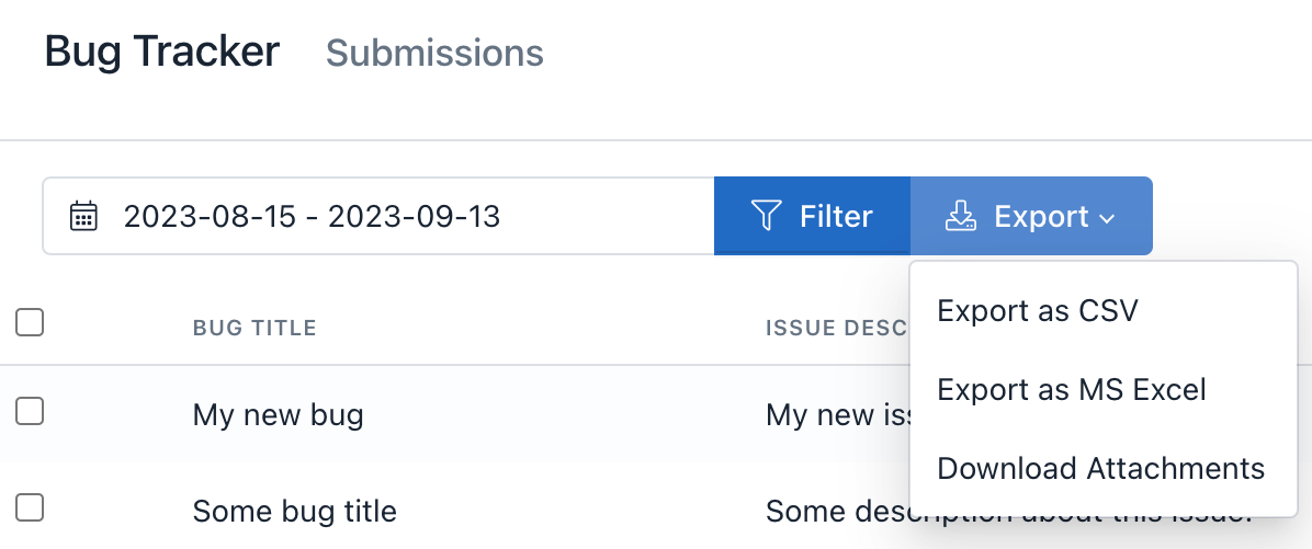
To export the data collected by the form you must select the Date Range and click the “Export” button.
Then select the format of the file to be generated:
- Export as CSV
- Export as MS Excel
- Download Attachments
Searching Submissions
To search, enter the search criteria in the search box located at the top of the Submission Manager. The search engine will return all instances of the word found in all the collected fields.
Find a submission by its ID or Custom Number is possible. To find a specific submission, use the key “id” followed by the colon and the ID, or you can use the key “#” followed by the colon, and the Number. For example, id:123 or #:ORDER-123.
Also, you can filter submissions by Double Opt-In (DOI) status. To find/list confirmed email entries, use the keyword “status:confirmed” (without the double quotes), and to find/list unconfirmed email entries, use the keyword “status:unconfirmed” (without the double quotes).
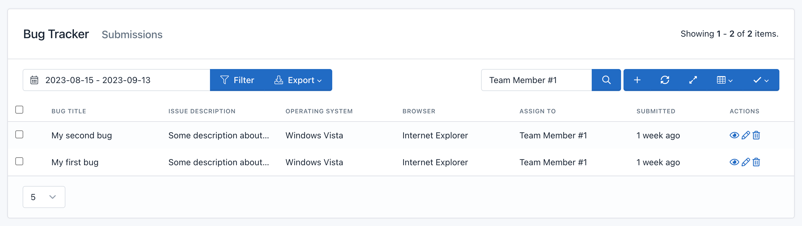
File Management
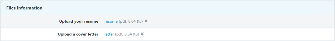
You can manage files sent with your forms. Basically file management allows to:
- View sent files associated with the field used (label).
- Upload files when creating Form Submissions using the Submission Manager.
- Update uploaded files.
- Delete files
Important! When trying to update a Submission file made before the upgrade to version 1.3.6, older files will appear at the bottom of the list of uploaded files. You can remove them when you consider appropriate.
Resend a Notification or Confirmation Email
If your form has been configured to send confirmations or notifications by email, an Email button will appear in the Submission Details page. To resend any of these emails, just click on them and confirm you want to send.
Report Builder
Introduction
Report Builder allows you to see the data collected by a form.
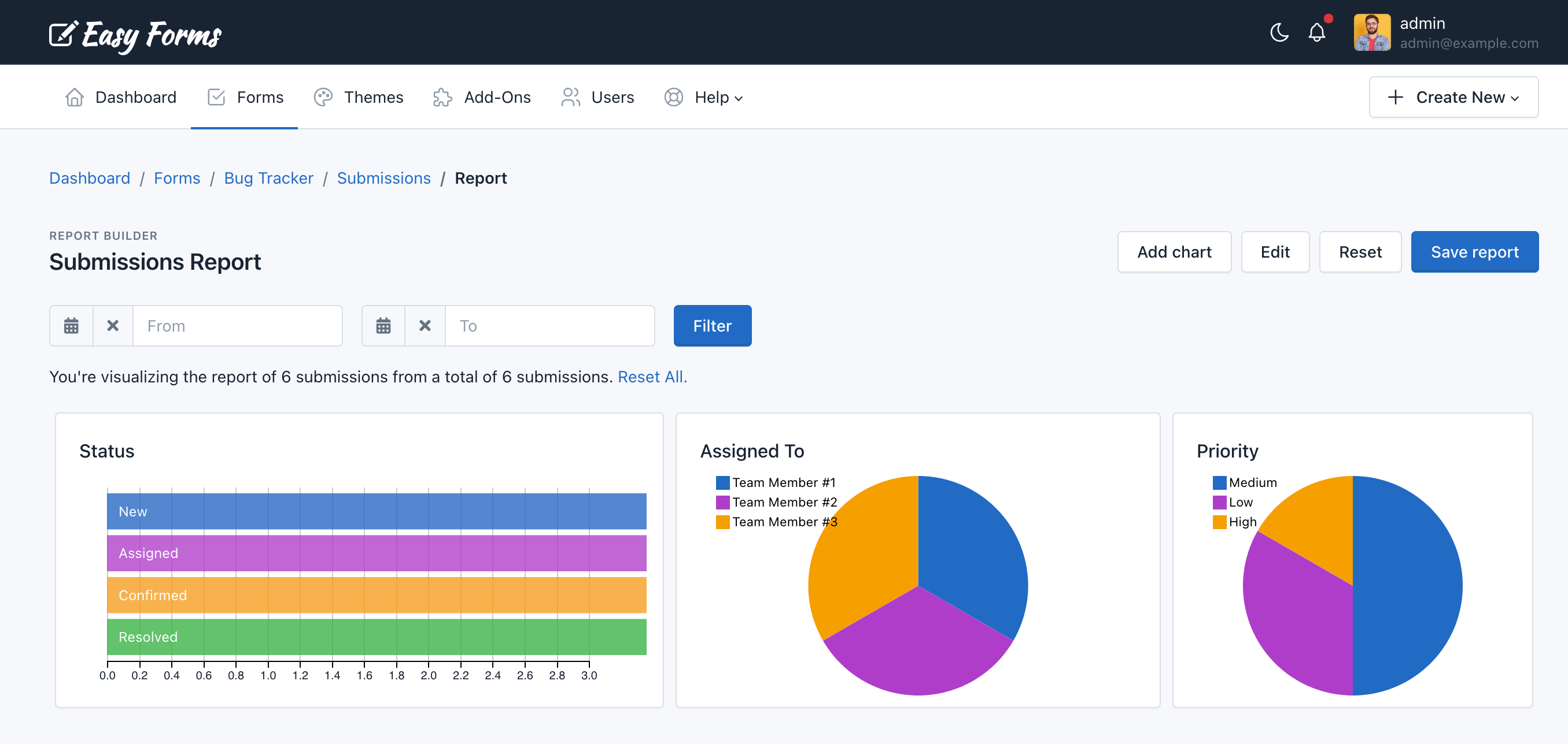
Note: You can only create a report per form.
Create my first report
To create your first report go to Form Manager. Then, click on the Actions button and select the Submission Report option.
A report is made of multiple charts. You can create as many charts as you have fields in your Form. When finished editing, you should click on the Save report button.
Add a chart
To create a chart:
- Click the Add chart button
- Fill the Title field
- Select the Type of chart
- Select the Field from which to get data
- Click Save
Your chart has been added. Now you just need to Save the report.
Edit a chart
To edit a chart:
- Click the Edit button. Note that the report has now a yellow background and the Edit button now says Stop. In addition, all charts must show a pencil icon (for editing) and X (to delete).
- Click the pencil icon of the chart to edit.
- In the form that appears, change the data you need.
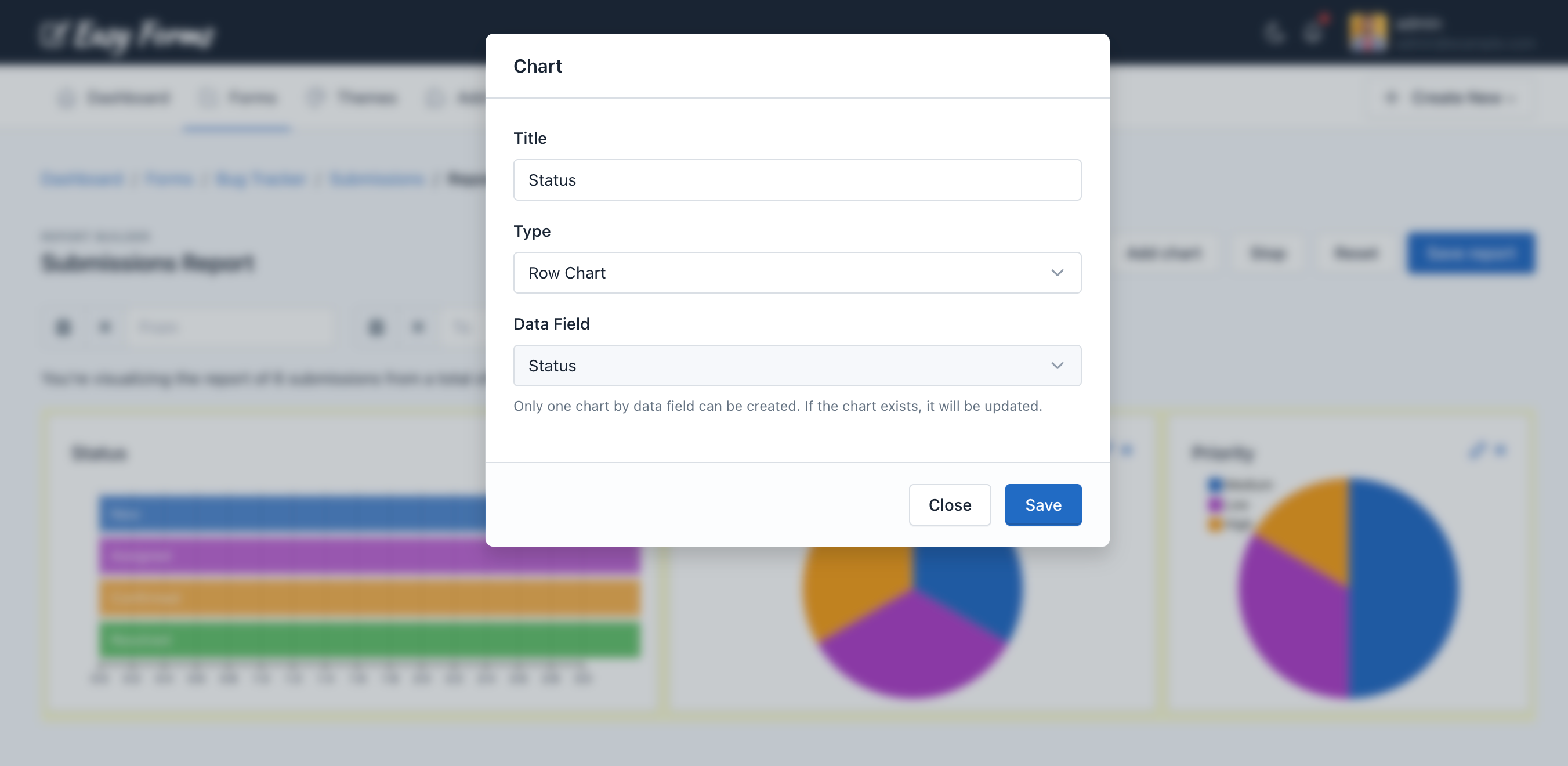
- Click Save
- When the chart is reloaded, press the Stop button.
Your chart has been edited. Now you just need to Save the report.
Delete a chart
- Click the Edit button. Note that the report has now a yellow background and the Edit button now says Stop. In addition, all charts must show a pencil icon (for editing) and X (to delete).
- Click on the X icon and the chart will disappear.
- When the chart disappears, press the Stop button
Your chart has been deleted. Now you just need to Save the report.
Resize a chart
- Click the Edit button. Note that the report has now a yellow background and the Edit button now says Stop. And when you hover the mouse over a chart an icon will appear in lower right part to resize the it.
- Click on the icon to resize the chart and drag to make it bigger or smaller.
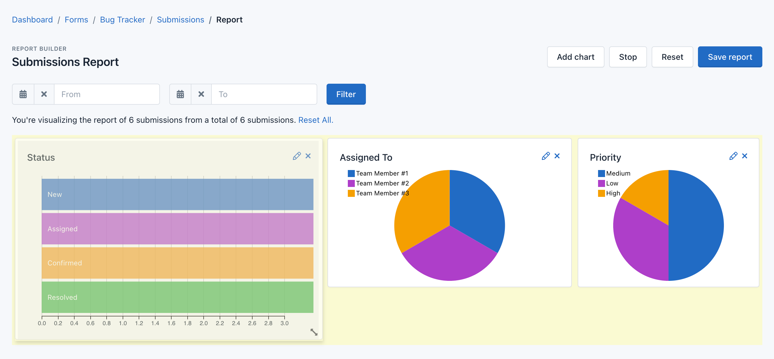
- When the chart has the size you need, press the Stop button.
Your chart has been resized. Now you just need to Save the report.
Save the report
To save the report:
- Be sure you are not in Edit view. Click the Stop button if this still appears.
- Press the Save report button.
- A message will appear confirming that the report has been saved.
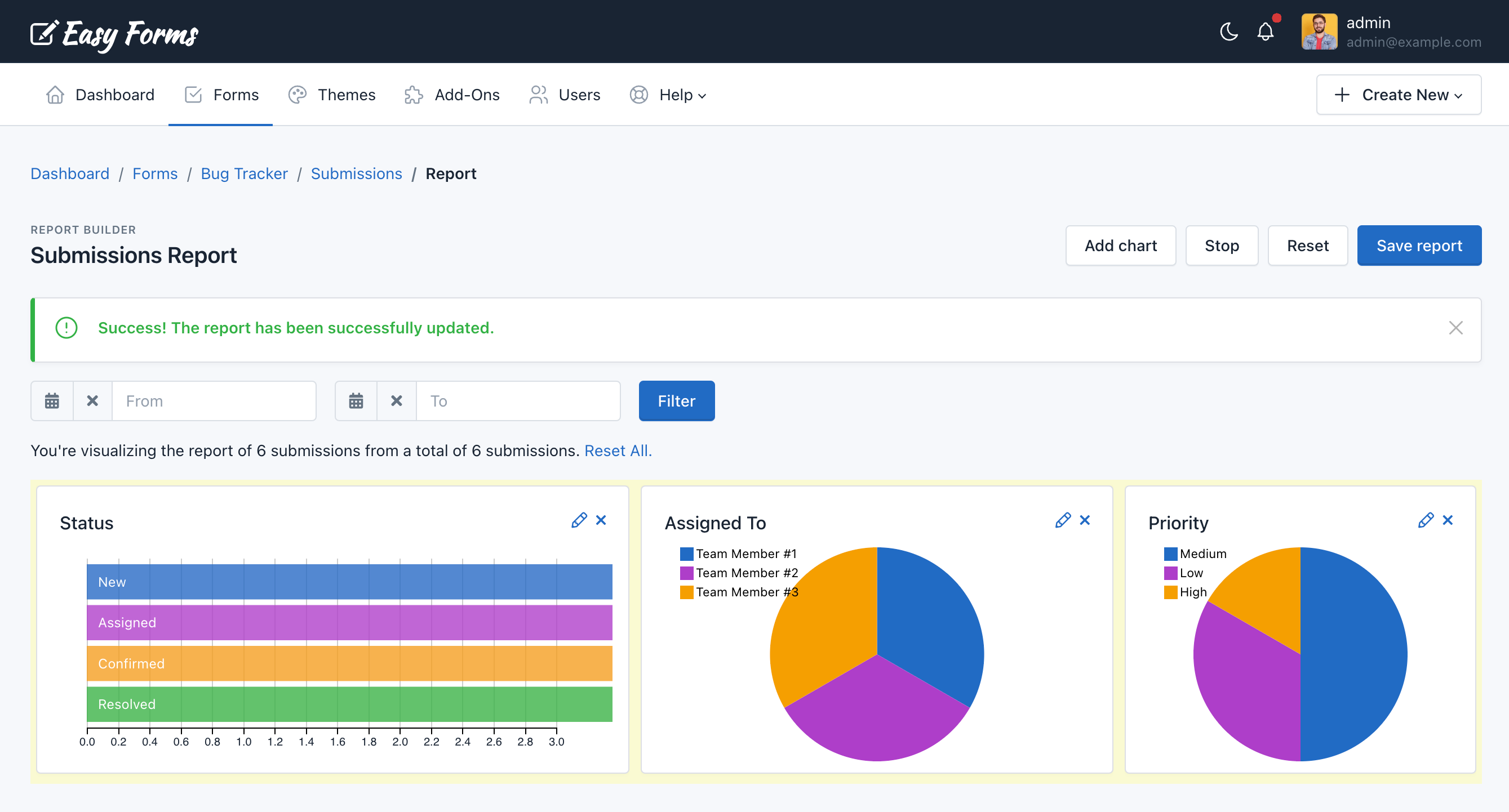
Interacting with the report
Charts can interact with one another. When you click one of them you will see how the others change to show the chart element information you clicked.
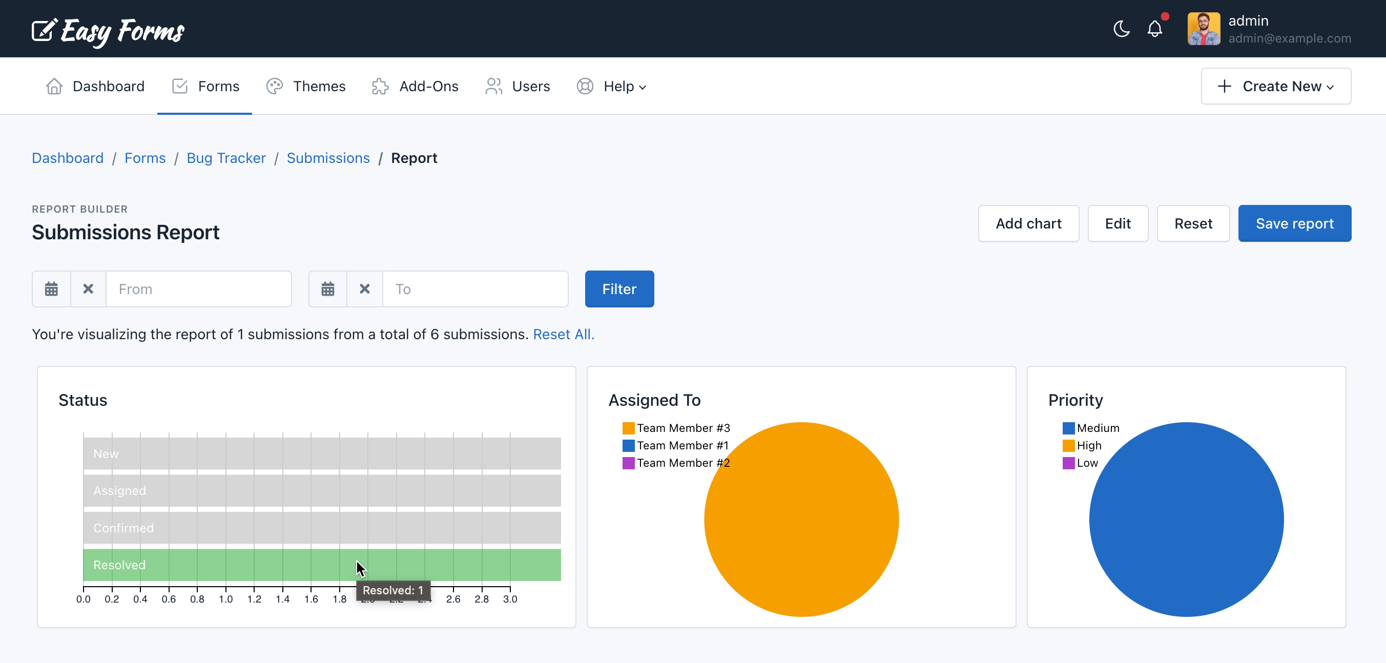
Reset a report
If you want to create a new report, you can press the Reset button. You will notice that all charts have disappeared. Now you just need to Save the report.
Print / Save a report as PDF document
To print a report:
- Press Ctrl + P, or use the browser print feature.
- Select “Microsoft Print to PDF” (Windows) or “Save as PDF” (Mac).
- Now just click “Print“.
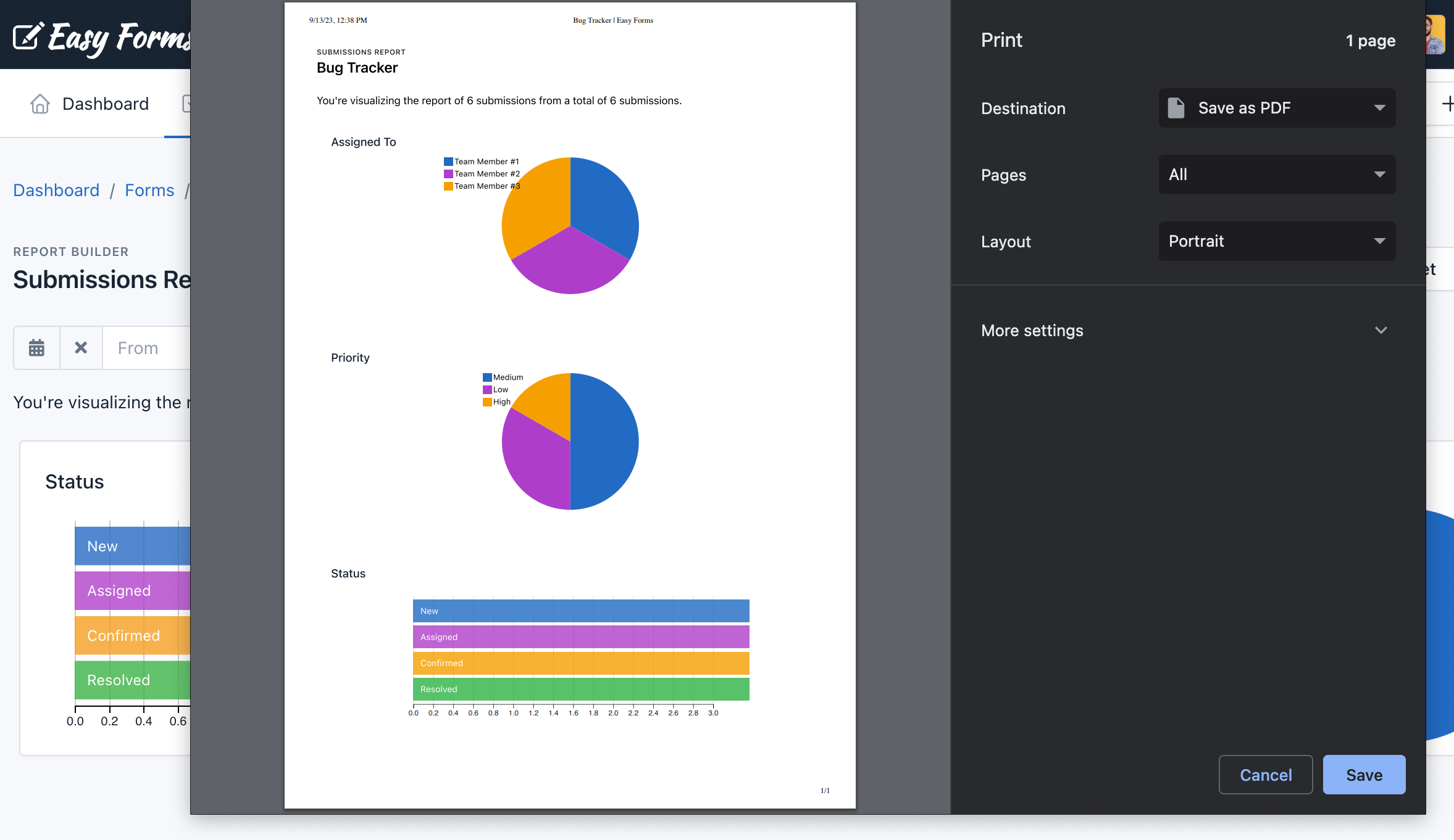
In-App Analytics
Introduction
Want to know how well are your forms performing? Well, now you can do it fast and easy with the Easy Forms’ In-App Analytics. Get the best results from your forms, improve them to increase your conversion rates and much more. Yes, with only a few steps, you can start tracking your forms and in real time! Try it now and see the difference!
In-App Analytics offers two kinds of reports, each with a different approach:
- Performance Analytics
- Submissions Analytics
Performance Analytics
The Performance Analytics report let you measure how effective is your form in converting inbound visitors.
The funnel: KPIs

The funnel in this report represents how many visitors make it to the next conversion stage.
Users: Visitors who landed on the Form.
The first step in the funnel is the number of unique users that landed on the form. This number represents the total amount of people that saw the form and serves as a baseline for the rest of the funnel steps.
Began Filling: Users who interacted with the Form.
The next step in the funnel shows how many unique users have interacted with the form beside the users that saw your page.
An interaction will be considered an action with any of the input fields in the form (attempting to fill them out, change them, or any other). This funnel step tells you how many people made some effort to fill out this form, but weren’t able to make it through to the next step (a successful conversion).
We recommend looking at this segment very closely, because the visitor that have made it to this step, but not to the next; have displayed interest in the form but due to confusion, form validation errors, or other reasons, decided not to go any further.
Conversions: Users Converted Successfully
This number represents the unique users that successfully converted the form by completing every stage of the funnel.
Conversion Rate: This is the average number of conversions per users, shown as a percentage.
Timeline
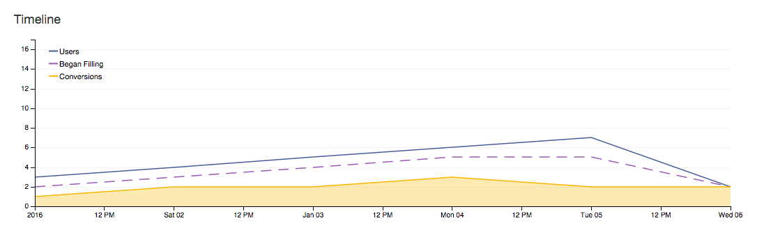
The Timeline represents the evolution of the first three indicators mentioned above through the time.
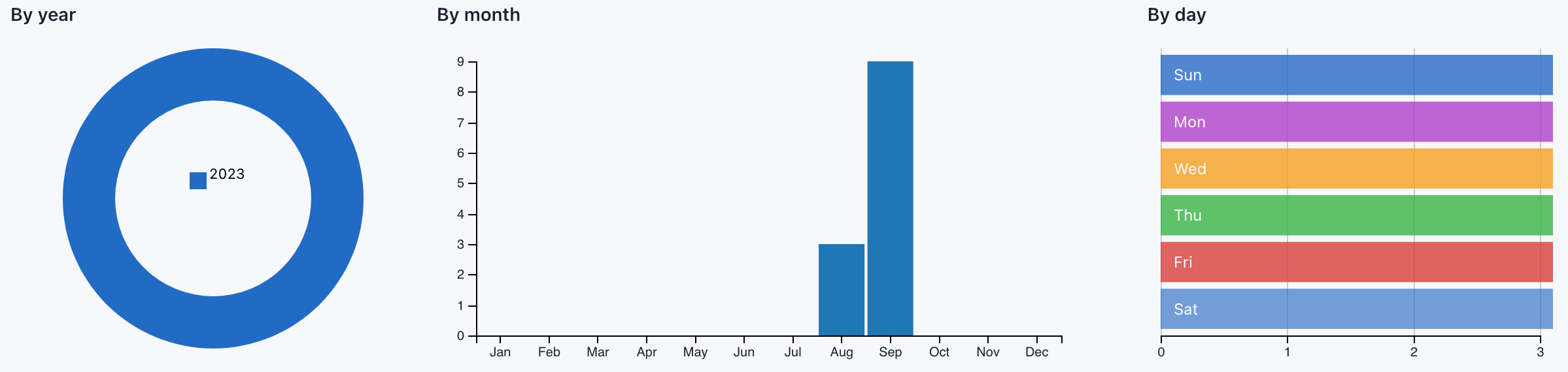
These three graphs grouped the number of users, interactions and conversions in that time unit. For example, at a glance we can know that on Mondays we have more conversions than on Fridays.
Conversion Time
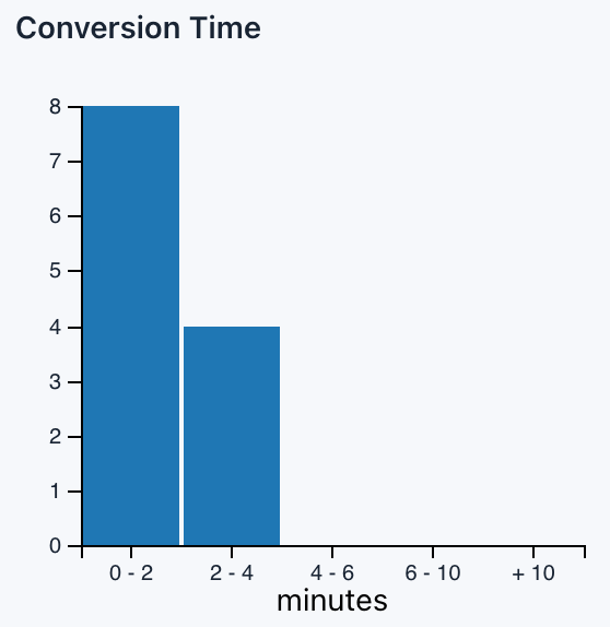
The Conversion Time chart shows how much time your average users are spending filling out your form.
Conversion Time Average
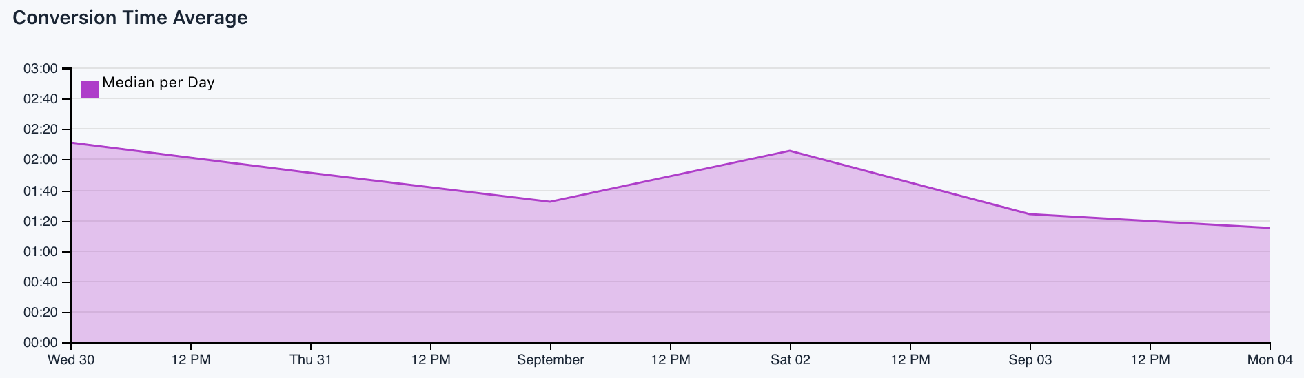
The Conversion Time Average chart shows the average time per day that users are spending filling out your form.
Conversion vs. Abandonment
This chart makes a comparison between the number of conversions and the number of abandonments.
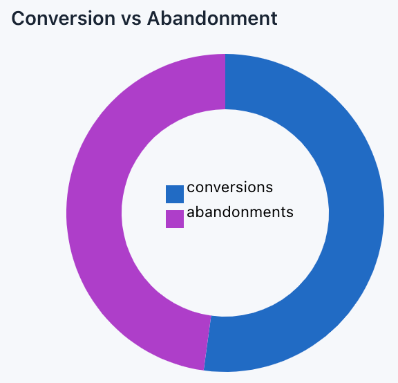
Abandonments: This rate represents the number of unique users that interacted with the form (start filling it) but, for one reason or another, didn’t send it.
Abandonment Rate
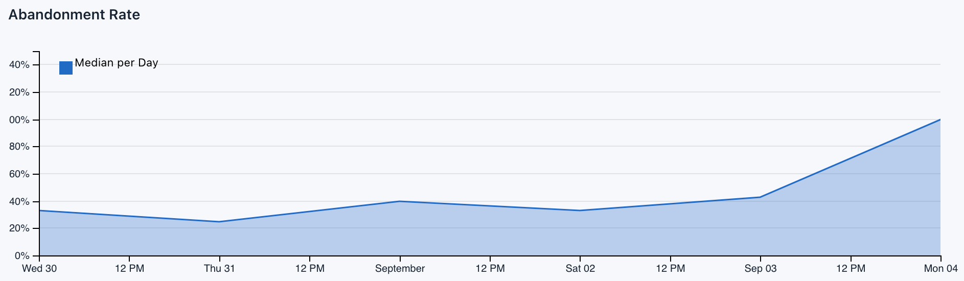
This chart shows you the percentage of abandonments in the course of time.
Abandonment Rate: This is the average number of abandonments per users, shown as a percentage.
Submissions Analytics
Unlike the previous report, the Submissions Analytics report focuses on submissions and for example, let you know at a glance the number of submissions that are made in time, how many sessions are performed by your users to submit the form or which country and city have made more submissions.
Timeline
With the Timeline you can see how many submissions are made each day.
Sessions before submission
Each time a user visits a site, Easy Forms sets a session counter: Set to 1 on the user’s first visit, 2 on the user’s second visit, etc. So with this chart you’ll know the average number of visits by users before sending the form. This KPI will help you better understand the behavior of your users
By country
One of the coolest features of In-App Analytics system is that it can show you a geographic map of your form’s submissions. Geographic maps can help determine top markets, the effectiveness of offline Campaigns, where to target special offers and advertisements, and more.
This chart will show you a world map with each country with a shade of blue. For example, some countries (like the USA and Canada) will have a dark shade of blue, which indicates that these are your most important countries in terms of submissions. Other countries may not have any shading at all, which indicates you’ve likely never had a submission from that country.
Top cities
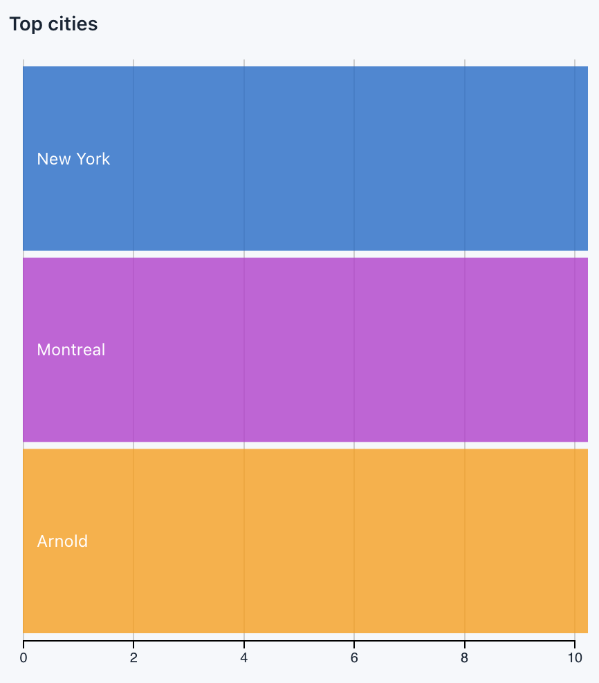
Next to the World Map is this Row chart listing the major cities where users have made a submission, as the number of submissions made in each.
Submissions by hour
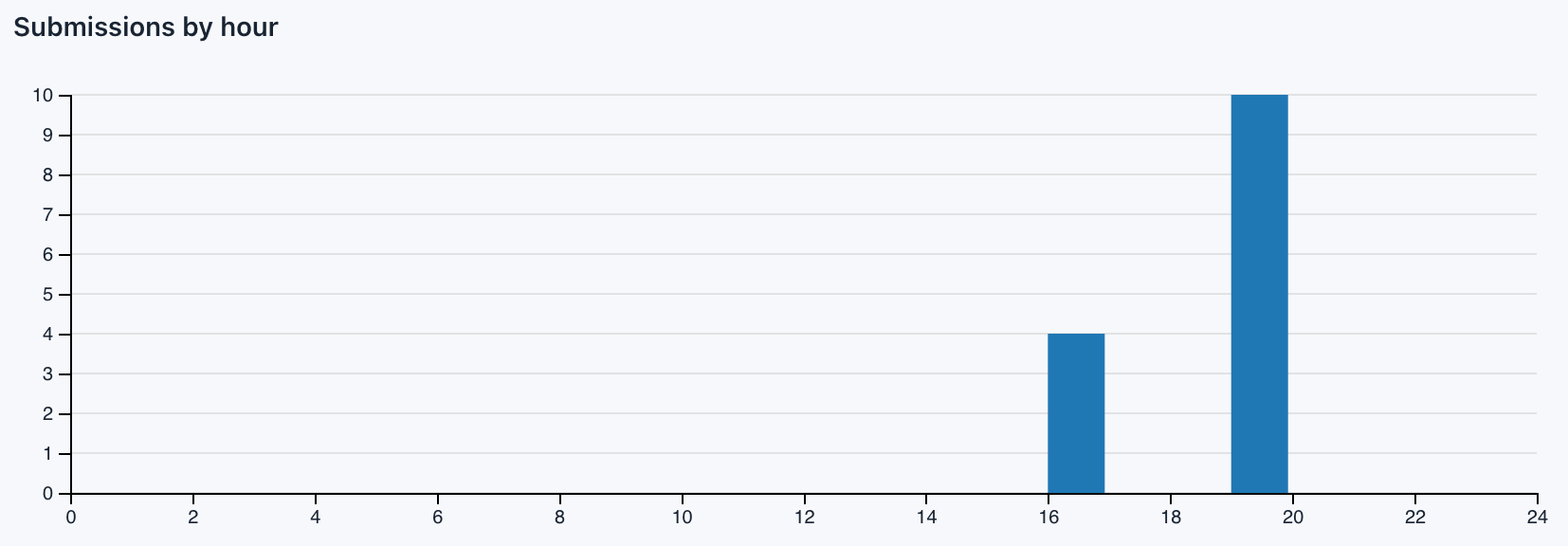
With this chart you can know in what time of the day are made more submissions. Some websites will experience peaks of traffic through the day depending on the content they publish and the audience they target. For example, a children’s website will be quiet at night, while a B2B website will be much busier during business hours.
Note: This chart complements the Performance Analytics’ charts (By Year, By Month, By day).
Top referrers
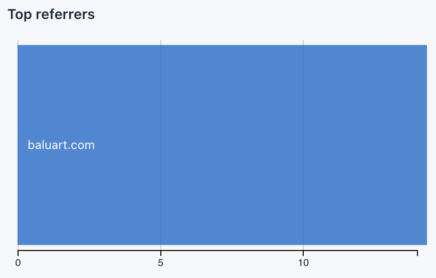
With this chart you will see the main domains that send traffic to your form, listed by number of submissions.
By type referrer
With this chart you can see the number of submissions segmented by the type of reference from which the user came.
Types:
- search
- social
- internal
- unknown
- invalid
By device category
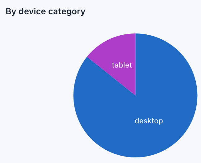
With this chart you can see the number of submissions according to the device categories from which was made.
Categories:
- desktop
- smartphone
- tablet
- feature phone
- console
- TV
- Car browser
- Smart Display
- camera
- portable media player
- phablet
By OS
With this chart you can see the number of submissions segmented by the type of operating system.
By Browser
With this chart you can see the number of submissions segmented by the Navigator.
Is Mobile?
With this chart you can quickly determine the number of submissions made from a mobile device or not.
Interacting with In-App Analytics
Keep in mind that the In-App Analytics Charts are naturally data driven and reactive, therefore providing instant feedback on user’s interaction.
Just click on one of the charts and the rest of them will show the segment reporting.
For example, on the Performance Analytics report click on Monday (‘Sun’) and you will see how the other charts update their data, including the funnel where you can see the number of users, interactions and conversions performed on Mondays.
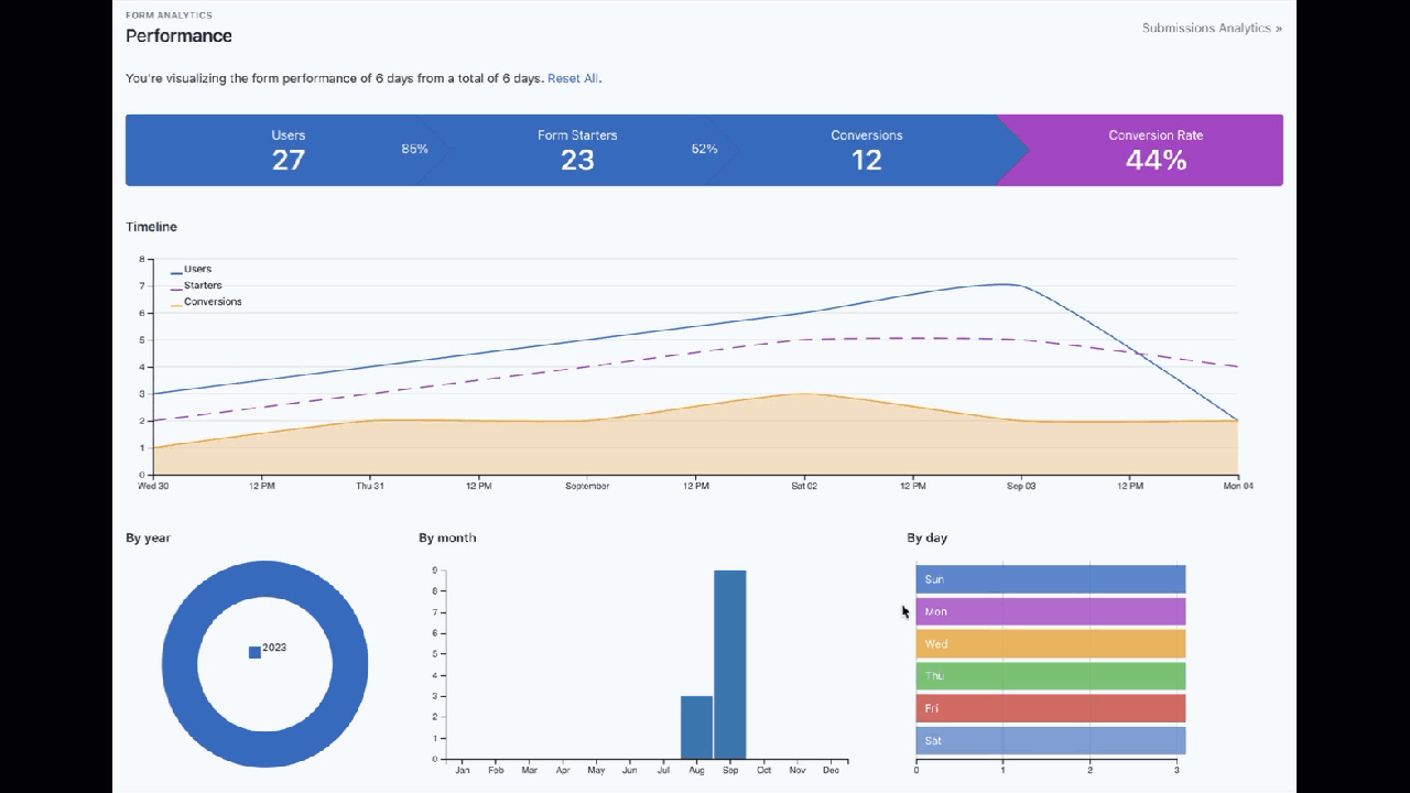
Enable / Disable In-App Analytics
Most of the time, you won’t have to do anything to enable form analytics. When a form is created the option to track their performance is enabled.
To disable a form tracking, you must follow these steps:
- Go to the Form Manager.
- Click the Actions button of the Form and then Settings
- Change Analytics from On to Off or vice versa.
- Click Save.
Enable / Disable In-App Analytics on the fly
Depending on the requirements of your site, you may be interested to track your form when certain conditions are met. For these cases you can enable / disable in-app analytics on the fly by adding the configuration option record to the embed code you use to publish the form in your website.
For disable:
‘record’: 0,
For enable:
‘record’: 1,
This parameter is enabled by default.
Note: You can read more details in the Form Widget documentation.
Advanced Settings
How often should statistics be computed?
In-App Analytics is updated once by hour, so you will see the stats until yesterday. We decided this because multiple queries are made to the database in order to upgrade the data and this could degrade the application’s performance (especially in sites with high traffic). However, this can be configured easily.
For example, follow these steps:
- Open the
@app/config/params.phpfile. - Change App.Analytics.cronExpression value of
@hourlywith@dailyor* * * * * - Save the file
With this change, the stats will be updated every day or every minute.
Note: Remember, it’s important to properly configure your server’s cron.
Import / Export
Introduction
Migrate a form with Easy Forms is a very easy process due to the simplicity of the import/export tool. Once a form is migrated, you can edit it like any other form in Easy Forms, so you won’t need to restart from scratch.
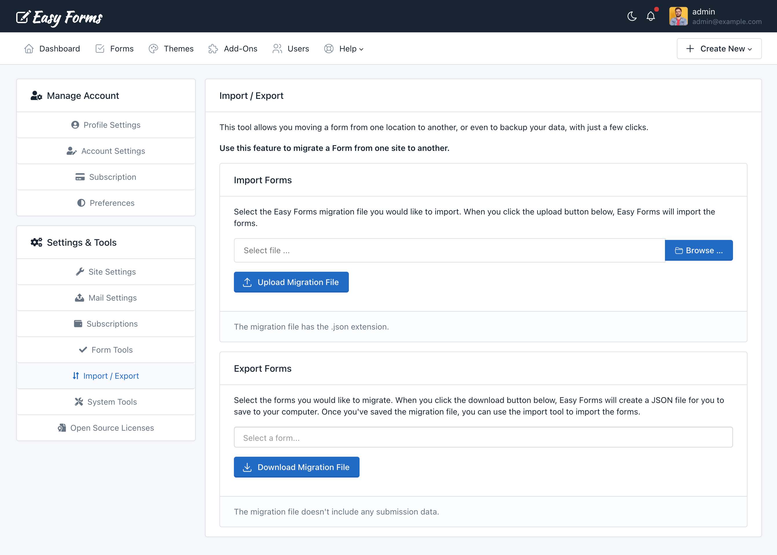
Note: You can import/export multiple forms at once.
Importing a Form
Note: This section assumes that you have already exported your forms and saved them in a JSON file. If you have not already done so, below you can read the steps to export forms using Easy Forms.
To import a form with Easy Forms, just follow the next steps:
- Go to Easy Forms and click your username. Then, click Settings. In the Sidebar, click the “Import / Export” link.
- From here, click on the Browse button and navigate to the form settings file that you need to import.
- Click the “Upload Migration File” button.
If successful, you should see a message on the top of the page indicating that the form has been imported successfully.
You should now see the form appropriately listed with the rest of your forms
Exporting a Form
When moving a form from one location to another, or even to backup your data, we have implemented a tool within Easy Forms to perform an export of your created forms with just a few clicks.
To export a form with Easy Forms, just follow the next steps:
- Go to Easy Forms and click your username. Then, click Settings. In the Sidebar, click the “Import / Export” link.
- In the Export Forms panel, select any forms that you want to export.
- Click the “Download Migration File” button.
- Then, you will be prompted to save a JSON file containing all of your form settings. Be sure to save this is a safe place for easy access later.
Your form should now be successfully exported. If you need to import your form, you may review the first section of this article on importing forms into Easy Forms.
Note: This export is only for Easy Forms and not include any submission data.
Template Manager
Introduction
Create a template is as simple as creating a form. But if you need to create several similar or identical forms, first create a template, then you can create the forms you need with a few clicks.
The Template Manager
To access the Template Manager, go to Form Manager, then click the drop-down menu located on the right side of the “Create Form” button. Finally, click in More templates.
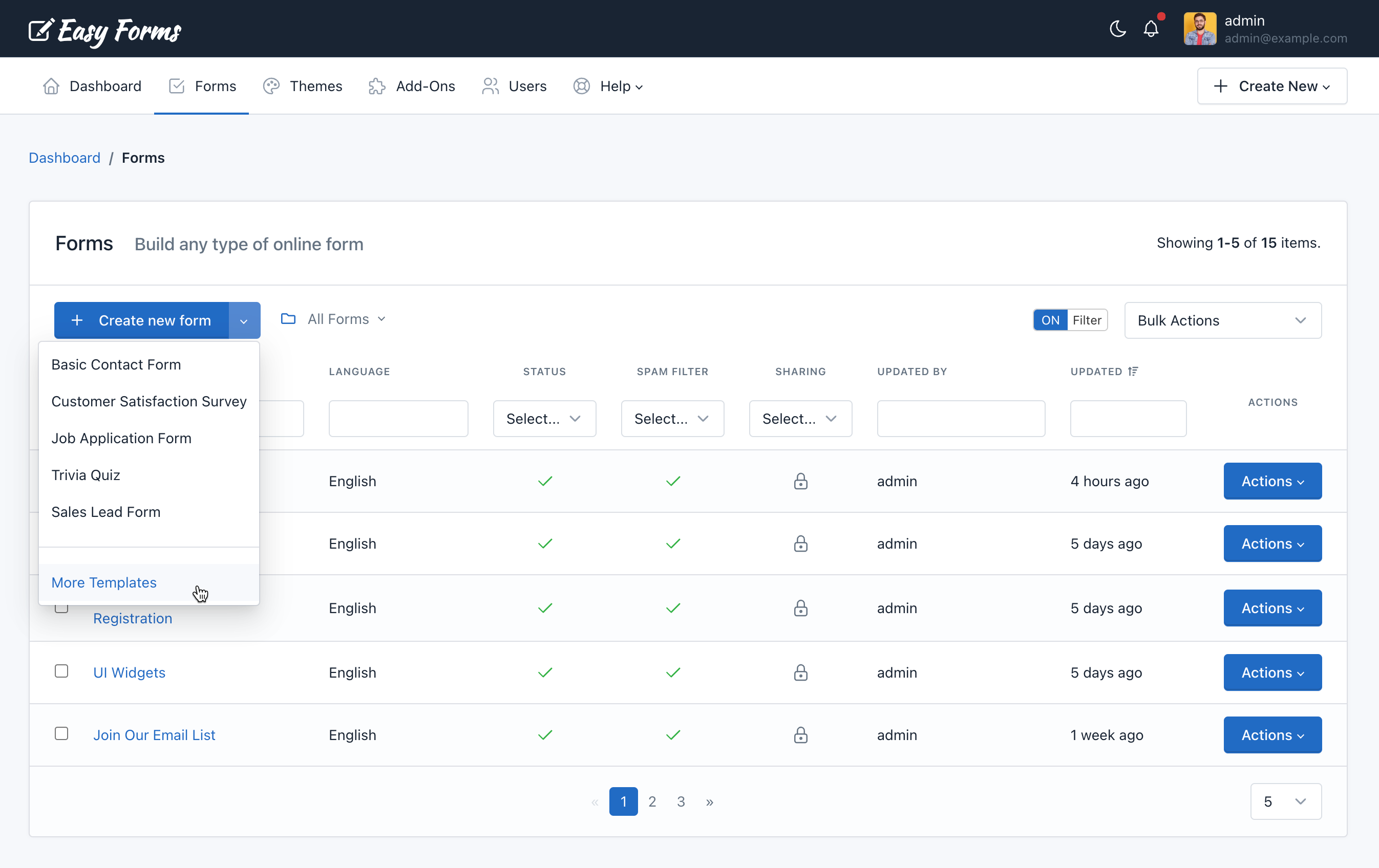
Create a Form from a Template
To create a Form, perform the following steps:
- Click the Actions button on the chosen template.
- Click Create Form
- Form Builder opens, and the template will be displayed in the preview.
- Click Save
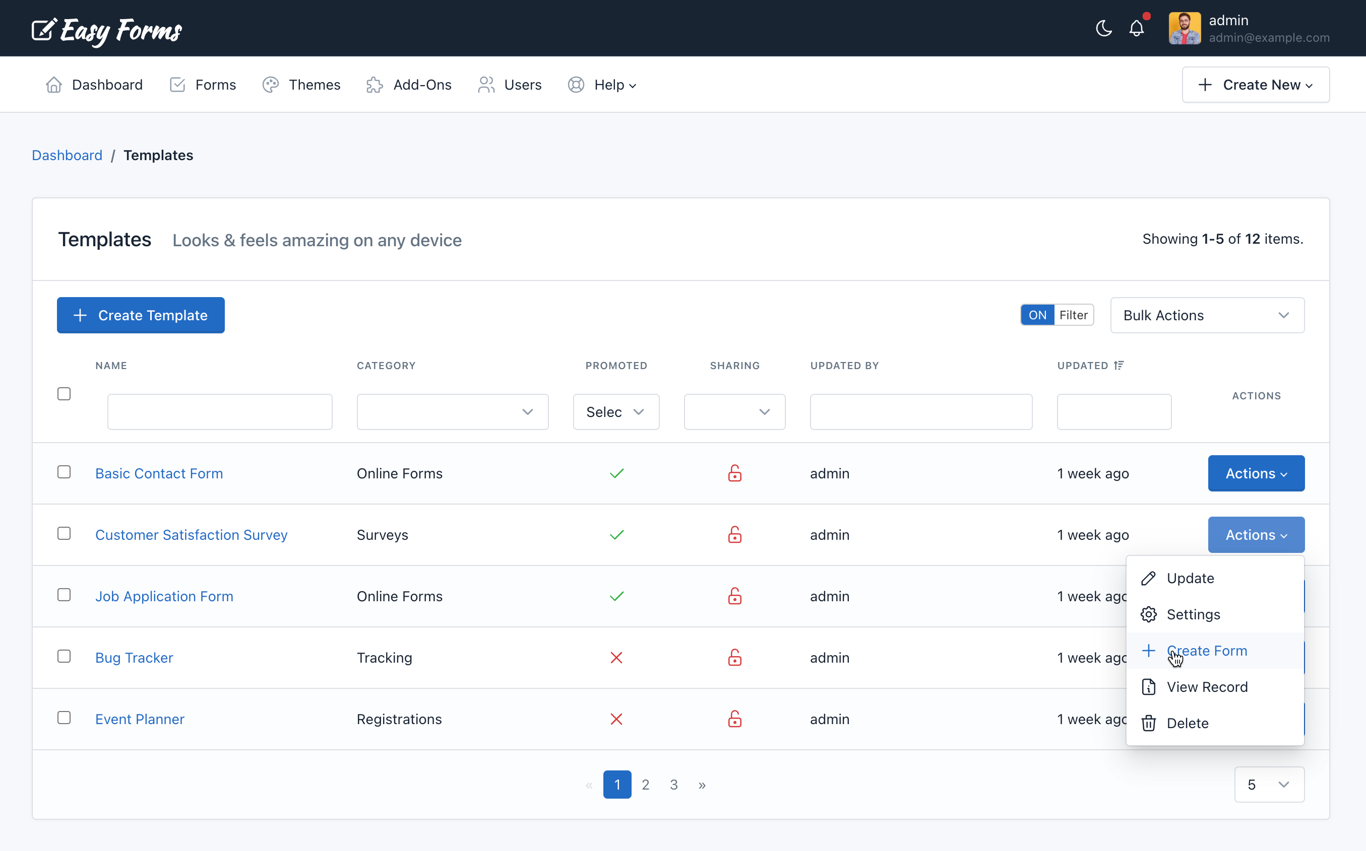
Create a Template
To create a template, follow these steps:
- Go to the Template Manager
- Click on “Create Template” button
- The Form Builder will open, but this time will create a template.
- Add the fields and make the changes you need.
- Click Save
Edit a Template
To edit a template, perform the following steps:
- Go to the Template Manager
- Click the Actions button on the template to be edited
- Click Update
- The Form Builder will open, but this time to edit the template.
- Make the changes you need
- Click Save
Share a Template
To share a template, perform the following steps:
- Go to the Template Manager
- Click the Actions button on the template to be edited
- Click Update
- Shared With: This feature allows you to share the template with other users. You have three options:
- None: The template will only be visible by its creator (without considering the administrator who can see all the templates).
- Everyone: The template will be visible by all users of the application. Only managers can share templates with everyone.
- Specific users: Allows you to select the users who will be able to see the template. Related permissions: Includes the word “Shared” in his name. For example, viewSharedTemplates, editSharedTemplates, deleteSharedTemplates.
Important! Keep in mind that although a user can share a template with another user, this user must have the permissions to view, edit, delete, etc. required for each action. For example, if you share the template with two users with different roles: Basic User and Editor. The basic user could only have access to use the templates to create his form, while the Editor user could access the Form Builder to update the template.
Promoting a Template
Promoting a template allows you to create a form without having to go to the Template Manager. You will be able to do it directly from the dropdown menu at the right of the Create Form button.
To promote a template, perform the following steps:
- Go to the Template Manager
- Click the Actions button on the template to promote
- Click Settings
- Select the checkbox Promoted
- Click Update
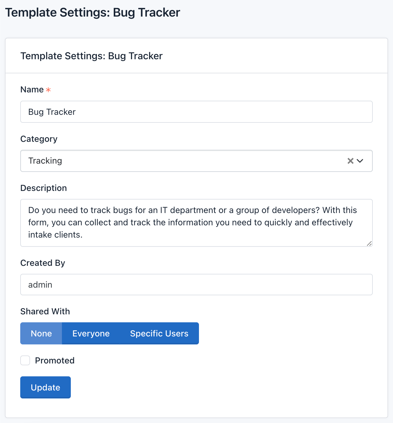
Note: By default, the promoted Templates drop-down menu displays the last 5 updated templates.
Add Category to a Template
To categorize a template, perform the following steps:
- Go to the Template Manager
- Click on the Actions button of the template in which you are adding category.
- Click Settings
- Select a category
- Click Update
Delete a Template
To delete a template, perform the following steps:
- Go to the Template Manager
- Click the Actions button of the template to delete
- Press Delete
- A popup window will appear asking to confirm your delete template decision.
- Click OK
The Template Manager will reload and the Template will be deleted.
Note: When you delete a template, all data related to it will be deleted too. This action cannot be undone.
Theme Manager
Introduction
Easy Forms has a tool that let you create themes that can be applied to a form to change their appearance, backgrounds, colors, text type, etc.
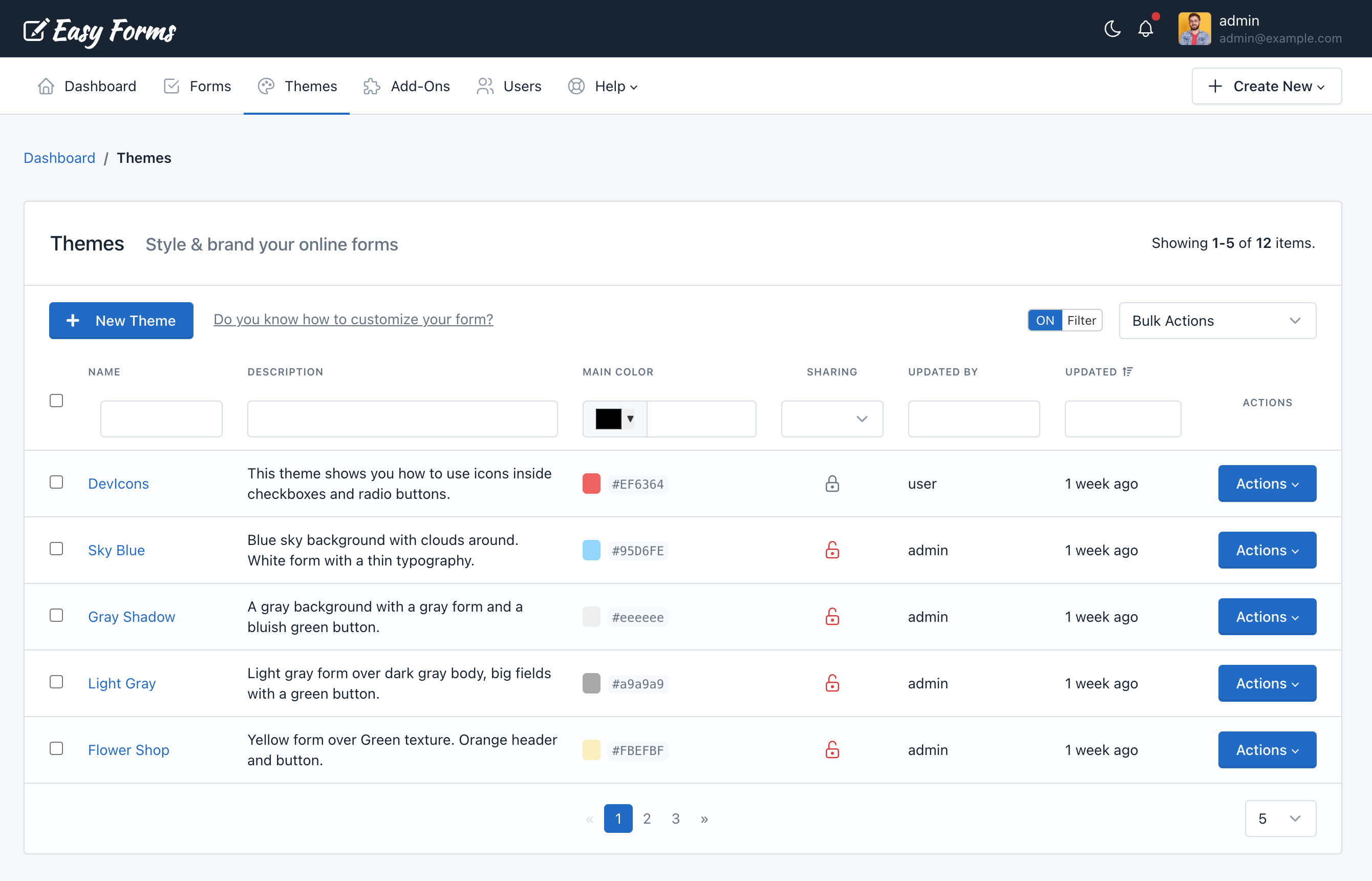
Create a Theme
Go to the Theme Manager, by clicking on Themes in the navigation bar. To create a theme, you must:
- Click on the Create Theme button
- The form to create a theme have 5 fields:
- Name: The theme name
- Description: A very brief description of the theme
- Main Color: The hexadecimal value of a color to identify your theme
- CSS: Must be a valid CSS
- Created by: Defines the owner of this theme (Visible by Administrators only).
- Shared With: This feature allows you to share the theme with other users. You have three options:
- None: The theme will only be visible by its creator (without considering the administrator who can see all the themes).
- Everyone: The theme will be visible by all users of the application. Only managers can share themes with everyone.
- Specific users: Allows you to select the users who will be able to see the theme. Related permissions: Includes the word “Shared” in his name. For example, viewSharedThemes, editSharedThemes, deleteSharedThemes. > Important! Keep in mind that although a user can share a theme with another user, this user must have the permissions to view, edit, delete, etc. required for each action. For example, if you share the theme with two users with different roles: Customer and Designer. The Customer user could only have access to view shared themes, while the Designer user could have access to the view and edit shared forms.
- Click Save
Note: You can select a Form in the Live Preview field to see how the theme applies to your form while you are editing the CSS field.
Edit a Theme
Go to the Theme Manager, by clicking on Themes in the navigation bar. To edit a theme, you must:
- Click the Actions button of the Theme to edit
- Click Update
- Make the changes you need
- Click Update
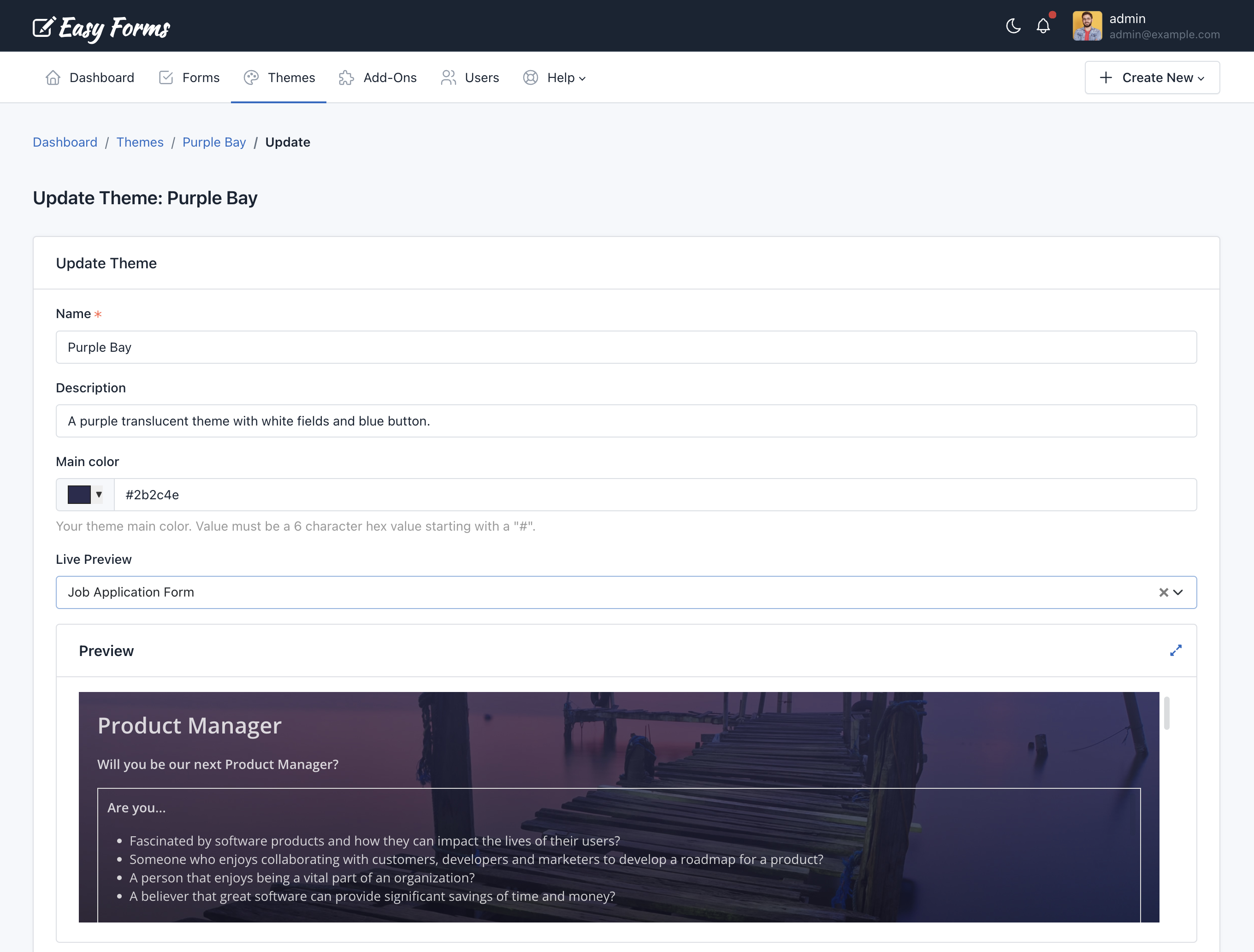
Delete a Theme
Go to the Theme Manager, by clicking on Themes in the navigation bar. To delete a theme, you must:
- Click the Actions button of the Theme to edit
- Click Delete
- A popup window will appear asking to confirm your delete theme decision
- Click OK
Note: When you delete a theme, all data related to it will be deleted too. This action cannot be undone.
Assign a Theme to another User
You can assign a theme to another user using the Theme Editor. To assign a theme, you must:
- Go to Themes -> Actions -> Update.
- In the ‘Created by‘ field, choose the username to which you want to transfer the theme.
- Click Update
Apply a theme to the form
To apply the theme you have created to a form, go to the Form Manager. Then, perform the following steps:
- Click the “Actions” button of the form in which you are going to apply the theme
- Click “Settings”
- Click the “UI Settings” tab
- Select a theme from the menu
- Click “Save”
Form Page Settings
To customize the landing pae where the form is displayed inside the application, go to the Form Manager. Then, perform the following steps:
- Click the “Actions” button of the form in which you are going to customize the landing page
- Click “Publish & Share”
- Click “Share Form Link”
- Click “Go”
Now you can see the Form Page with a “Settings” button in the top left-hand corner. When you click on that button, the form page configuration options will appear on the left side.
From here you can customize the following elements of the web page:
- Upload a custom logo
- Option to remove the link in the logo
- Option to customize the logo link
- Upload a custom favicon
- Define the CSS Styles for the form page
- Set a Meta Title, Meta Description and Meta Image
This way you can customize the look and feel of the entire landing page and customize the design when the form link is shared in social networks.